Advising kids to drink more water can often be a little more challenging than it seems. Kids from such a young age are likelier to listen and follow instructions with a source of entertainment that keeps them busy and active. This idea was created to help attract kids and even persuade parents to help get their kids to drink more water and less sugary drinks.
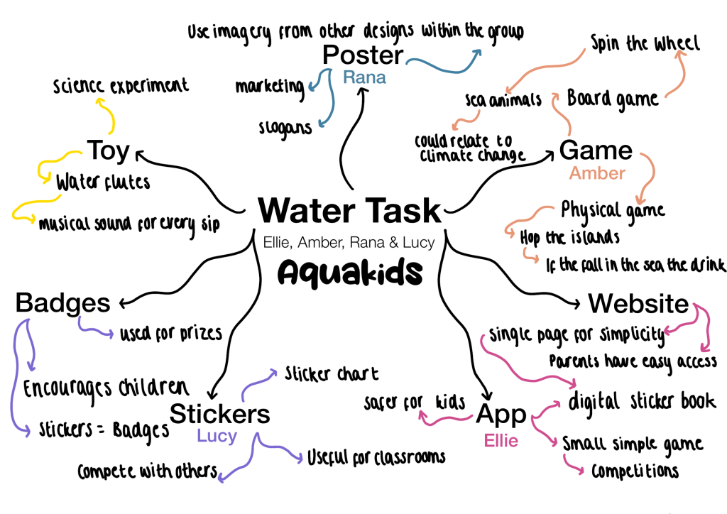
Groups of 3’s and 4’s were divided among everyone and we were set to come up with a way to entertain and attract parents to help get their kids to drink more water. Kids ages 3-5 were our target audience, so we started off with a mindmap to help split the tasks between everyone in my group, I was set with making posters to spread around as a marketing strategy to attract my audience.
We came up with the name “Aquakids” for the brand, reflecting on the word “Aqua” as it fits well with the idea of ‘water’. The meaning of aqua is in fact water, only sounds a lot more professional. Adding the phrase kids after the aqua implies that this branding is for kids.
Logo
One of the members of the group (Amber) created the logo for the branding name.
Keeping it plain white with only a stroke around in blue kept the aqua look a lot more attractive and professional for parents, but it was a little simple for a child’s satisfaction. Another one was created by Ellie which included a lot more colour but still stayed similar to the original one created by Amber.
Given the feedback we had from both designs, we came to a group decision that we would take the coloured blue droplets from Ellie’s design logo and apply it to Amber’s logo. This way the design would stay professional and kids would be more attracted to it by the brightly coloured illustrations.
Game
Bringing the fun to aqua, the idea of making a fun game for the kids was definitely an aspect that needed the most attention. Amber was in charge of creating and designing the games for the kids, and as a group, we had decided that we would create a board game, along with a physical game of ‘Hop the island’.
The idea of the board game was created with a simple design, avoiding any complicity since the kids are ages 3-5, making a detailed game would make it difficult for the young kids to understand and play. Sea animals would be created for the kids to use as their counters to play along the board. Whilst this game is designed to only persuade kids to drink water, it also covers a small educational side by showing them a little bit about climate change and how ice melting is a real-life situation. This board game is targeted at ages 4-5+.
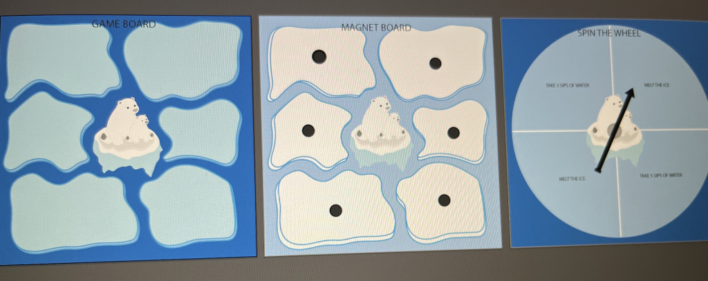
The graphics used on the board game were selected to fit a kids-styled game. Kids often look for brightly coloured objects and products, especially younger kids who enjoy interesting objects such as a magnetic board and would be very interested in playing around with the board game and the spinning wheel. A polar bear was picked to fit the ice caps around the board, along with blue for the ice and a darker shade of blue to fit the ‘aqua’ theme.
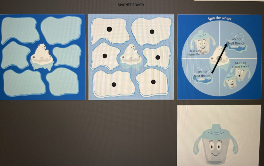
App Design
We came to a group decision that make the app would be more ideal and easier to access then it is creating a website. This task was handed to Ellie Ward, a member of our group. Children of today’s generation will easily own an iPad or any such device. Creating a website would possibly lead the kids into wanting to search for other content and be distracted than being focused on the website, as well as it being a little complicated for such young kids to be using and communicating through a website rather than an app.
(IMAGE)
Within the app, we came up with the idea of a digital tracker for children to stay up to date, in addition to the previous game designed above, another game would be created. After every milestone is achieved throughout the app, coins are rewarded on every step which kids can then later save and use on upgrades and new unlocks throughout the app, making it enjoyable and lasting for the kids wanting more.
This idea is also environmentally friendly, less paper is wasted through stickers and charts, which are still an additional option to use for perhaps the younger aged kids/toddlers, but also allows parents to see in seconds the progress their kids have made.
Poster’s Sketches
As a group, we decided to also create a poster to market and advertise the new design product we came up with for this campaign. Getting the audience’s attention in wanting to better their children and persuading them to drink more water using these posters will allow them to notice and download the app.
Sketches were designed and planned out in order to see and test random placement and design ideas, and colour testings to come up with that final design structure. The sketches shown below were done in the given time frame and were then discussed with the rest of the group, taking ideas and opinions from other teammates’ perspectives allowed a better outcome.
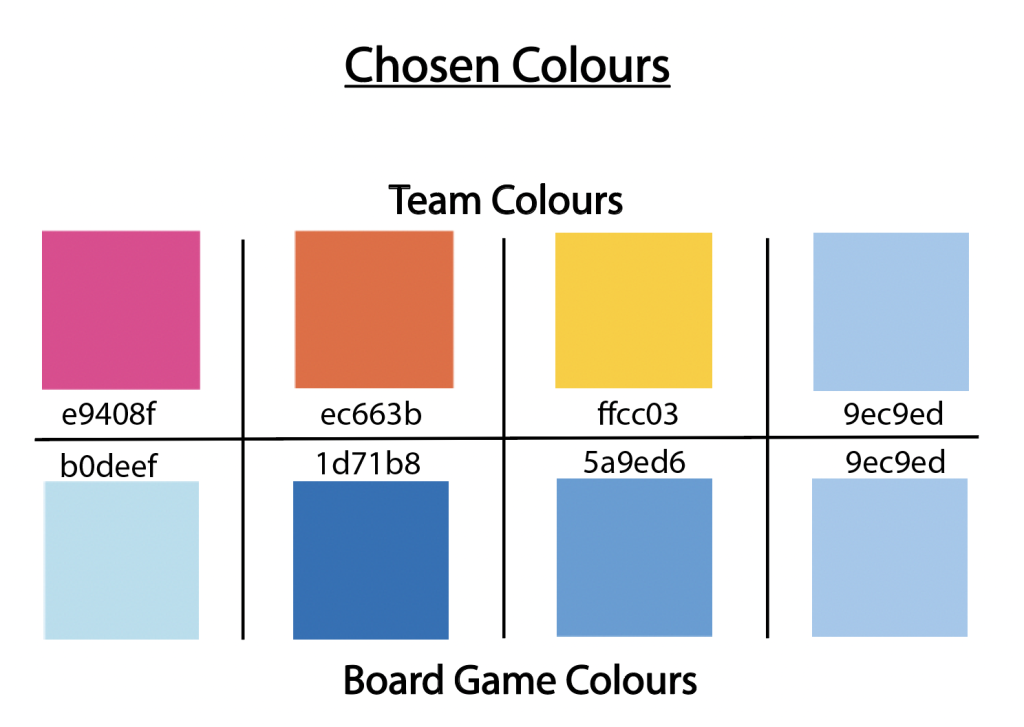
The chosen colour schemes shown above were analysed and discussed by all members of the group. We came to a final decision after testing a number of colours that did not best fit the scheme we wanted to do. These colours were specifically chosen because of their shading, how well it fits with the meaning of ‘Aqua’ as well as its children’s theme, the colours did need to be quite vibrant to attract kids, in addition to being playful.
Poster’s Design
These posters will be designed using the colour frames used among other created products, the same design typography is also used throughout the rest of the designs to keep a consistent house style.
Stickers | Badges
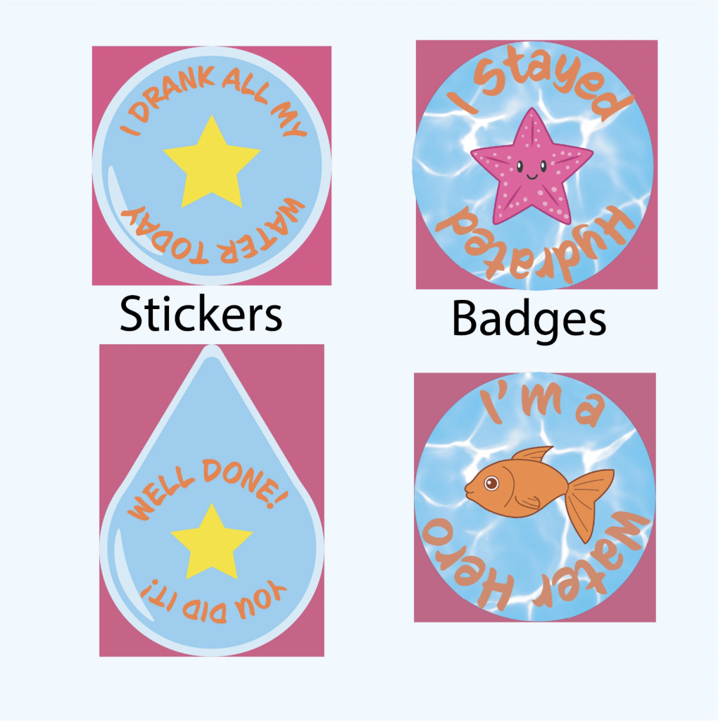
Finally, through our group discussions, Lucy’s task was to create badges, stickers and a chart to allow the kids to keep up with their weekly tasks as they work through the activity. Badges were created in order to persuade the kids further to compete against themselves in order to drink as much water as possible to earn those rewards.
They were created using the fish and starfish that can also be found on the chart, with the water background to keep with the house style. Stickers were also created with the same blue background, with a yellow star in the centre of both designs. The typography used in both the stickers and badges was kept consistent throughout all design pieces, creating them to amuse the kids as well as the choice of design that best fits a kid’s audience.
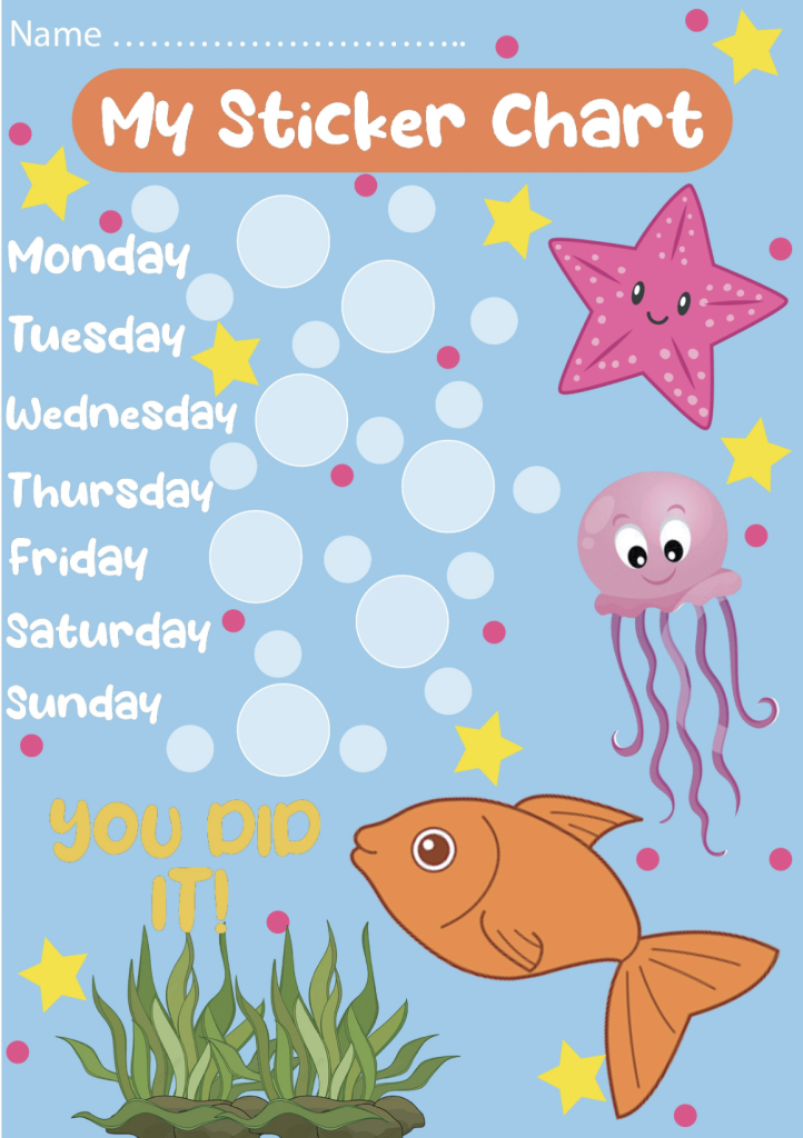
Followed on is an image of the designed chart for the kids to use during the week in order to keep track of how much water they drink. The kids are instructed to use the designed stickers above to stick on the white outlined circles every day after they’ve drunk a good amount of water. By the end of the week, if all the circles have been filled with stickers and full-filed to their standards, they are to give the chart to a parent in order to earn their badge.
Using bright colours across the page, large sea animals were also designed onto the chart to bring out more of the water theme design across all products, along with the same star used for the stickers, with small pink dots to match the pink starfish. The typography used at the top of the chart is quite large, just so it’s clear and visible to the kids that this is their personal chart, and so it’s clear to the older audience which product is which.
Rejected Designs
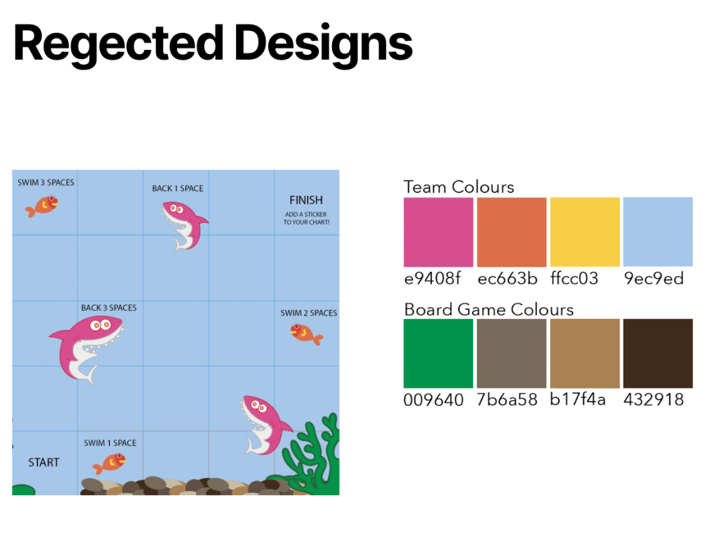
The shown image to the left is one rejected design game that had been designed by Amber. The reason this design had been rejected was because of the way it was formatted. For our target audience, the design comes across as quite complex for them to understand, which in this case would fail to reach the goal for this specific task. The colour choices were not the best and could have been a lot brighter. Instead of choosing colours that are more ‘adult’ related than ‘kids’ related, using brighter shades instead of Brown, Dark Brown and Dark Green, previously chosen colours shown above come across as a lot more amusing to children.
Group Achievement
Working in a group definitely allowed us to develop a better bond between each member of the group, sharing ideas and opinions with everyone gave a better outcome to all products that were designed and created throughout the journey of this campaign.
The level of communication between all the members was high in relation to sharing ideas with everyone and adding in those ideas, creating the final design to everyone’s standards allowed a better ‘team effort’ throughout achieving the goal of this campaign together.
Ellie Ward’s water task post: http://ward-2021.hulldesign.co.uk/2022/10/10/water-task/
Amber Dalton’s water task post: https://dalton-2021.hulldesign.co.uk/2022/10/01/drink-water-campaign/
Lucy Magowan’s water task post: https://magowan-2020.hulldesign.co.uk/2022/10/06/childrens-water-campaign/



1 thought on “Dev.Log 1 – Water Task”