
Brainstorming
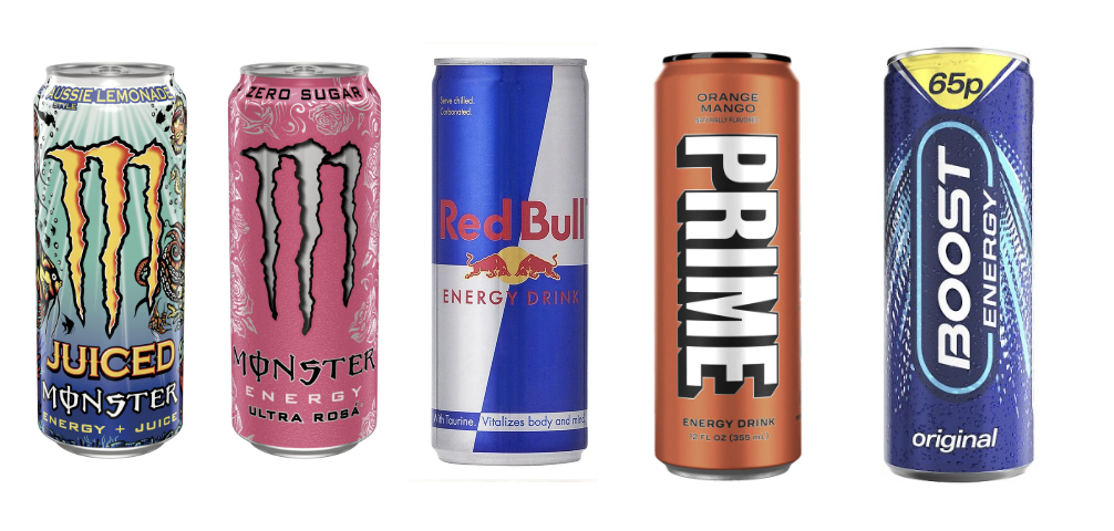
Taking a look at these energy drinks, they all have 9 things in common, or what makes them identify as an energy drink:
- The name
- “Best before” or “Used by”
- Any necessary warnings if needed
- Net quantity information
- Ingredients needed
- A country or place of origin
- A signature design
- Any storage conditions
- Instructions of use if needed
Ingredients and extra information on the energy drink are usually located at the back of the can in small writing, making it quite difficult to read and see what’s included towards the drink. Logo and design structure is quite an essential aspect of the energy drink, having an attractive design and convincing logo engages your target audience a little further when wanting people to buy your product. Further information that is required for an energy drink is essential to be on the product to help and guide your target audience. Other important aspects such as “Best before” and “Used By” are important to help your target audience when the drink is suitable to drink and how long they can keep it.

My energy drink uses a variety of colours to help reflect the flavours that are available, as the image above shows the colour and the flavour that could possibly associate with that colour. Metalic designs are to be further improved and how they could be used to later make the design look more attractive to my target audience. They can also present where my logo may position itself and how the design structure may be set out, such as bubbles and other effects that can be included.
Designing & Testing

Further improvement to my energy drink was done to see visually if my design works, and I then used adobe substances 3D to see if it works. I tried this for 3 different flavours, Strawberry, Blackcurrant and Apple. The lighting and positioning of the design will be improved and changed further later on.
Currently, I approve of the position my logo sits on the can, the shades of the flavours I do want to change and make a little bit lighter as it does blend a little too much with my logo. In order to make the flavour of the can more visible, I would need to change the resolution of the can as well as make the logo a little bold.
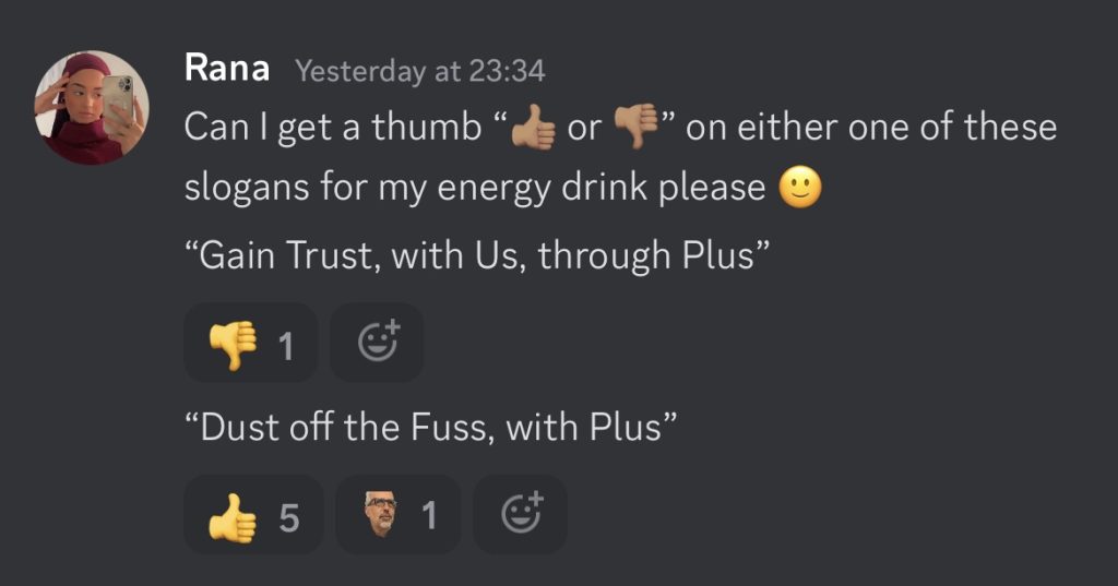
Finally, I also wanted to include a slogan in my energy drink. In order for me to have the perfect slogan, I came up with a number of different slogans and selected two of my favourites. I then took my slogans to discord and pasted them into our discord group chat and had my classmates vote on which was the best.
The Packaging Design
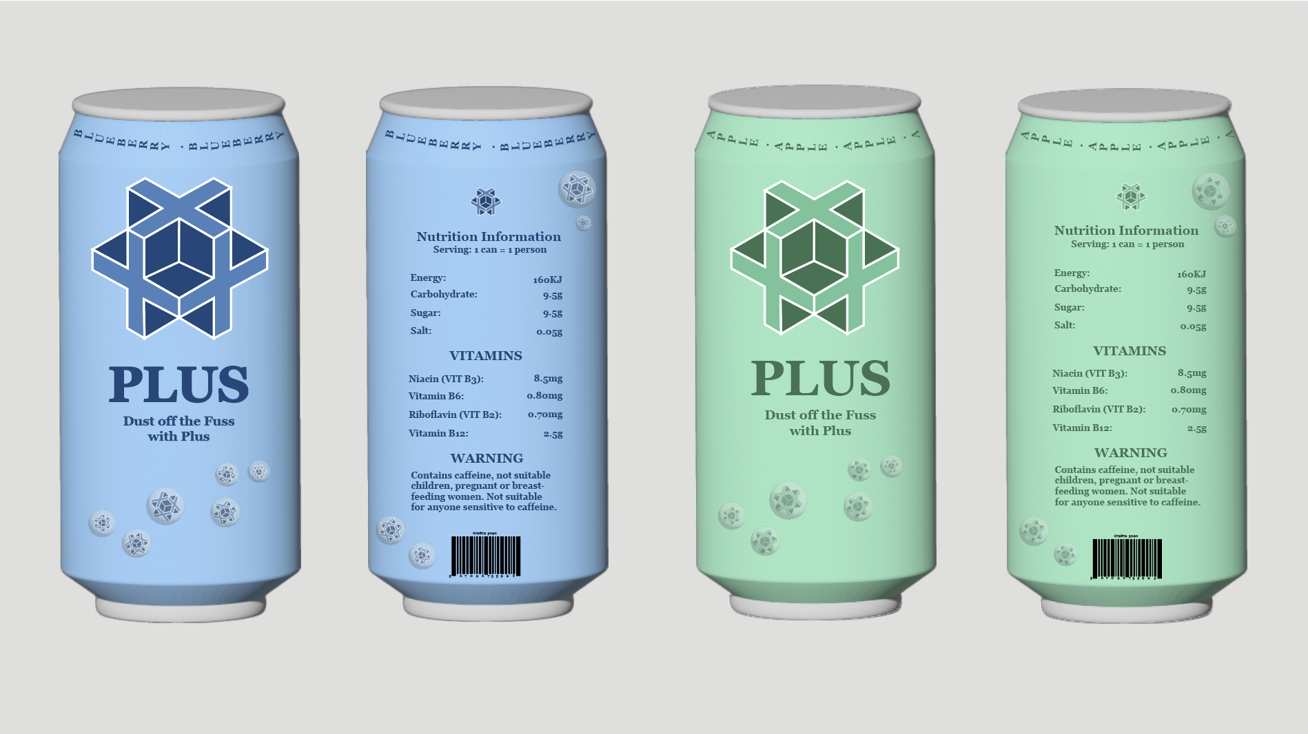
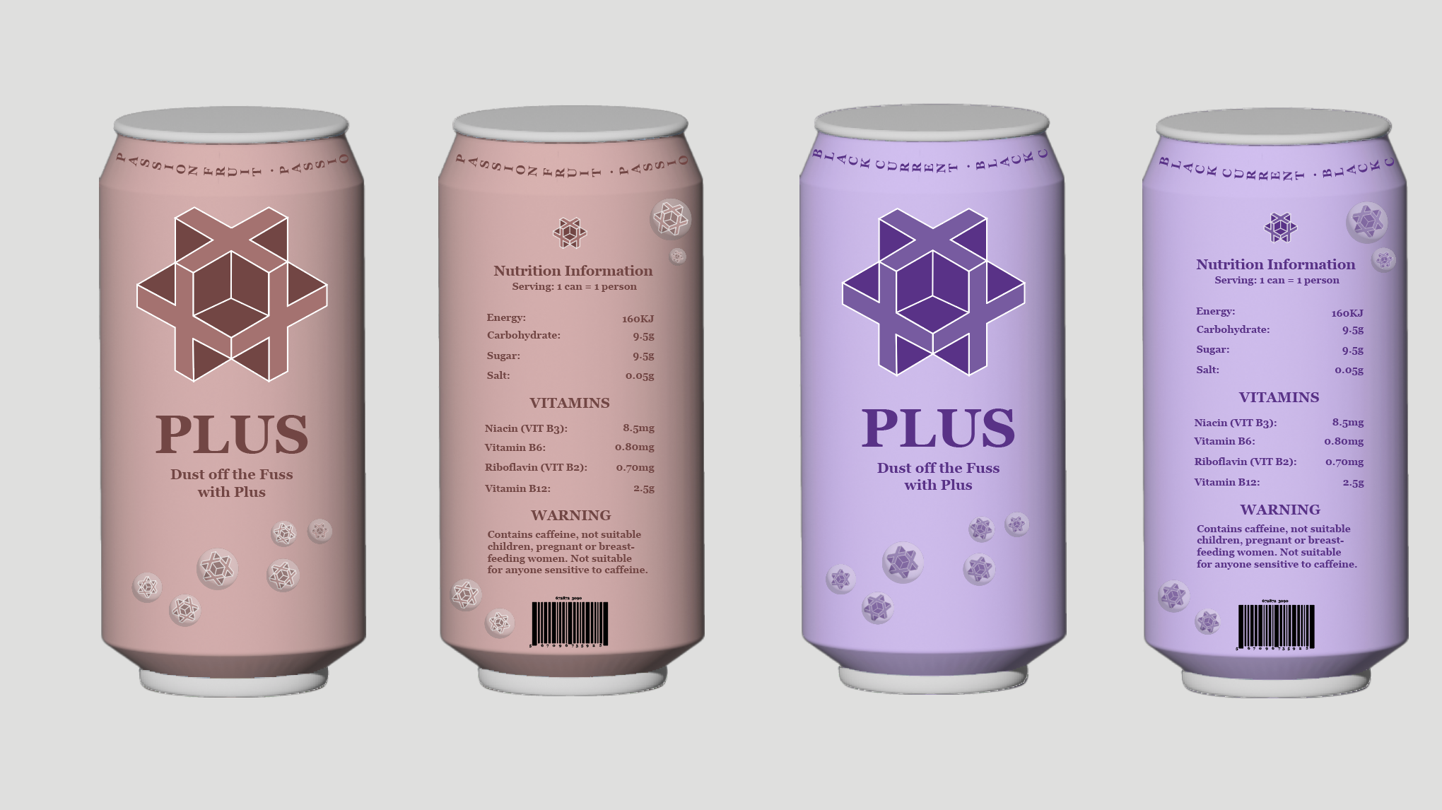
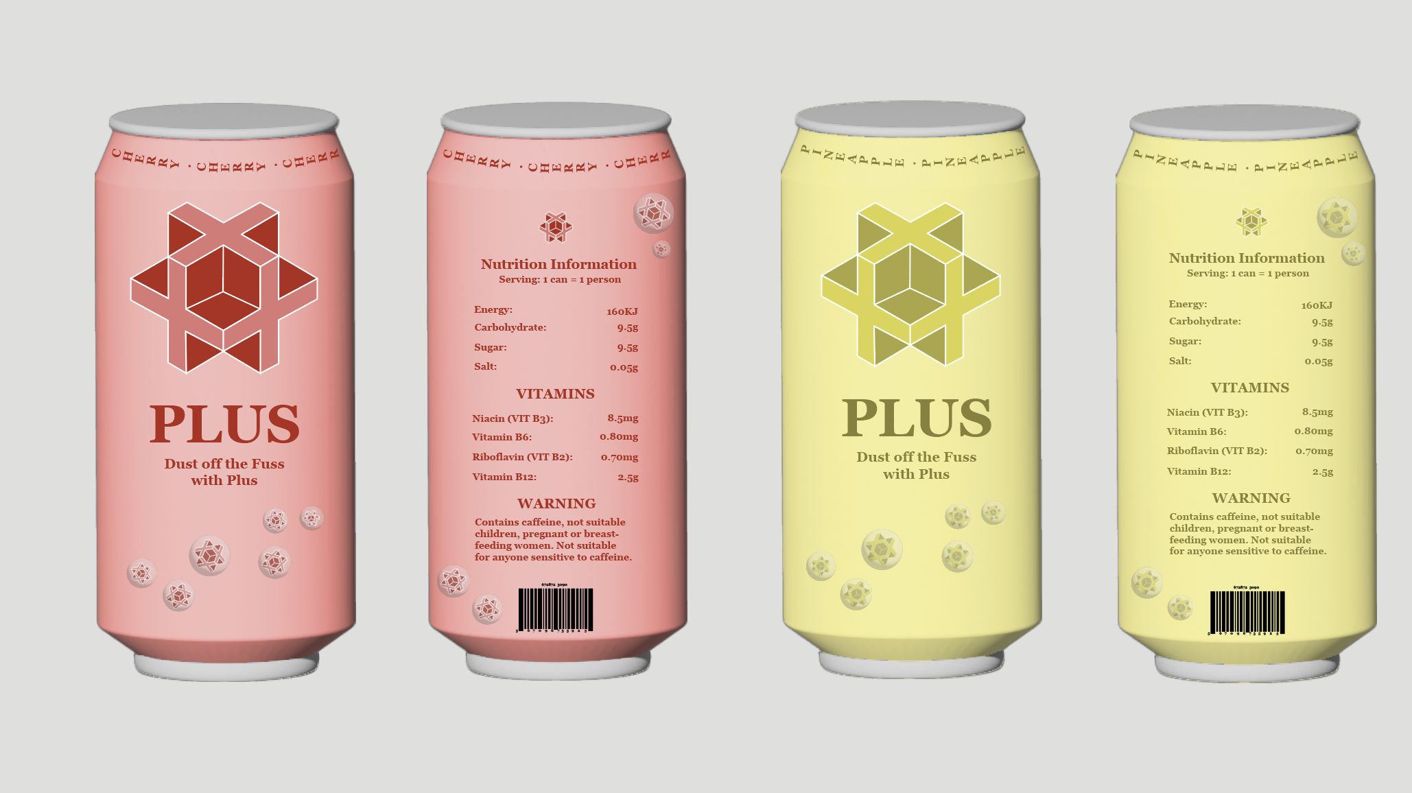
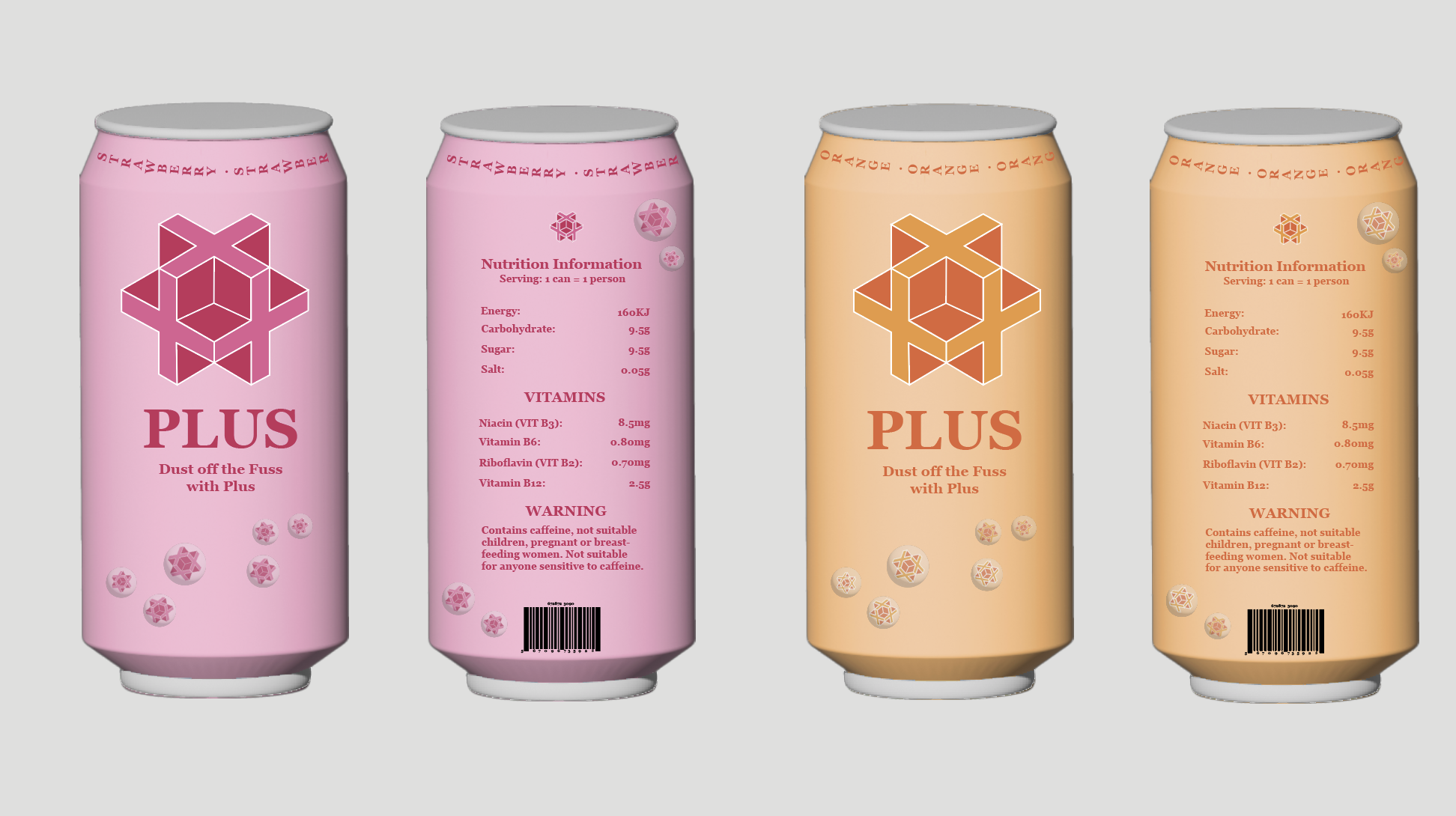
As I was creating these packaging designs, I had originally started with my first design that was sketched out above but came to notice that the design was not as appealing as I expected and could be improved. I then decided to change small features and move around some of the objects in my design, which turned out a lot better than the original design shown on Adobe Substances 3D.
Reference:
https://www.kff.co.uk/red-bull-energy-drink/p/351
https://www.ebay.co.uk/itm/334627990259
https://www.megaretailer.com/1boo0or1-boost-energy-original-24x250ml-pmp-65p.html