
Menu:
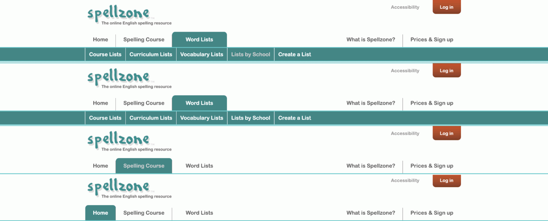
Websites Overview (Menu): Although Spellzone has quite an ongoing colour scheme across its website layout, the menu above uses the same primary colour that can be seen almost everywhere on the website. The menu has several different pages, in some options have even more pages, giving its target audience an easy and free way to navigate across pages.
Improvements: No major improvements are needed for the menu as it sets an easy design look to the user’s experience when wanting to navigate across pages. The colours of the text and further analysis of the logo and buttons can be easily seen and identified. The fonts used are readable and do not bring any complicity to the user’s vision. Just moving the search button to the top of the page from the bottom of the page would give the user an even easier time using the menu navigator.
Improvements for User Experience: When first met with the website, the user has the relaxed option to visit any page through the provided menu at the top, making the navigation across the website accessible for the user’s experience. No difficulty can be met when trying to access the website, however, bringing the search option from the bottom of the page to the top of the page would be a lot more ideal when giving the user quick access to searching a specific page.
About the website:

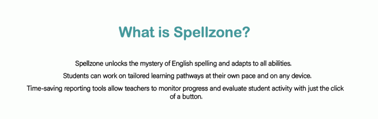
Websites Overview (Introduction): Shown above is a short, 3-sentence introduction to the website. The introduction gives a very simple brief of what Spellzone has to offer across its web pages and the goals it plans to bring. Keeping a simple yet detailed introduction is one aspect that should be carefully written and examed since this can be seen as the opening to your target audience, and how they understand what the website is for comes from the introduction.
Improvements: The introduction is quite simple, and is formatted in only 3 sentences that sit all underneath each other. Although keeping it simple is important, it’s also important to add a little further detail to draw the audience to your page.
Improvements for User Experience: Having further detail in your introduction not only raises your user experience but can also give the user an idea of your website. Adding further detail on what the page is about will allow the user to fully understand the goals that are to be met when using a website such as Spellzone.
Sequence of images:
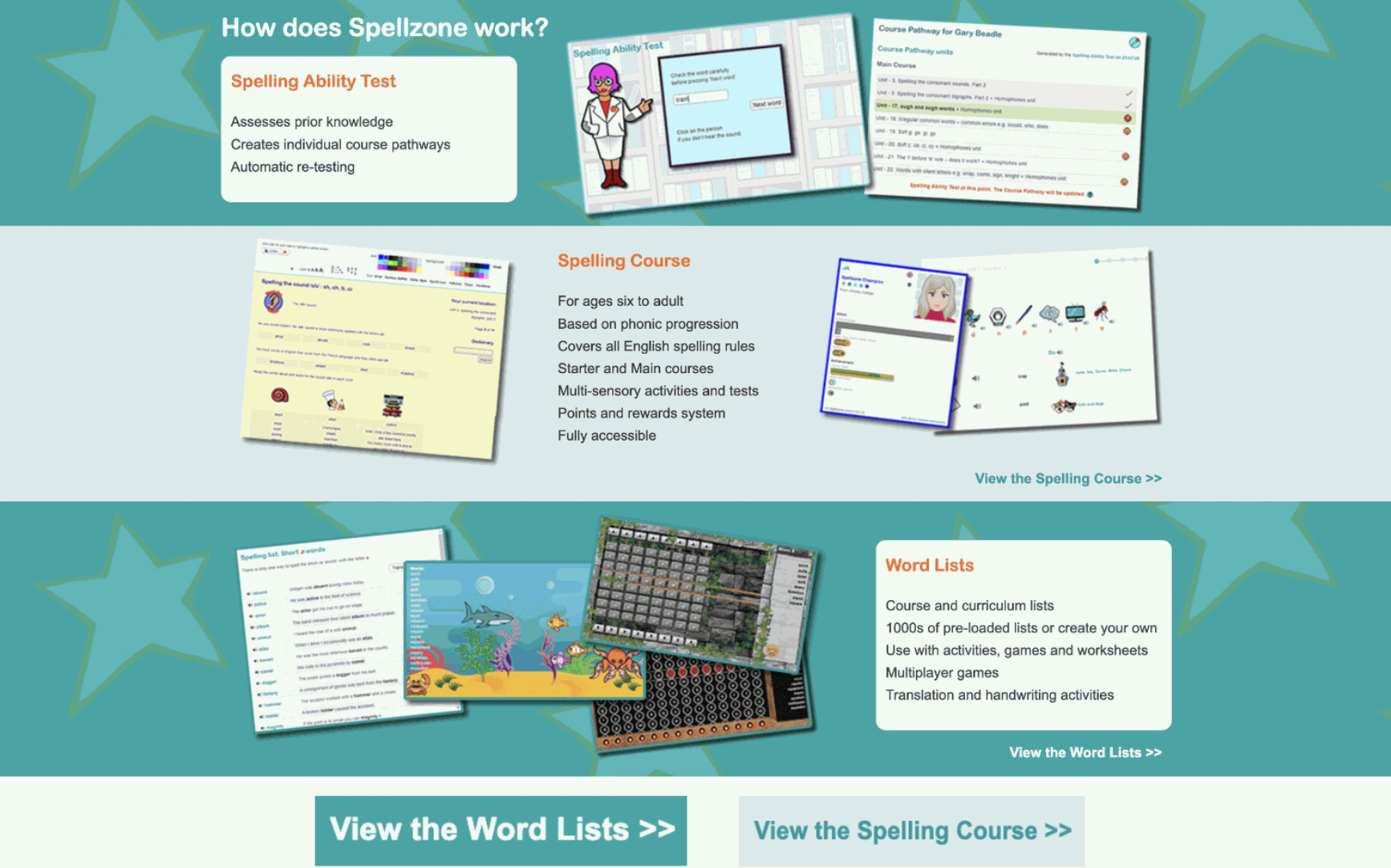
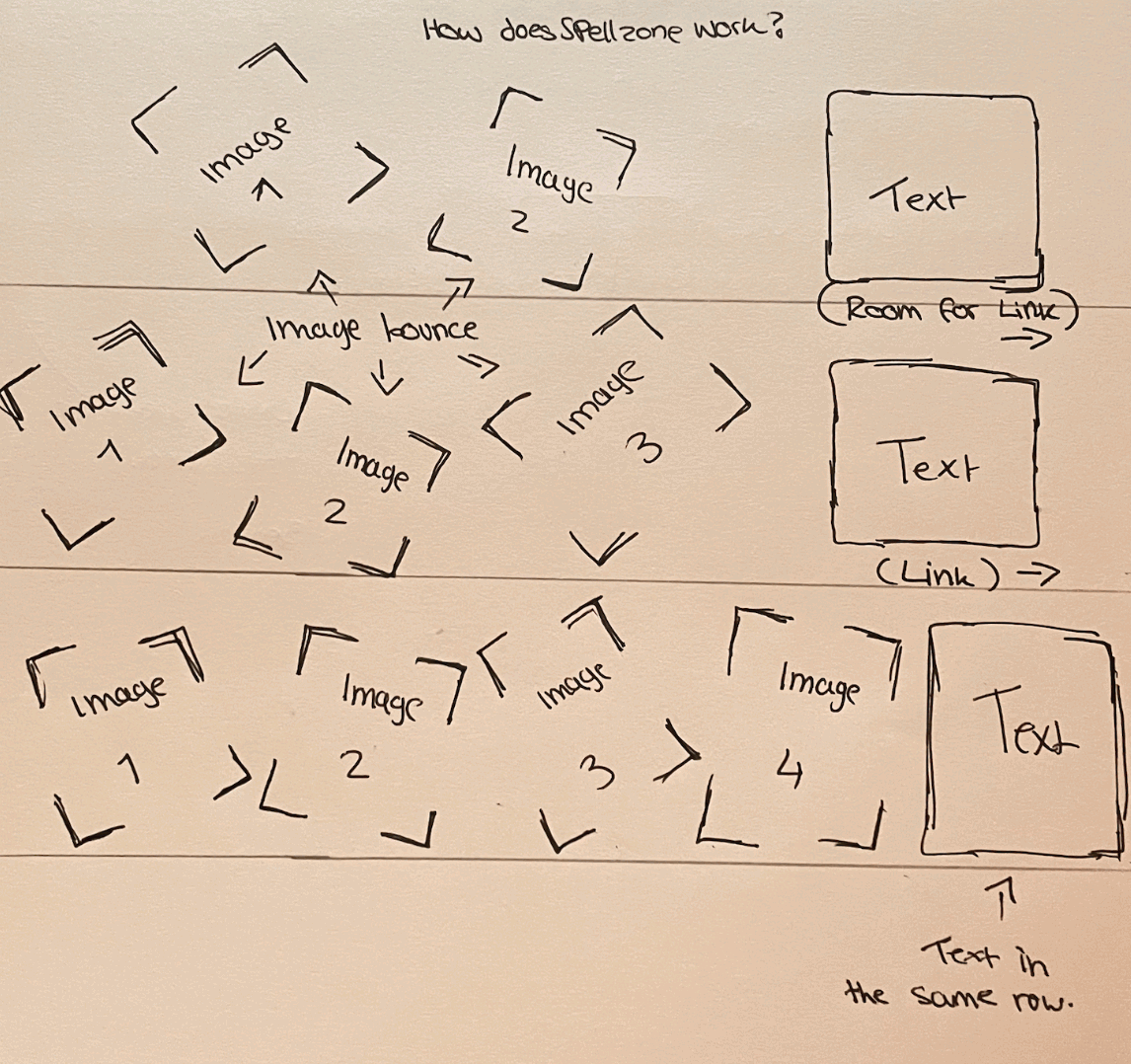
Websites Overview (Sequence): A sequence of images can be shown in the formed grid above. Each row shows a series of different sections on how Spellzone works throughout use. The sequences use 3 – 5 different images all lined in a messy order to show exactly how every section appears and is displayed through the cycle, which almost can be seen as a storytelling sequence. Links can be seen through two of the sequences which give the user access to see further on through the pages and more about that particular section.
Improvements: One improvement that does stand out to me is the layout of the sequence, some of the images overlap each other which makes it quite difficult to see what some of the images identify as. As well as this, the layout of the entire section could also have a better design, a design that makes it easier for the eyes to see.
Improvements for User Experience: Improving the placement of the images in this sequence would make it easier for the user to see and view the images, allowing them to visually see and identify what each image tells them. Changing the design layout of this chosen section could also allow easier comfort for the eyes, making it less difficult to view with the mix of bright colours, such as the white background with the bright blue text. Along with the bright orange sub-headings.
Target Audience:
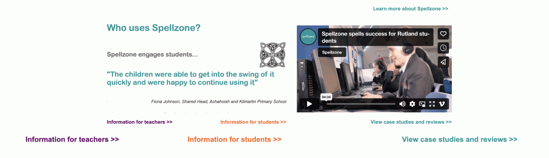
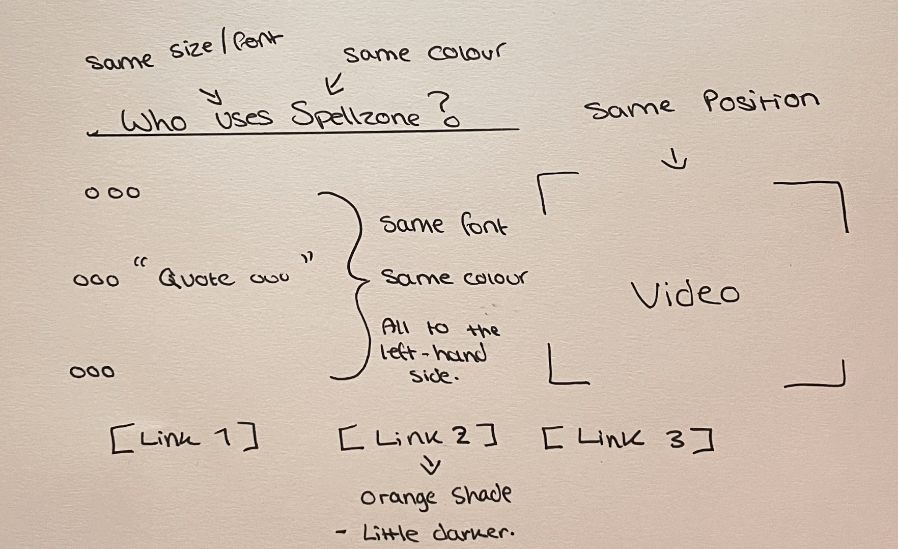
Websites Overview (Audience): A section of the website was designed to show the audience exactly which target audience this website was aimed and created for. The small sentences that can be seen above give a short insight into what some students have experienced whilst using Spellzone, followed by some links at the bottom which give further information, depending on the user.
Improvements: Because the design theme across the entire page is mainly the shade of blue shown above, some of the written text can be quite hard to see such as the orange on both the regular text and used for the link. Changing these colours to a more natural colour or a bolder shade would make it a lot easier and better presented on the website.
Improvements for User Experience: Changing the colours and the layout of this section would give the user a better experience when wanting to read and understand what the review has to say. Making it easier for the user to navigate around the webpage or a specific part of the page gives them a better experience, which then puts your website in a better position.
Further Sponsor Links:
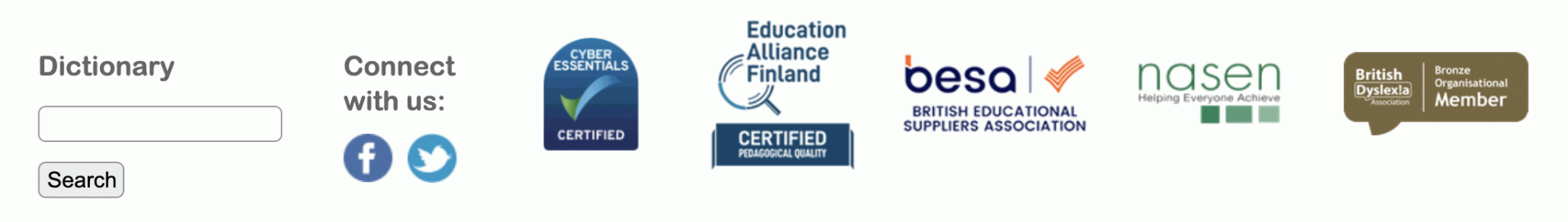
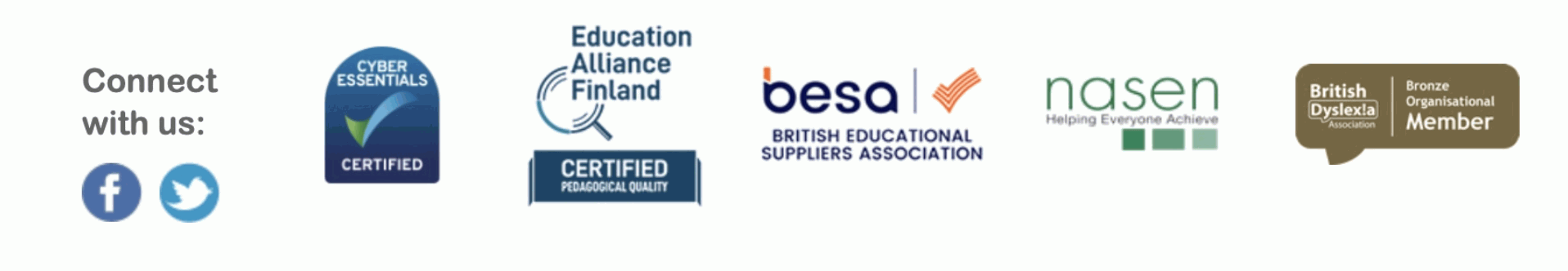
Websites Overview (Links): Having different sponsors and links at the bottom of the page sets a high and professional look towards the Spellzone website. Spellzone has several different certified companies, which reassures their target audience that this website is supported by several different trusted businesses under education.
Improvements: Moving the search bar to the top of the page would be a lot more convenient when wanting the user to navigate and have easy access to searching a specific page across the website. In addition to this, keeping a separate page dedicated to the sponsors does give a better and more professional look to the website.
Improvements for User Experience: When the user sees the number of different companies that support Spellzone, it gives a better outcome to the user that they can trust this webpage because of the several trusted educational and certified companies that support Spellzone. The user’s experience will become light, allowing them to use the website in all comfort in knowing the website will not provide anything it shouldn’t.
Audience’s Reviews:

Websites Overview (Reviews): The reviews section of the Spellzone website consists of only one review which can be seen in the figure above. This section also provides 3 different columns that allow the user to find resources, a help section for enquires and a curriculum section for any further information they may be looking for.
Improvements: The design of the website consists of stars across the blue shade that can be seen in the above figure. However, due to these stars overlapping some of the text, it’s making it difficult for some of the information to be seen or even read, particularly from a distance. Making the text bold or even shading the style of the background would give the user an easy view of the reviews section.
Improvements for User Experience: Including reviews for the user to read on your website would be ideal when wanting to let the user know other people’s opinions on their time using Spellzone for their students. It allows the user to feel more aware of the website and persuades them in wanting to use Spellzone more.
Page Language Options:
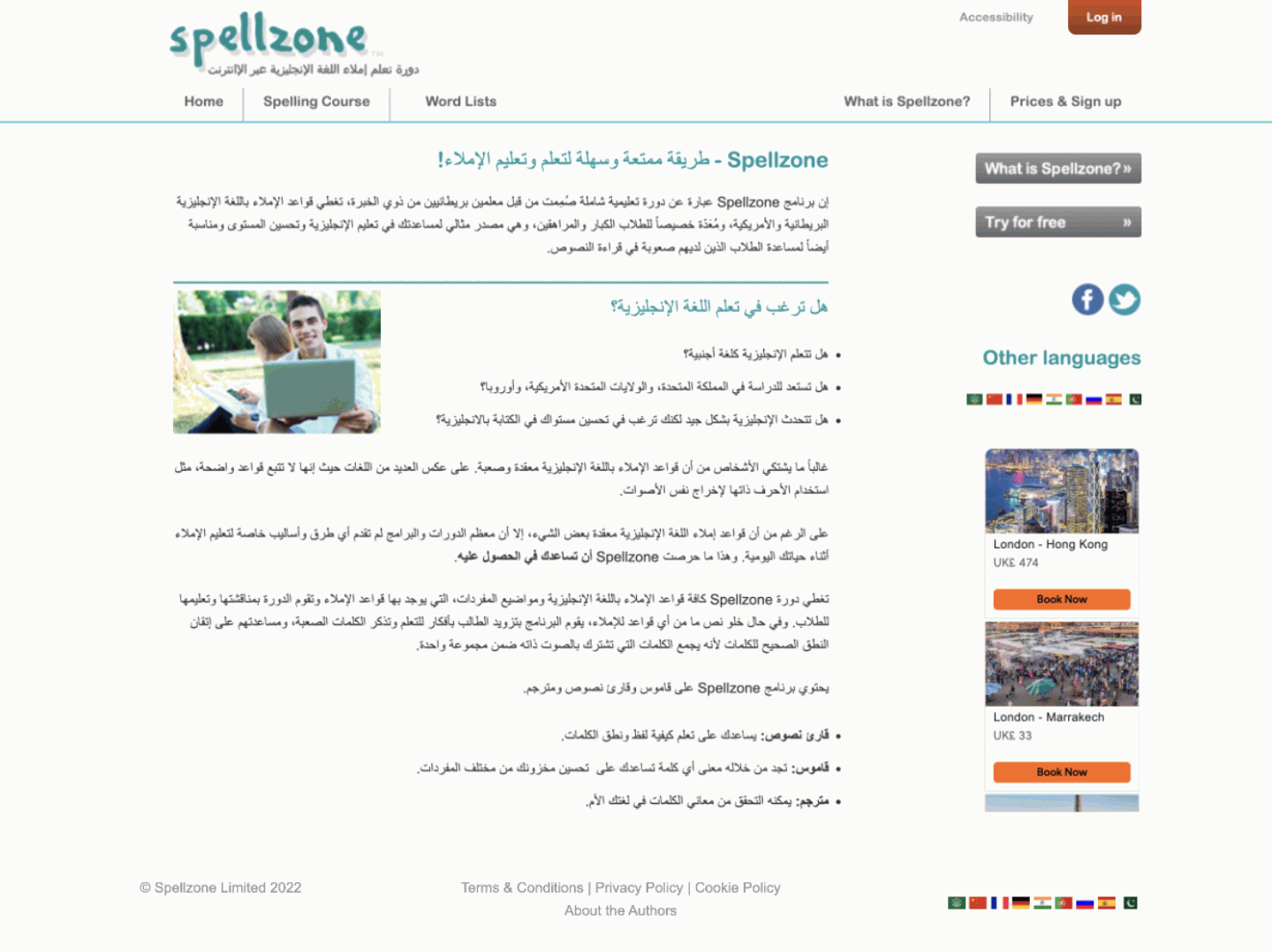
Websites Overview (Language Preferences): The above figure shows the website Spellzone presented in a different language. The website includes 9 other icons of different flags from different countries, identified to allow the user to change the language across the website.
Improvements: I think no improvements are needed for this specific part of the website since it presents itself clearly with no complicity to the user’s vision. A simple and organised layout of the page is well set out making it easy for the user to navigate and access different parts of the website with no difficulties.
Improvements for User Experience: User’s from any country or any language with any background can have no trouble using the Spellzone website since it presents the page in several different languages which sets the user experience at an even higher bar. The website shows detailed descriptions of the website in all languages, which makes it accessible for almost anyone to use, as well as any student adapting to any language, to further learn easier with their chosen language.
Improvements:
Menu:

About the website:
A sequence of images:
Target Audience:

Further Sponsor Links:
Audience’s Reviews:
