Understanding the font’s
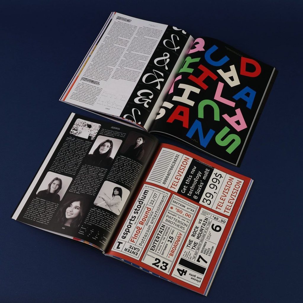
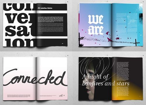
Possible Fonts:
- American Type Writer
- Times New Roman
- Gill Sans, Eric Gill 1930
- Melior, Hermann Zarf 1952
Famous Artists:
- Eric Gill, 1930
- Perpetua, 1928
- Hermann Zarf, 1952
The Design – Understanding Colour
“The Fundamentals of Typography” by Gavin Ambrose/Paul Harris, pages 136 & 137 provide a range of illusions created by the use of colours. They’ve specified 3 colours that are high in CMYK > Cyan, Magenta, Yellow and Black, making them more visible to the white background.
- Red (100% M, 100% Y)
- Green (100% C, 100% Y)
- Blue (100% C, 100% M)
Red and green are Included in the Palestinian Flag which will be used according to my book’s interior design, as well as blue which will be seen with the white for the Israeli flag.
- Black (70% C, 60% M, 70% Y, 40% Black)
Shows that “High aggregate values result in a muddy colour”, meaning high levels in vibrant shades such as Cyan and yellow can collide in a negative way in common shades.
The Design – Font
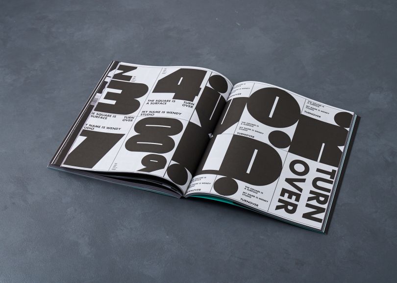
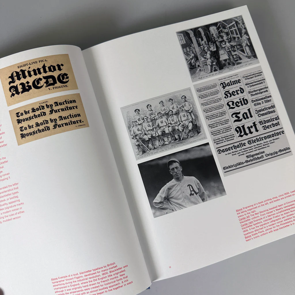
“The fundamentals of Typography” by Gavin Ambrose/Paul Harris, pages 104 & 105 display numerous designs of different styled fonts, from thick to thin, large to big. Given my targets to achieve within my Interior and Exterior designs, I aim to look at old but gently styled fonts to reflect the war-styled photographs that will be included.
My chosen Fonts:
- Gill Sans, by Eric Gill 1930
- Melior, by Hermann Zapf 1952
- Perpetua, by Eric Gill 1930
- American Typewriter, by Joel Kaden 1974
Eric Gill targets every letter’s sharp edges, using a clean curve around every shape to curl its signature design. The sharpened letters can be used as subtitles and main headings in my printed book to give a more professional performance.
As for Hermann Zapf, he also uses Sharp edges to his letters and tends to go for a more italic-styled font, which isn’t particularly one of my design aims. Joel Kaden is also an artist to consider, as he uses a more old, laid back and bubbly styled font, which can be considered to be inputted to my printed book for an Interior design, using the bubble style to expand specific words and letters within pages.
Reference:
Ambrose, G. and Harris, P. (2006) The fundamentals of typography. London: Fairchild Books, An Imprint Of Bloomsbury Publishing.
eng.fontke.com. (n.d.). Melior Com. [online] Available at: https://eng.fontke.com/family/773236/ [Accessed 26 Oct. 2023].
Wikipedia Contributors (2019). Gill Sans. [online] Wikipedia. Available at: https://en.wikipedia.org/wiki/Gill_Sans.
Wikipedia. (2023). Hermann Zapf. [online] Available at: https://en.wikipedia.org/wiki/Hermann_Zapf#List_of_typefaces [Accessed 26 Oct. 2023].
Wikipedia Contributors (2019b). Times New Roman. [online] Wikipedia. Available at: https://en.wikipedia.org/wiki/Times_New_Roman.
Wikipedia. (2020). American Typewriter. [online] Available at: https://en.wikipedia.org/wiki/American_Typewriter.
Image Reference’s:
Femme Type: A new book that celebrates women in the type industry. (2019) Creative Boom. Available online: https://www.creativeboom.com/features/femme-type-a-new-book-that-celebrates-women-in-the-type-industry/ [Accessed 30 Oct. 2023].
Image result for graphic design portfolio book layout | Booklet design, Graphic design portfolio book layout, Brochure design. (n.d.) Pinterest. Available online: https://www.pinterest.co.uk/pin/445293481899267251/ [Accessed 30 Oct. 2023].
Facebook. (n.d.) www.facebook.com. Available online: https://www.facebook.com/femmetype/ [Accessed 30 Oct. 2023].
Featured Titles – Tagged ‘Typography’. (n.d.) Draw Down. Available online: https://draw-down.com/collections/new-titles/typography [Accessed 30 Oct. 2023].
