
Brainstorming and Planning:
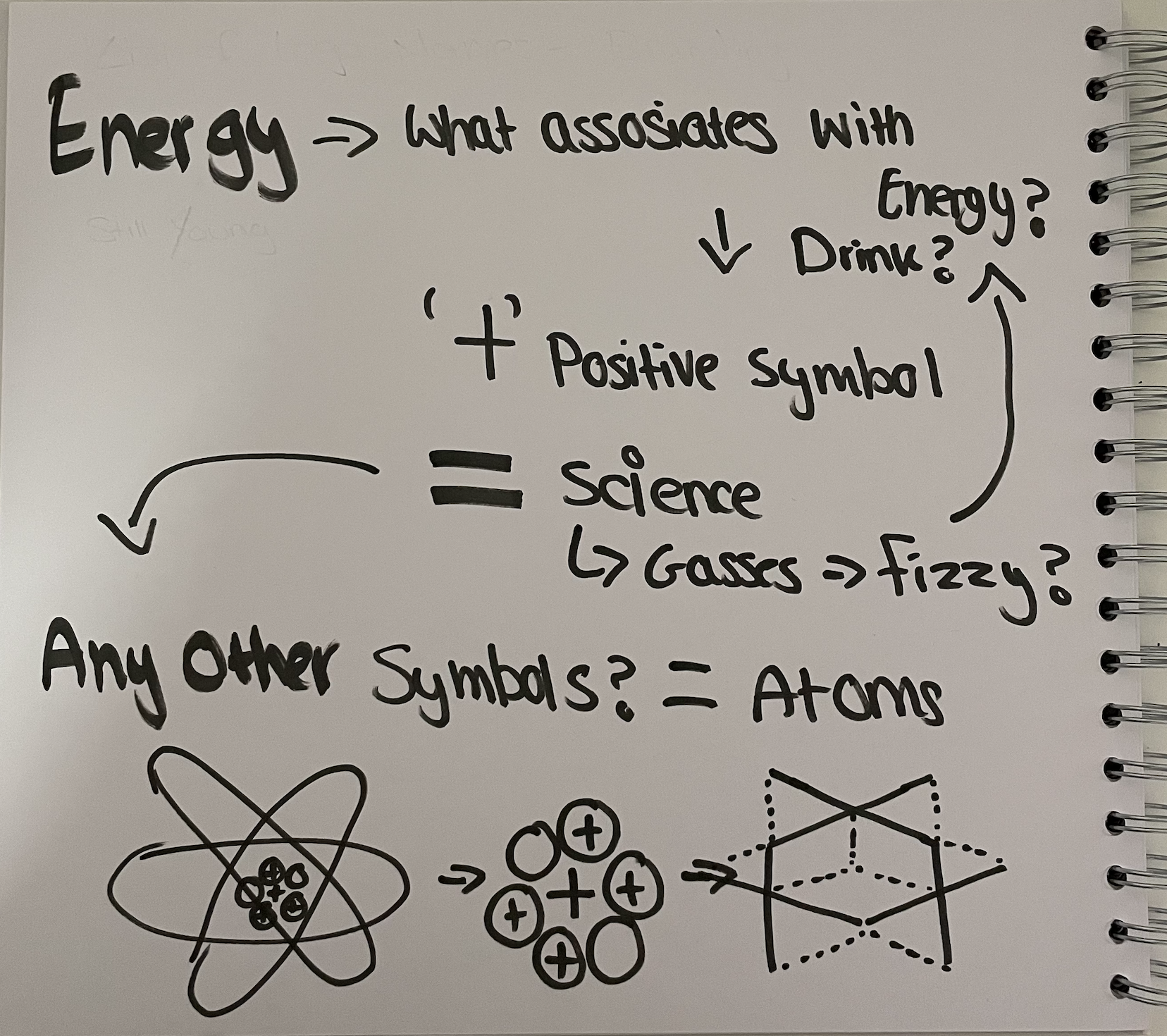
‘PLUS’ originally came from the positive symbol usually found in an atom. As we know in science, we have protons, neutrons and electron charges. Protons have a positive charge which is usually shaped in a bubble, in a form of a bigger bubble beside other charges. The bubble itself is where I also came up with my design idea of bubbles forming as you open a fizzy drink, as energy drinks are usually fizzy, you feel the little particles come up to your mouth as you drink.
The shape of an entire form of the atom is surrounded by multiple shapes that can be re-formed to represent a plus sign, using the bubbles to form the particles as an energy drink is opened, and the plus sign is re-created to a conceptual design, where the plus sign is in-fact in the design, but hidden amongst the dimensional structure.
Name Brainstorming:
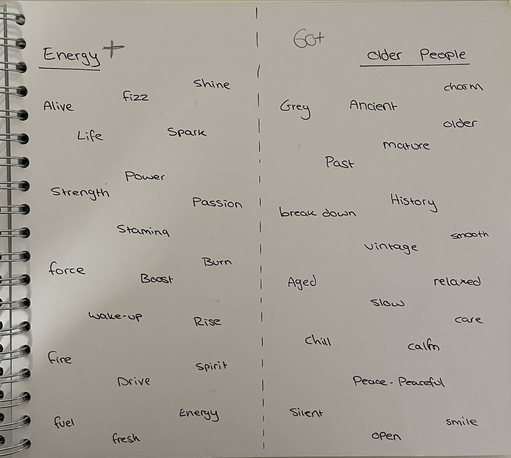
Name brainstorming is an important key step when coming up with a final name for your product. In order to have the full variety in front of me, I split my page into 2 spaces and added the two key phrases “Older People” and “Energy” at the top of each side, and listed down every single word that could be used other than the original. This helped me really mix and match my options and to come up with the final name, which ended up being a mix of the two phrases “PLUS”. Plus for the energy atom as described at the top first, and plus again to represent the older people, older age, “+”.
Logo Planning
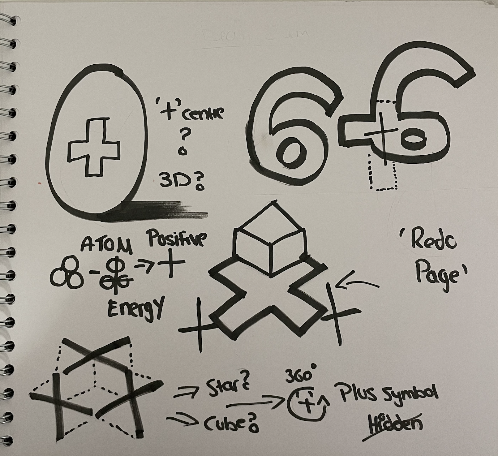
Designing the logo was a lot more difficult than it looked, coming up with a way to add the plus sign in, in a way that would have it visible yet not visible. Designing the dimension of the plus symbol is where I initially started, then gradually started building up other directions and testing out other ways the plus sign could be included. Some ideas didn’t work, for example, the 60, as people may mistake the energy drink for only 60year olds rather than ages above. I then started playing around with the rings that go across the atoms and started to see a small dimensional figure, which I then put to paper and ended up coming up with an atomic symbol that still included my plus symbol, but isn’t so visible.
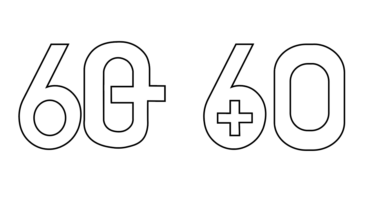
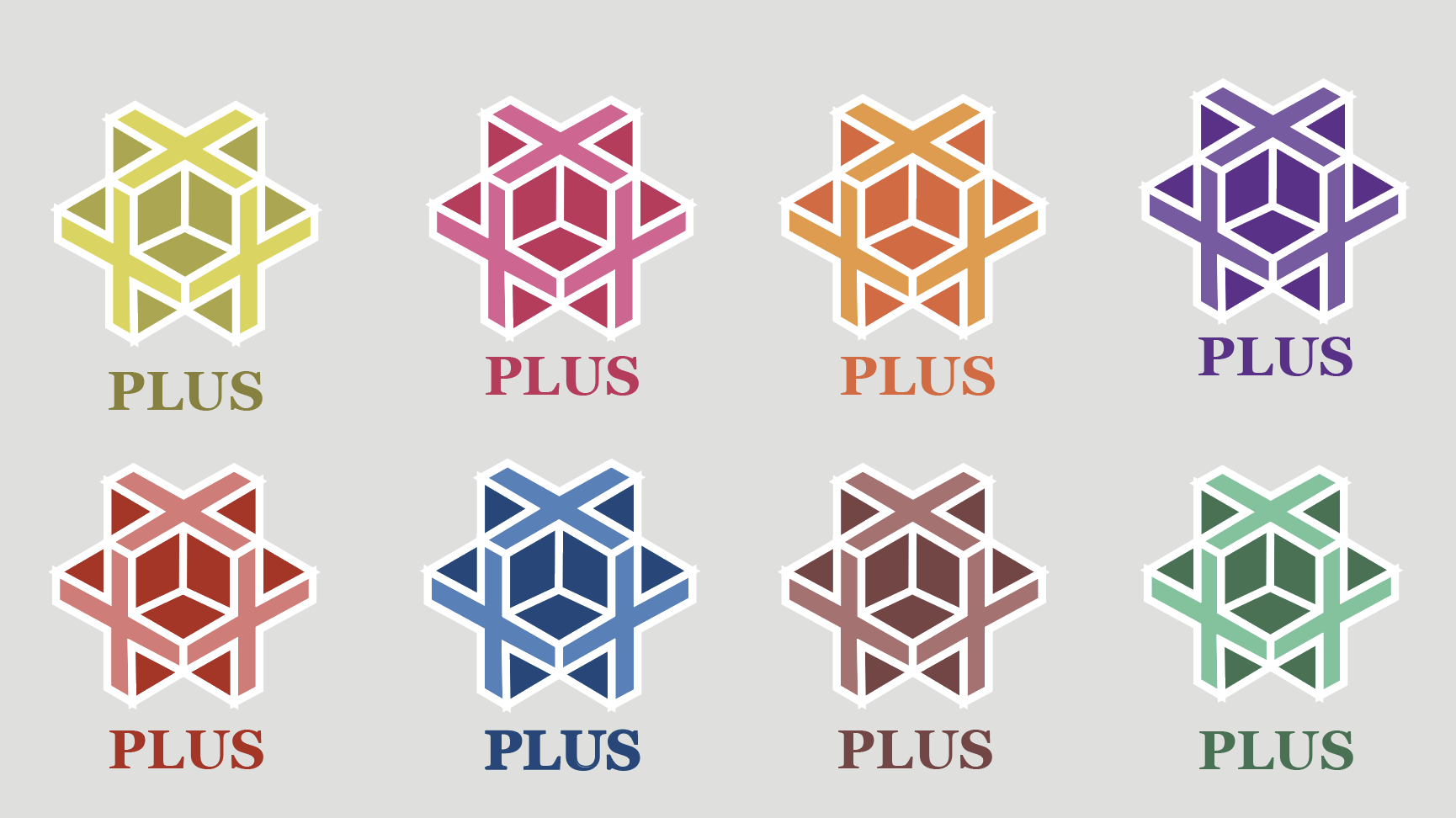
The design idea that was drawn to the left side had failed due to the mixed messages it may give my audience. The design originally came from the target audience being ages above 60, which could come across as people thinking the energy drink is only for ages 60. In case people got the wrong message, I did design the atomic symbol with the plus symbol still included, only then did I have to choose out of the two design ideas. I chose the right logo design as it was my safer and more suitable option, in terms of messages to my target audience, and the design structure itself seemed a lot more ideal for my energy drink.
Reference:
https://letstalkscience.ca/educational-resources/backgrounders/introduction-atom