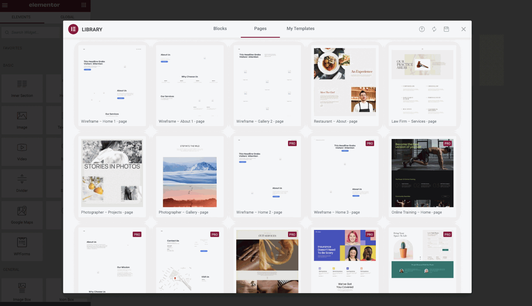
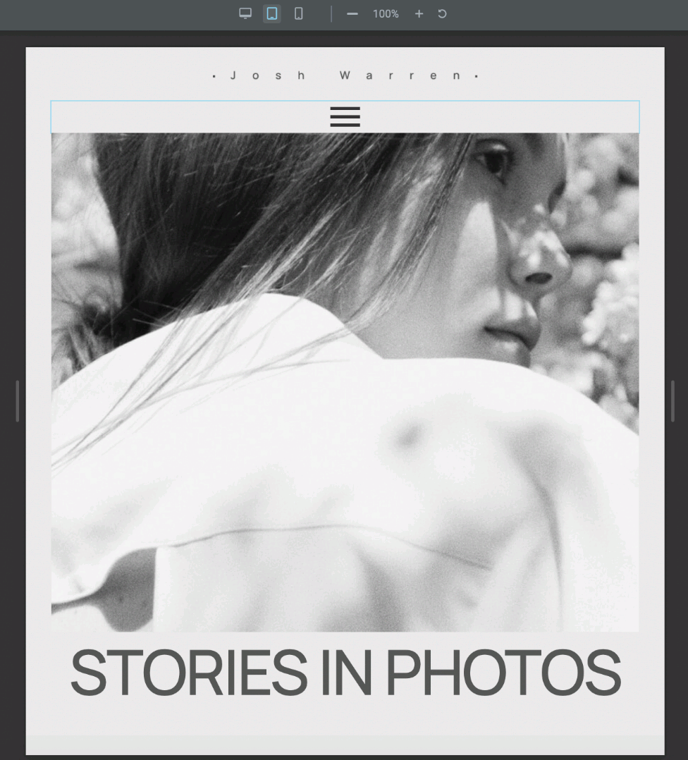
To begin with, I searched within the designs created and began searching for the ‘Photographer’ built-in design.
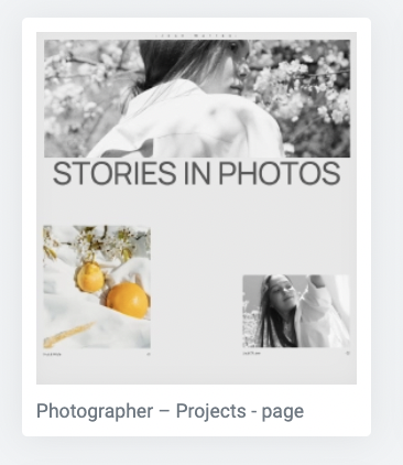
There were two different types of ‘Photographer’ templates, but I selected the project base since it fits more with my scheme.

After loading up the page, I then loaded up the settings bar and went down to find the ‘Responsive Mode’, to begin testing my responsive design across different device screens.
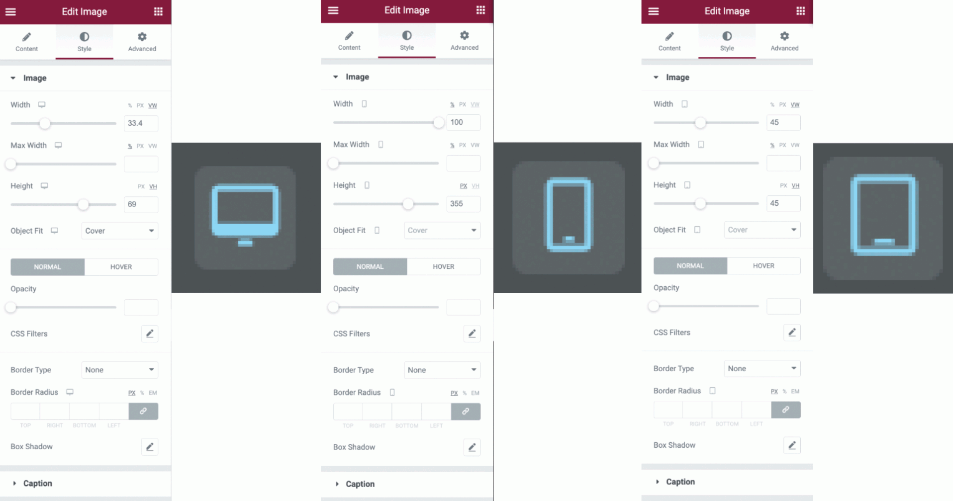
Above are listed several different sizes and screen settings for each category selected and applied to the page. For example, the chosen setting for these sizes is the images, which change across the devices, making them responsive to access not only through desktop but through tablets and mobile.
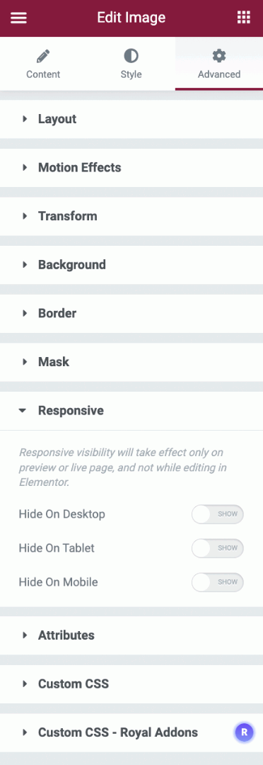
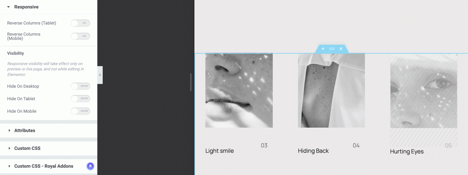
Shown above are several different extended settings depending on your section through design. Here is a selected image that shows whether to respond and appear on all devices, or select to hide on either desktop, mobile or tablet.
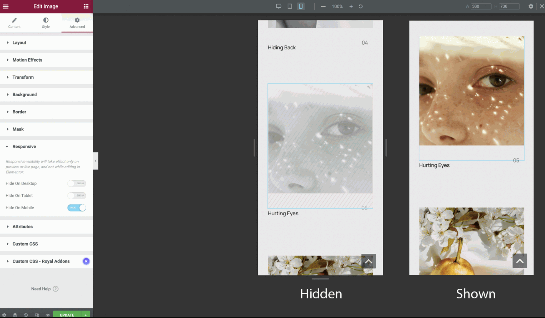
Shown in the figure above are two different tests of the responsive settings. Above where it says ‘Hidden’ is the selected ‘Hide on mobile’ testing, where it will make the image grey and show crossed lines across to show it’s hidden. When visible, colours will stand out and be visible as shown above ‘Shown’.
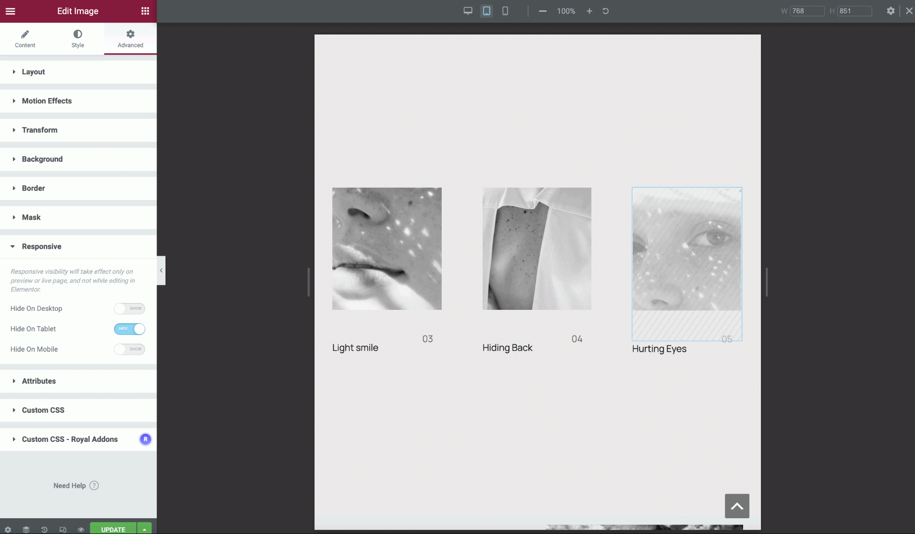
More tests are shown above, however, this time the settings are set through tablet mode.
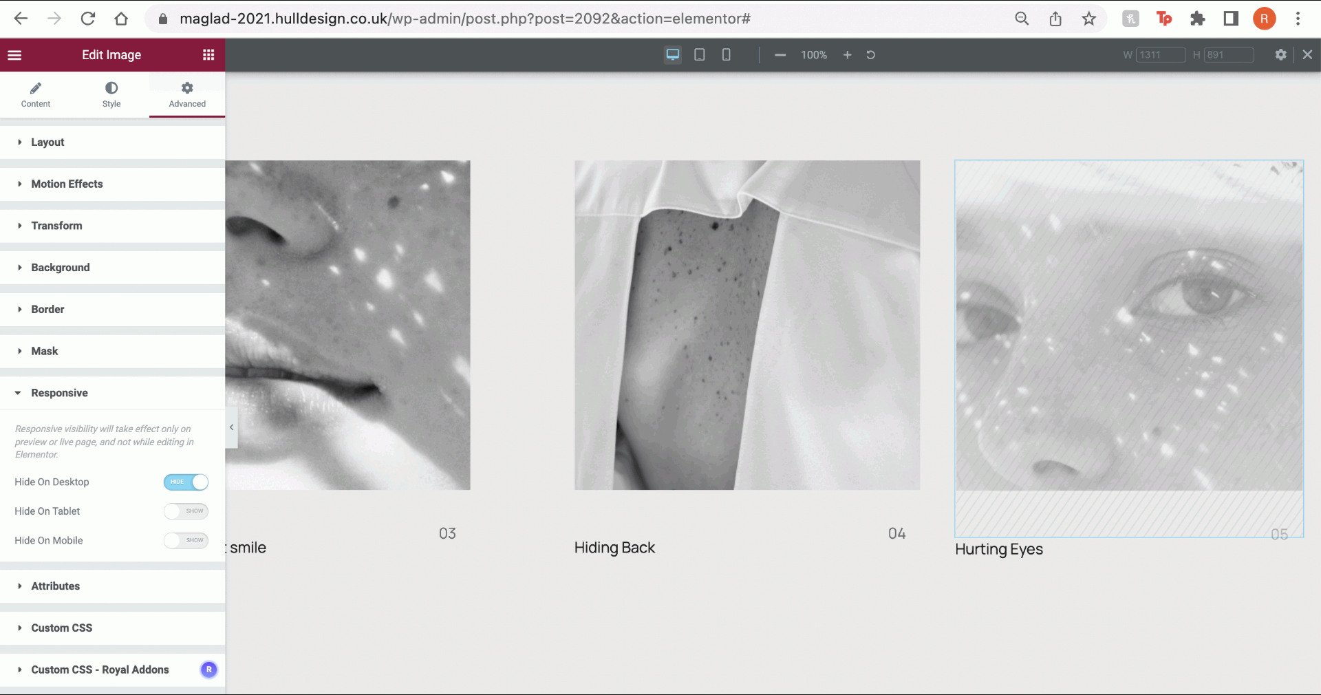
Another test showed above for the same purpose, but through to desktop mode.
In the image above, the settings to your left are selected for the columns that can be seen outlined in blue. The settings are almost the same, however, through to tablet and mobile, it allows you to reverse and change the structure of the column to make it more responsive across the screens when navigating.
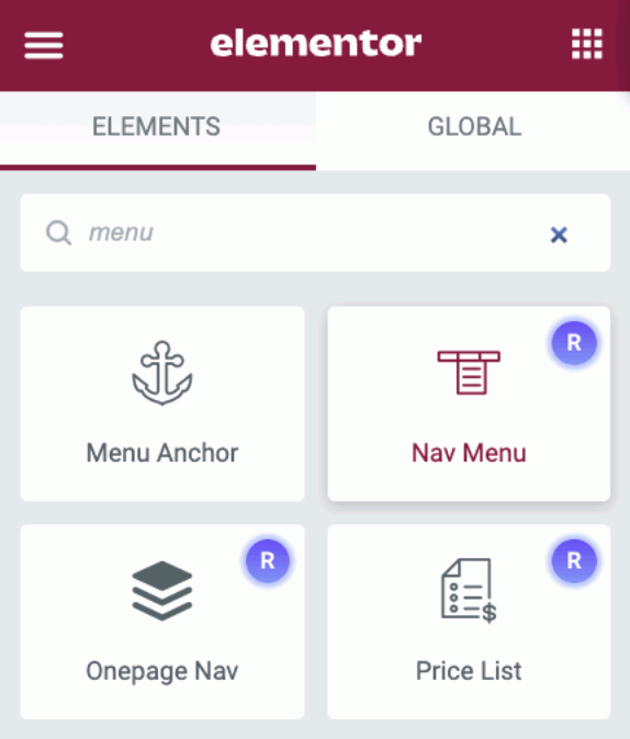
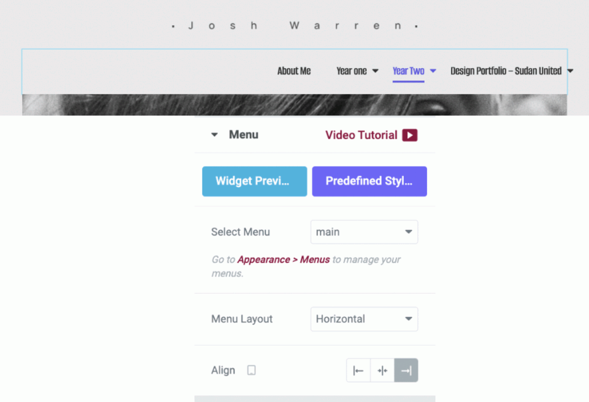
For the next steps, I decided to look further into menus and see how they become fairly responsive across the screens too.
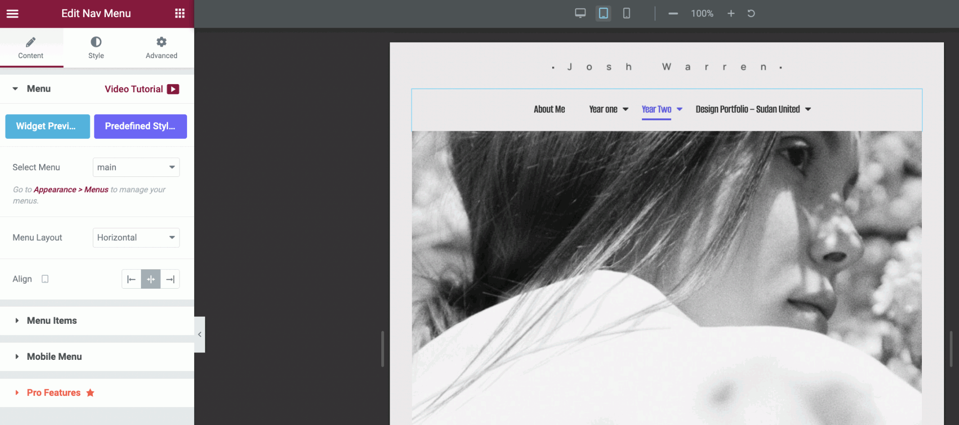
Take the selected ‘Nav menu’ and inputted it to the photographer design page, just under the heading. it fitted perfectly well to the tablet page.
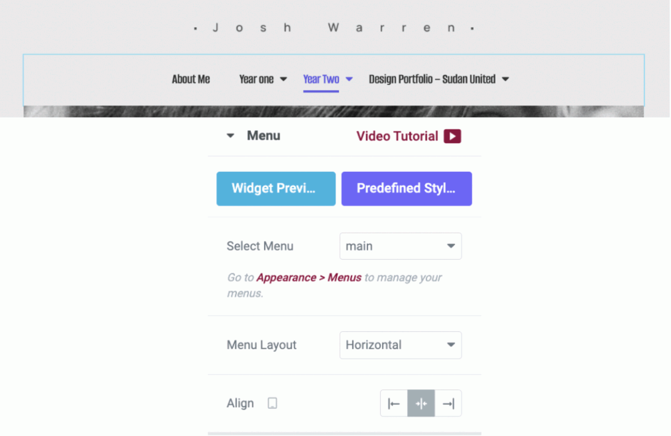
To the left of the page shows more settings that can allow how you want your menu to sit across the pages. For this example, the menu sits at the centre of the tablet page.
The above image demonstrates the menu setting set to the right side of the page, which can be seen as quite uncomfortable. Tested on a tablet screen.
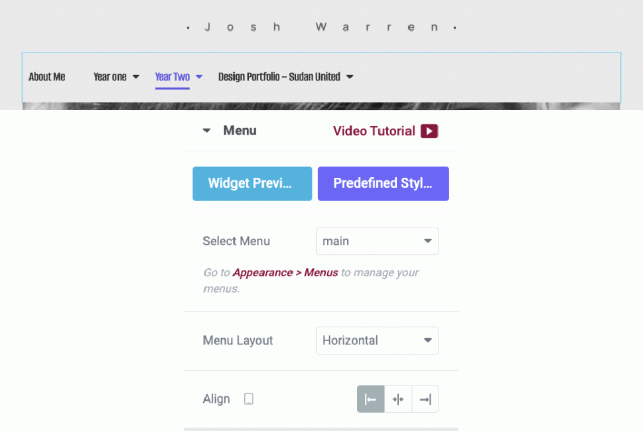
Again, the above image demonstrates the menu setting set to the left side of the page, which doesn’t look too bad, but placing it in the centre looks preferably neat. Tested on a tablet screen.
I then switched to the mobile screen and began testing through to the hamburger design menu. Figure one shows the menu drop-down to the centre of the page, and figure two shows the image with a further drop-down to the centre of the page.

I moved the hamburger menu to the left side for testing.

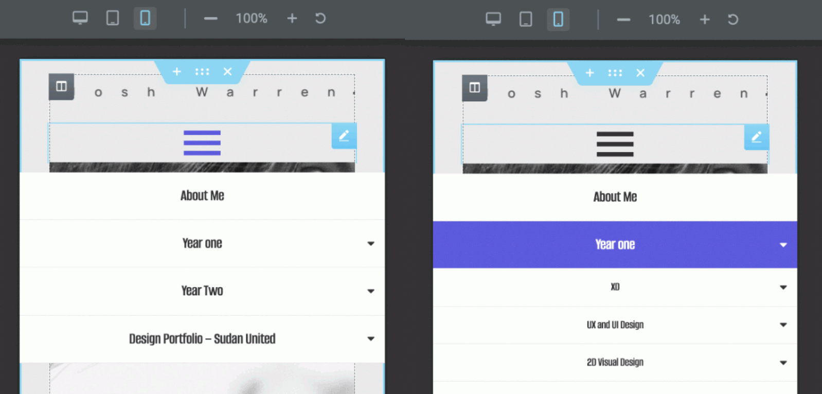
Switching to tablet mode, I take the same hamburger menu and placed it at the centre of the page for further testing.
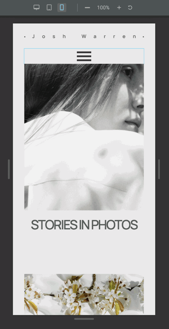
I went back to the mobile screen and placed the hamburger menu at the centre of the page to see and test if it was more responsive rather than being placed to the left.
Finally, I took the same hamburger menu and tested it on the tablet screen, but placed it in the centre to see how responsive it was according to the page.
Low Carbon Energy Website
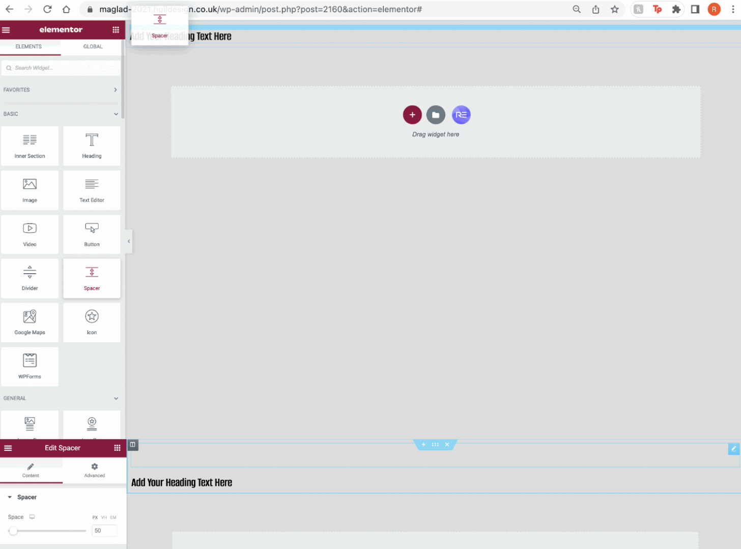
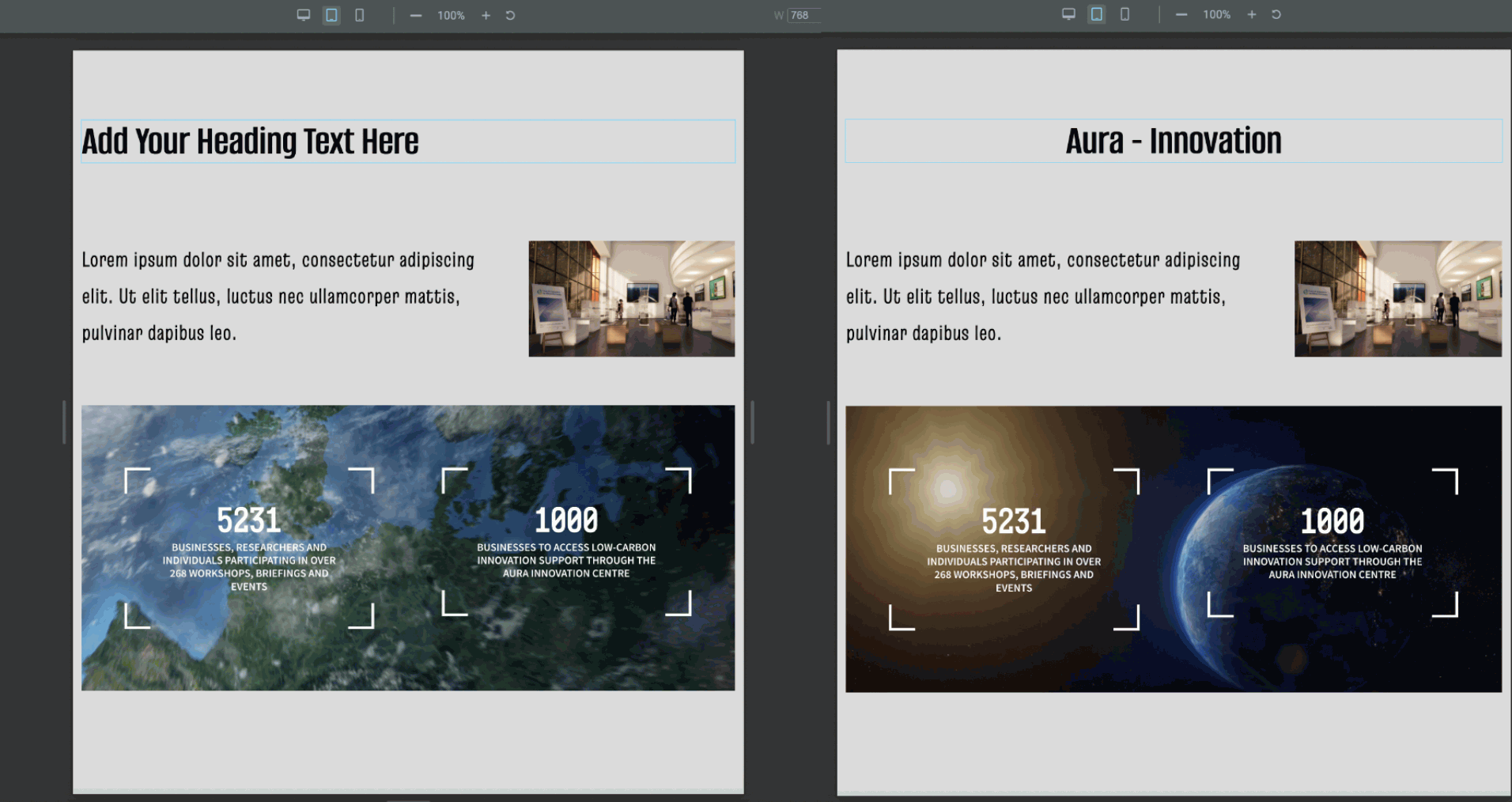
Inspired by Aura’s innovation, I started designing a website carbon-neutral, alongside testing some of the elements provided by widgets. I had added a simple heading at the top but noticed it was too far up. So I used the ‘spacing’ widget to add a small space between the top of the screen and the heading. Further settings to adjust the amount of space between this block can be shown above on the left side of the screen.

I added another section below to the heading and selected the 5th selection on the top row for my next block.
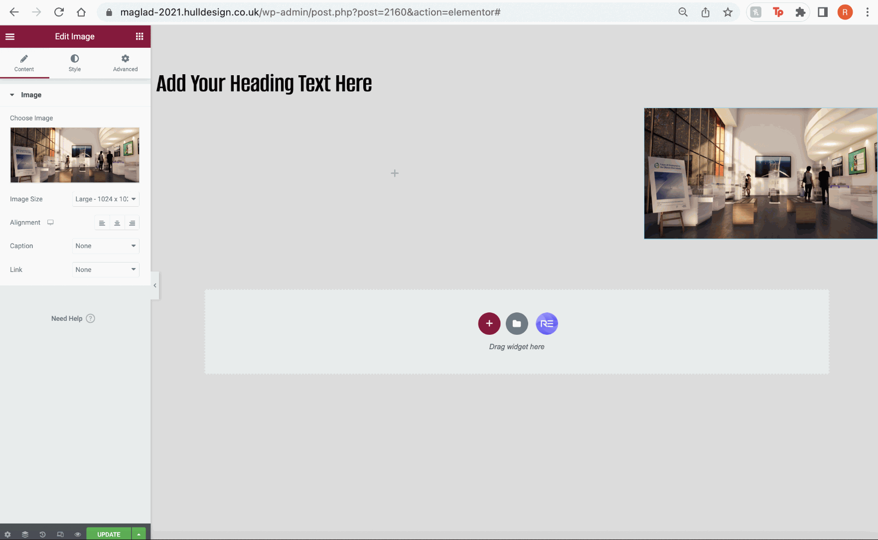
After placing the block, I dragged and added the ‘images’ widget that can be found on the left side of the screen, and added it to the far right side of the screen for further testing.
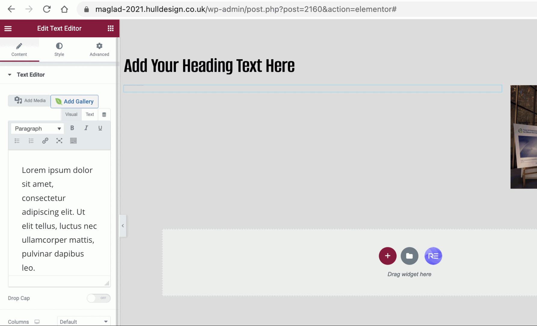
To the left side of the image, I then added the ‘Text’ widget which allowed me to add a paragraph to this block. As shown above, the text is there and typed as shown to the left side of the settings, but isn’t visible on the website’s screen.
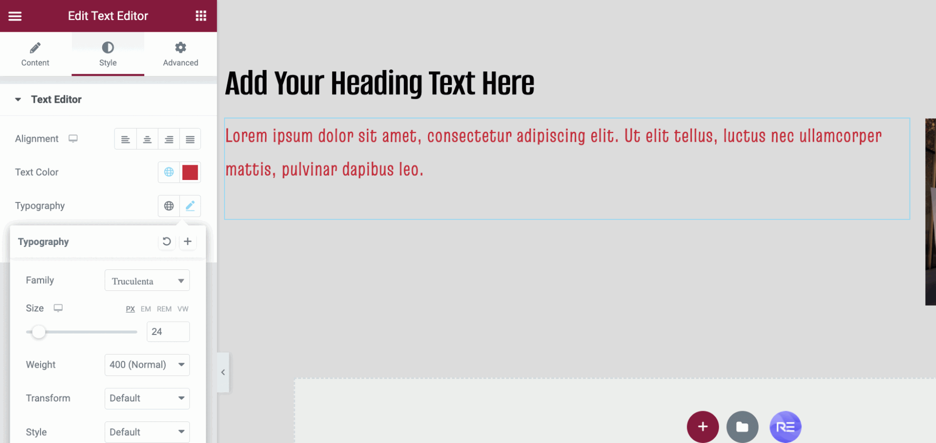
In resolving this issue, I went to ‘style’ settings which can be seen at the top left side of the settings bar and went to ‘Typography’ where I then changed the size, font and colour of my text.
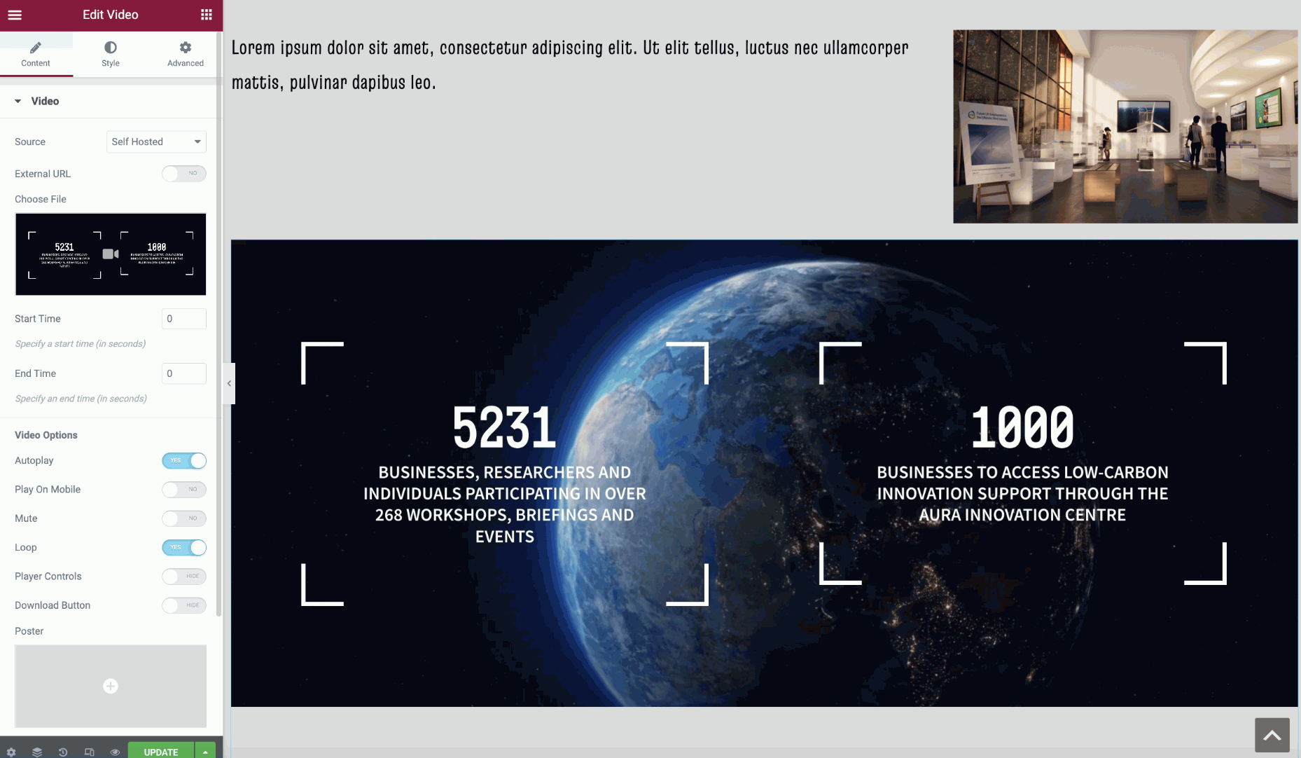
For my next testing, I then added another simple widget titled ‘video’s which allows me to add any video of my choice to my website. I had placed this below my first box with text and images.
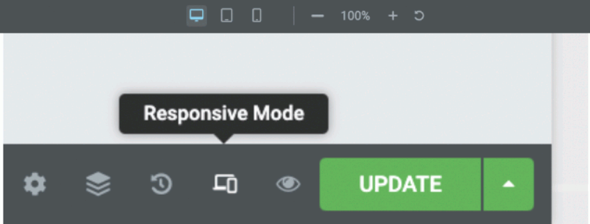
After applying all my widgets to the web page and organising their positions, I switched to ‘Responsive Mode’ to go beyond these further tests in viewing them across different device screens to see how responsive they are.
Desktop
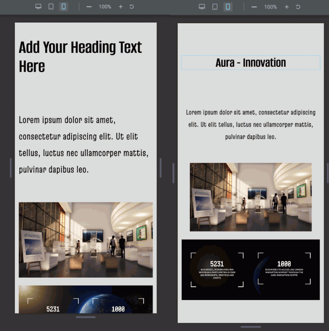
Starting with the desktop, I viewed and analysed every widget that had been added to my page. The heading had no problem sitting at the top centre of my page, along with the text I had added and the image to the side.
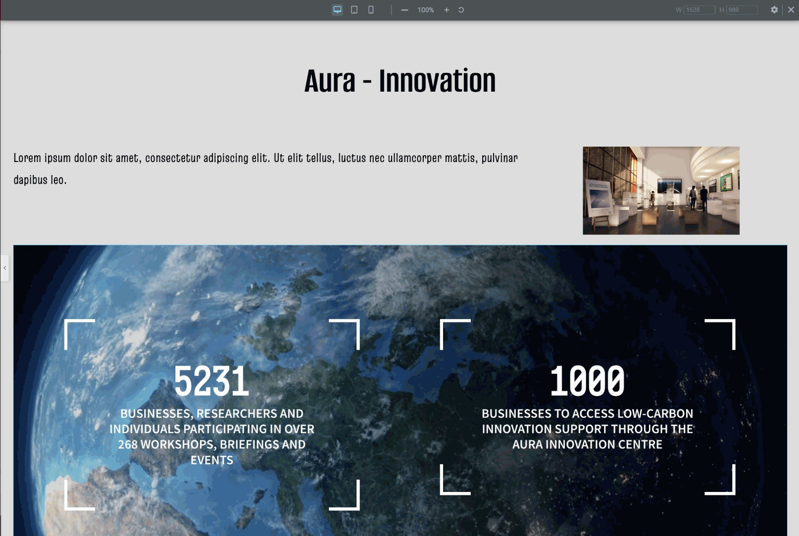
The video also allows settings to self-play which it applied and worked perfectly on the screen when testing. However, the text above that I placed on the first block beside the image on the right may be too small to see through a desktop, which means I may need to change the size to make it visible to the audience.
Tablet
Next, I switched to tablet mode, which automatically changed the size of the screen. As shown in the figures below, my place in widgets has shrunk and changed to adapt to the screen size, making it responsive to tablet mode.
Although everything sits well across the screens, I did notice a change in position to my heading at the top of my screen, which can be seen to the left side of my screen. Going into settings, I made a quick change and added the correct heading at the top and placed it in the centre of the screen. In terms of automatic responses, the tablet mode adapted very well with resizing and positioning to make the tablet mode successful to use.
The video shown above also had no problem playing in tablet mode, making it successful for all the widgets added in highly responsive tablet mode.
Mobile
Finally, the mobile mode was also tested to make sure that all 3 devices were successful in this web design. The heading also needed improvement as it did not change to the title I had added, alongside this, it was a little too big and very in your face, which led me to decrease the size, making it easy for the eye to view.
The text that was positioned to the left side had been changed to the centre which made it look a lot neater in terms of design structure, along with the image that sits just beneath the text widget instead of squished to the right side which would have made it difficult to view. The video widget also played very well and had no malfunctions or trouble, which makes the mobile highly responsive in terms of design and widgets to this page.
Reference:
https://aura-innovation.co.uk/our-impact/infrastructure/
https://maglad-2021.hulldesign.co.uk/responsive/
https://maglad-2021.hulldesign.co.uk/aura-low-carbon-energy/