Presentation
*Recommended to watch full screen*
Boddrinks
Starting fresh, I decided to choose the Boddrinks website as shown below. This website’s structure particularly really caught my eye because of the use of colours across the page. Since the purpose of the website relates to fresh drinks, brightly coloured fruits such as lemon fit well with the packaging of the product.

The website’s layout also keeps a very organised look, through the second image, a simple use of grids can be seen slightly through how the photos have been placed among each other.
In addition to this, the placement of some figured images across the page gives a very appealing and comforting sense to the page when scrolling across, how some images move among the edge of the grid frames that are placed can glide across the page, which is quite satisfying to see.
Mobile Version:
In terms of the Boddrinks website being responsive, the layout and grid structures stay in place and fit well across the mobile screens. The first screenshot shows the home layout, how the images sit at a reasonable and comforting size to the mobile screen size, alongside how the header at the top has no difficulty in how it appears on the screen.

3 lines can be seen on the side which takes me to my middle screenshot of the drop-down menu feature, which is quite an ideal feature given from mobile access, it’s a lot freer to access than it would be if it was crowded together at the top. Relating to the shapes and image spacing, I would say that everything has a lot of plane space around it which makes it a lot more appealing and easy for the eyes to view. The final result for Boddrinks is that it is successfully responsive through mobile and desktop views.
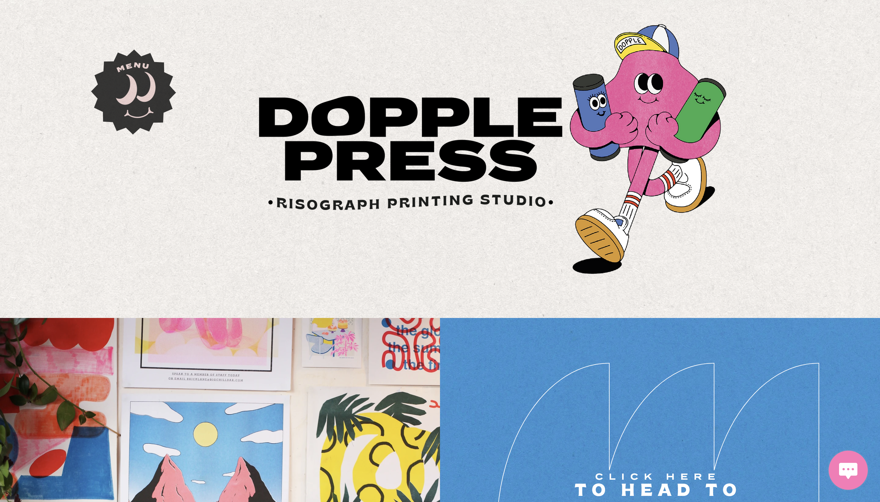
DopplerPress
The website shown below is done for a printing studio. One thing that stood out across this website’s page is the use of graphical designs and bright colour schemes across the page.
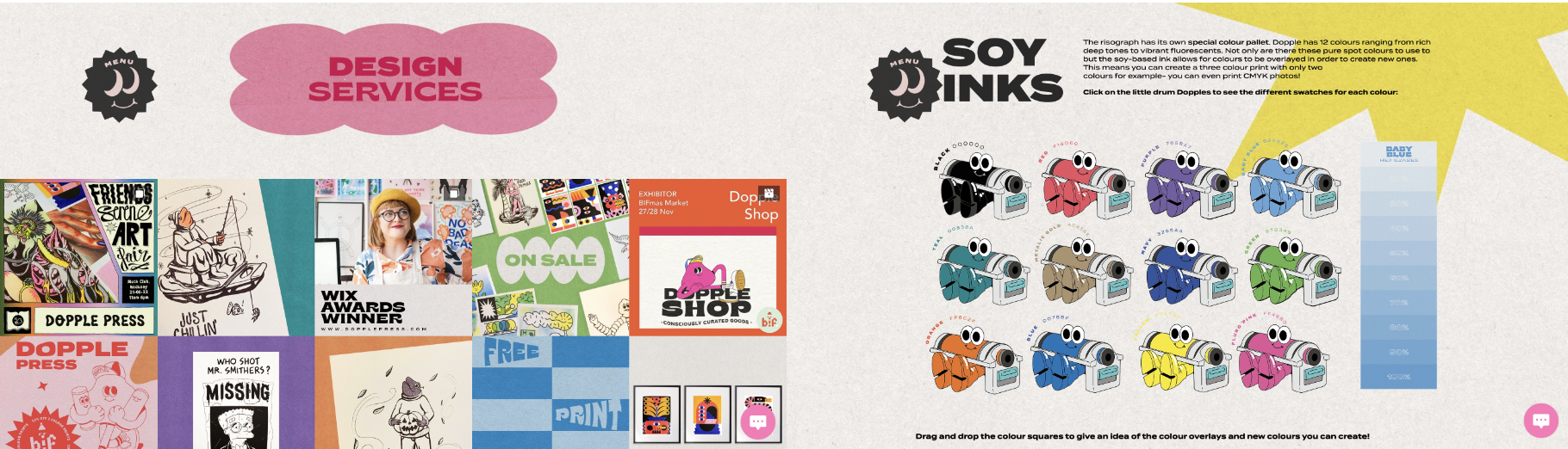
Due to the website being created to promote a printing studio, using a bright colour scheme is ideal in terms of showing the coloured inks that can be seen in the figures above. Besides the inks, colour shadings present a long chart with several different shades of a specific colour used along the side of the page.
Typography is another vital aspect of this website as it demonstrates several different designs that can be used, matching the ‘outgoing’ theme across the page. Graphical content such as the characters/avatars, and objects with facial features come to life through the page, which I think adds a nice effect to the website. Background designs also add a nice touch in regards to ‘printing’, relating to the audience’s perspective, it gives them a relaxing yet ‘friendly’ emotion.
Mobile Version:
Starting with DopplePress’s grid structure, the images sit pretty close together which can come across as quite crowded and a little difficult to see, especially if someone has their brightness up and there’s so much going on all at once, can be pretty harsh at the eyes. Another problem is the drop-down menu, which is a good feature to use for mobile as previously mentioned, however, the background colour used could be changed to a pink or sea blue shade which would be less harsh on the eyes.

Text across the page can be shown positioned to one side of the page, which can make it quite hard to read since the font is already quite small, with the design of the website makes it a little more complex to read. Changing where the images sit along with how the information fits is one improvement I would put to this website. Overall for it to be successfully responsive, I would say unsuccessful.
Ready
Finally, I decided to go with a website design that introduces an online calendar. The website uses a range of different styles across the page, such as shapes and bubbles to produce different sections of information. With ‘DopplerPress’ this website also uses a range of different graphical characters across its page to get its message across
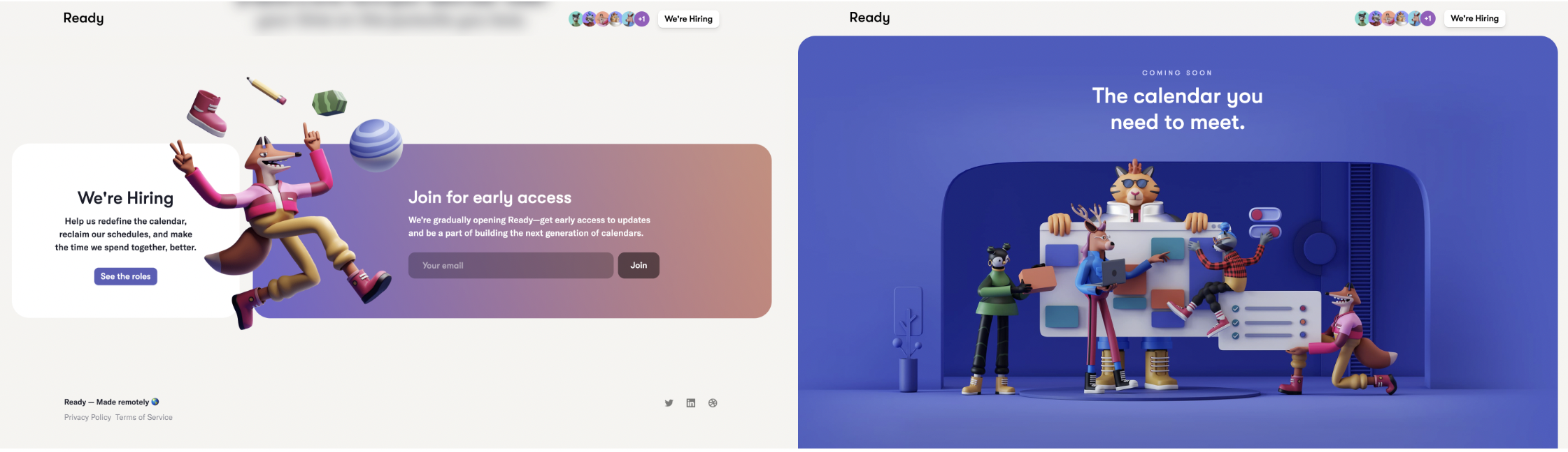
What makes it very appealing is the use of shades within the shapes used across the page. Looking at the top right image, you see a shape in another shape, but among these shapes inside are more squares and circles which have shadings around them, to give a more ‘soft’ design look. Colours are not too bright but are more seen as dark pastel shades which can be looked at as professional rather than messy to the eyes.
Another aspect I found quite a nice touch to this website is the squiggly underlining that appears as you scroll down the website. It continues to expand and grow, along with information that fades in which is another nice animation. These features can be seen as quite comforting to the audience, as well as how smoothly it blends in with the website’s design theme, allowing the messages across the page to be understood and seen visibly quite clearly.
Mobile Version:
Finally, the mobile version of the Ready Calendar website I think was the most pleasing out of the three. Since the website had already used quite a smooth yet professional design scheme across its pages, viewing this design through a mobile screen was very easy to scroll and see. Scrolling across the page made it quite easy, the same animations that you would see on a desktop were identified through the mobile version.
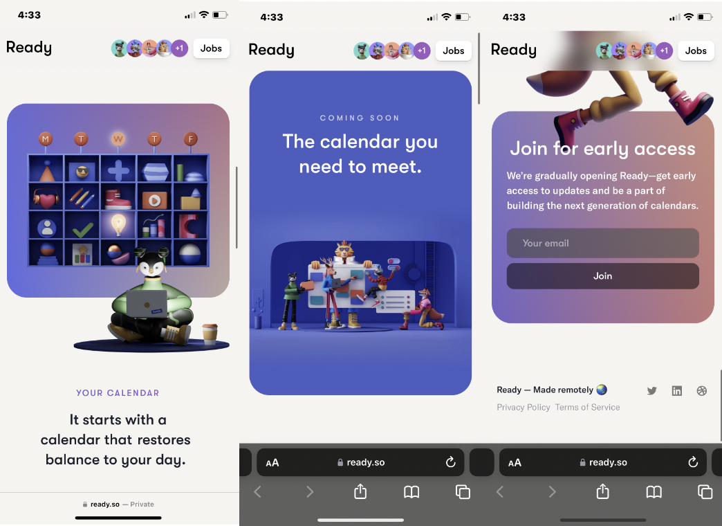
In addition to the images, text that followed across the website has also appeared on the mobile version. Placed easily and non-complex to the eyes makes it easy with a black font on a white background makes it is easy to read and view. Above the page is the logo which sits in the top left corner, along with a button to the right, attached with a link that allows their audience to access and apply for jobs in their business.