
For the birdhouse task, we were directed to create something freely to our interest that best fits the description of a “birdhouse”, not a real birdhouse. Creating something that can be promoted, shared and used with a birdhouse, not only does it need to stand out, it needs to bring in an audience. Due to a medical issue I’ve been experiencing, I was told to stay home and complete tasks online.
The Concept
Sketches
During the design progress, I decided to draw and plan out a couple of design ideas I had in mind for this project. Creating a number of different design ideas and concepts that could meet this approach, and which would turn out the best.

Design Concept
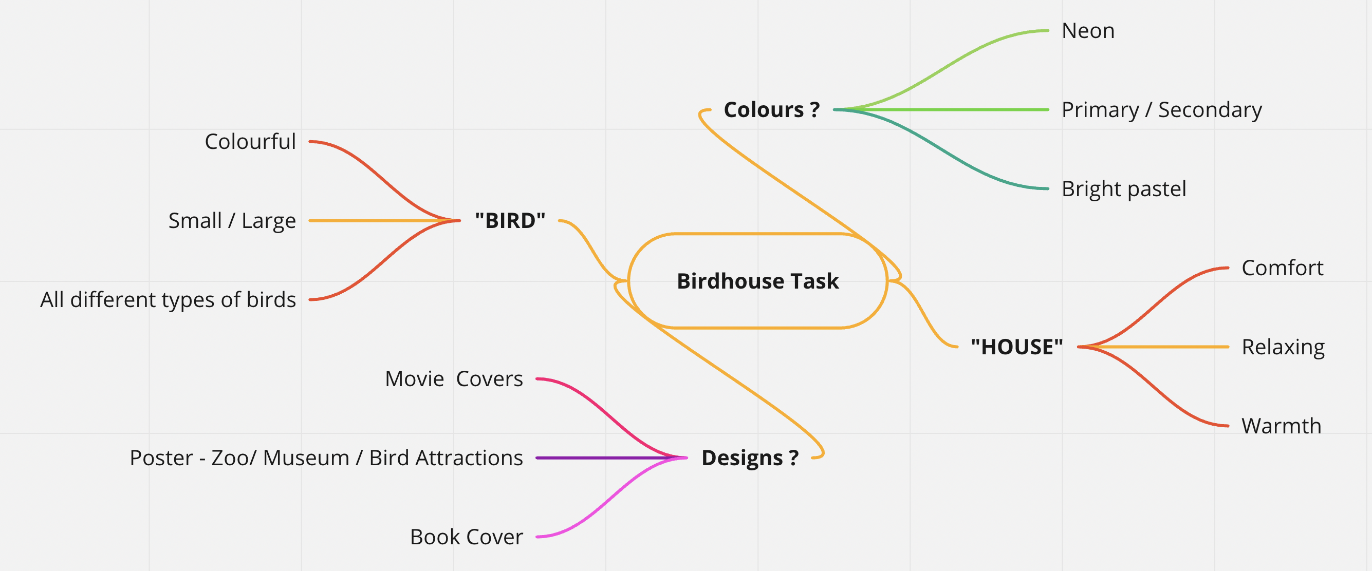
Creating the mind map to present and approach the birdhouse task, and how I got to my final design. I had gone ahead and first broke down the word “Birdhouse”. Starting off with the phrase “Bird”, I went ahead and described what I imagine and see in a bird. Many of them come colourful, birds can be viewed in all sizes starting from very small such as chicks, or you can see some very large birds such as Flamingos. Birds can also come in many different styles and shapes, some with extra fur in different areas of their bodies, some with large or small beaks, and some with different designed patterns to their fur.
I then moved on to the phrase “House” and what I imagine when someone mentions a house. Houses are known as people’s safe places, making them feel safe and relaxed. It’s a place that brings warmth from the outside, and there’s nothing more than feeling comfortable, referring to the slogan “There’s no place like home” by Judy Garland from “The Wizard of OZ”, released in 1939.
Furthermore, I then expanded on my choice of colours, what colours were possible to be used, and what colours best relate to a bird. Birds are often bright colours, some can come in natural colours, some in plain colours, and some simple designs that clash with one another. Mentioning neon for the brightly coloured birds, primary / secondary colours for the casual and known colours you’d find on a bird with patterns, and very rare birds that show shades of pastel on them.
The Final Design

My final design piece aims to be a very ‘mysterious’ but calming look for a book cover. I had chosen the faded sunset colours to the back of the bird to show that birds are outdoor animals. At any time of your day birds can be found outside, but they have their home. I added the two black triangles at the top of the cover to represent that ‘house’ looks just above the bird, colliding with the sunset I feel as though this brings in a very relaxing emotion towards this design which was one of my targets for making this design. Applying the moon above the bird which gives off the shadow just below the bird is what gives off that ‘mysterious’ feeling on this cover, as much as I wanted to make it relaxing, I still wanted to apply that slight ‘edgy’ feeling to the design piece.
I used the font “Academy Engraved LET Plain:1.0” to keep that mysterious look through the typography of the cover. Allowing the sharp edge to each letter of the font is what attracted me the most to this font, alongside the subtle form of ancient bubble writing that goes along with the design of the font looks nice with the black around the cover.
Achievement
Due to my circumstances, I was medically unwell and authorised by a doctor to stay home and work. Because of these instructions, I was not able to achieve this task as a group. However, working through the project gave me a better insight into how it would have been a lot easier to get other people’s say and ideas involved during the journey of this product.
As for my future improvement, I will have to say that when I am medically fit to work face-to-face with my classmates, I plan to achieve the ‘group’ work criteria for future tasks.
References:
Bird: https://svgsilh.com/image/48025.html
Mind-map: https://miro.com/app/board/uXjVPO8Bq4U=/?share_link_id=747285969370