Presentation
*Recommended to watch in full screen*
Last Heavy
No matter how messy or awkward a website may be designed, there’s always some sort of purpose behind it. Last heavy was a website I had chosen because of its style and how it uses several unusual transitions and effects across its page.

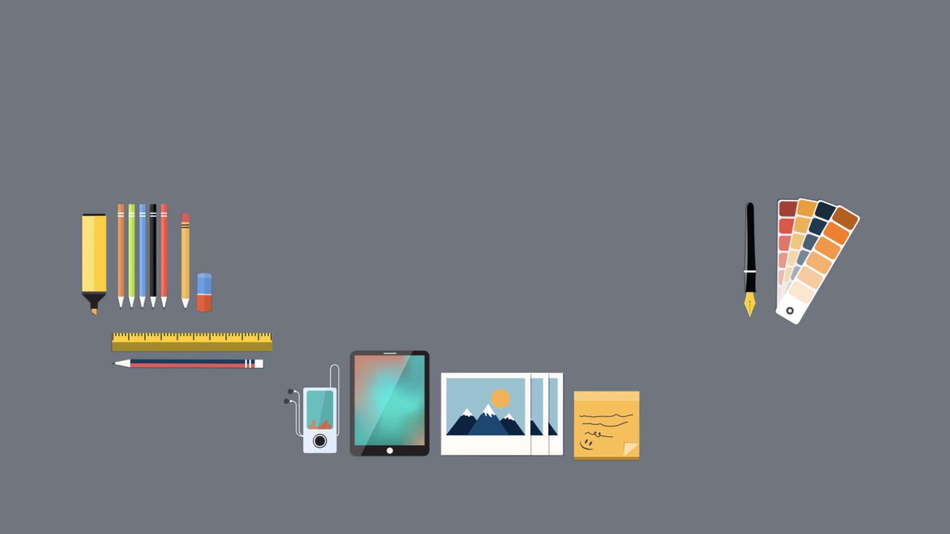
The website uses several different hover animations across the entire page, hovering over the screen’s background allows the page squares to flip over. This takes me to my next point on how the background uses a large grid to organise its squares, almost like a messy jigsaw puzzle, but across the whole page uses a very minimum amount of text, almost like the website only sells its items through images instead of text to present its products.

Upside down, large and small, with styles that are used on this website. It uses a lot of different types of typography to really stand out from one another. Scrolling along the page, the colour of the font becomes invisible when the background changes colour to that font colour, which can be quite a frustrating feature if that information is not read or understood quickly enough by the audience.
However, scrolling along the page shows the text that uses quite an old ancient font, which tells its story and explains more about its products. In terms of the website being responsive, I would have to say that there is room for improvement when wanting to get the correct message to your audience. Having a crowded website and not making it clear to your audience what the website is actually for can make it quite difficult to reach the website’s goal.
Mobile Version:

Given how the design of the desktop is quite busy as it is, viewing it through a mobile screen is a lot more simple in terms of interactivity. Images are quite large on the mobile screen and due to the existing busy background this website already has, adding in those large image products with a plain white background gives a little more of a simplicity to the website in contrast with the black and white design.
When relating back to the motion across the page, animations through the background of the website that’s visible to the desktop are also visible to the mobile version, which shows a consistent design across all devices. Reading text although is quite hard on the eyes since some of the text is written in a very small and thin font, which can be quite difficult to analyse.
Life From Earth
The second chosen website I’ve decided to go with also sells its products. It uses an organised grid to keep in place the images of the products available. the grids are organised into columns of 3’s both along and across the page. In addition to this, text and images have also been used which makes this website much more responsive in terms of selling and getting the right source across to its audience.

The video below shows a small interactive activity on how the page uses its transformations to get across and around the pages. Scrolling down to the page takes you back to the original page which in some aspects can be a good thing, but difficult if you’re wanting to return back up to the product.
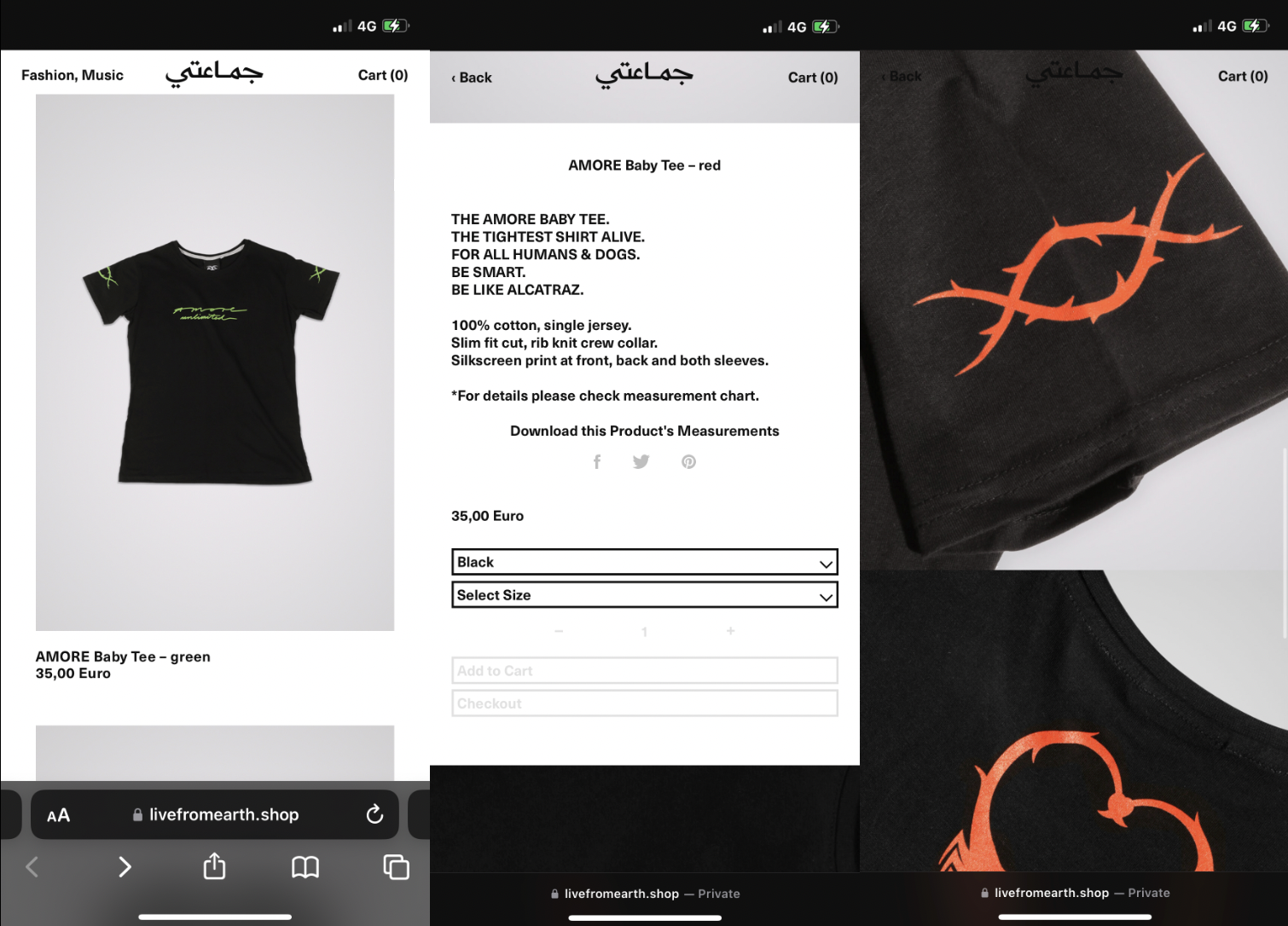
Another good point to add about this website is the hover-over feature it includes when wanting to select a product. The original colour of the product’s text can be visually seen as black, when the mouse hovers over it turns grey, but does not change colour when it’s been selected and returned too.
Mobile Version:
As shown from the desktop, again, the same design and house style can also be seen through the mobile version. Products in terms of layouts are the same, however, due to the mobile’s screen size, there is a change in the grid format. The photos can now be seen as one column and multiple products above another, which is quite a professional look when wanting to browse. Every product has its individual page that’s also shown above, the same layout with the images of the product shown below can also be seen through the mobile.
Navigating the website is quite simple and easy. Live from Earth has quite a simple colour scheme across the pages, where only colours that are brought to the page are reflected from the products. This means if there are products that consist of only black and white through the pages, colours would then clash together and the website would only evolve around 2/3 of colours.
Yanis
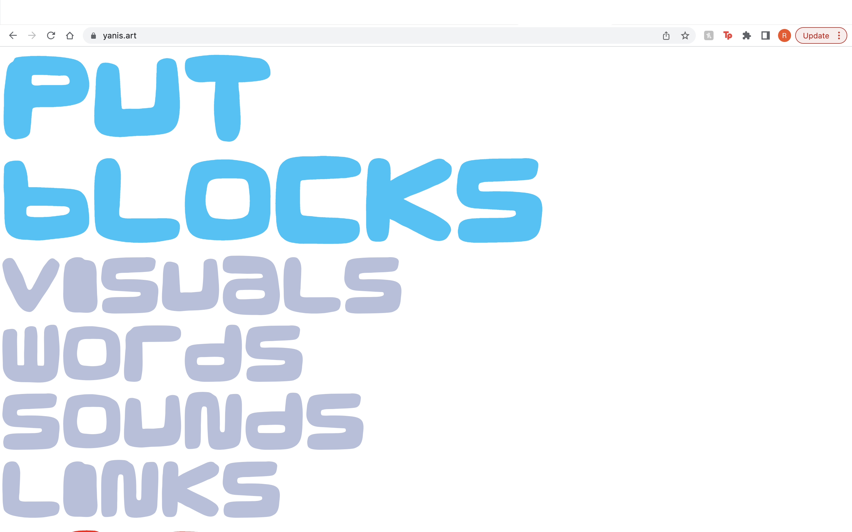
For my final website choice, I decided to go with Yani’s website, which speaks about an open page for you to simply express yourself in any way you wish. The website uses a number of responsive features such as a simple carousel which shows examples of people’s posts and their choice in expressing details about themselves.
Many images have been used to show visual expressions, as well as captioned texts to relate to these examples that help go into further detail. The texts use numerous types of fonts and sizes, styles and shapes which each fit well in its own way. Every example shown across this page tells a story of its own, a story which relates to every individual shown in these images.

Another hover-over feature is shown at the bottom of the page, where you can see the colours change over the bubble text, which you can click to that take you to another page. The colours used across this website can be seen as quite vibrant and ‘in your face, but because the purpose of this website is related to ‘expression’ and ’emotion’, in some aspects it comes across as a fun and energetic web page.
Mobile Version:
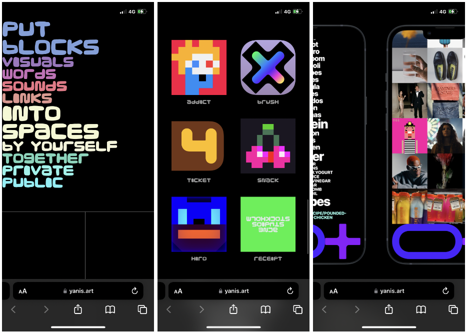
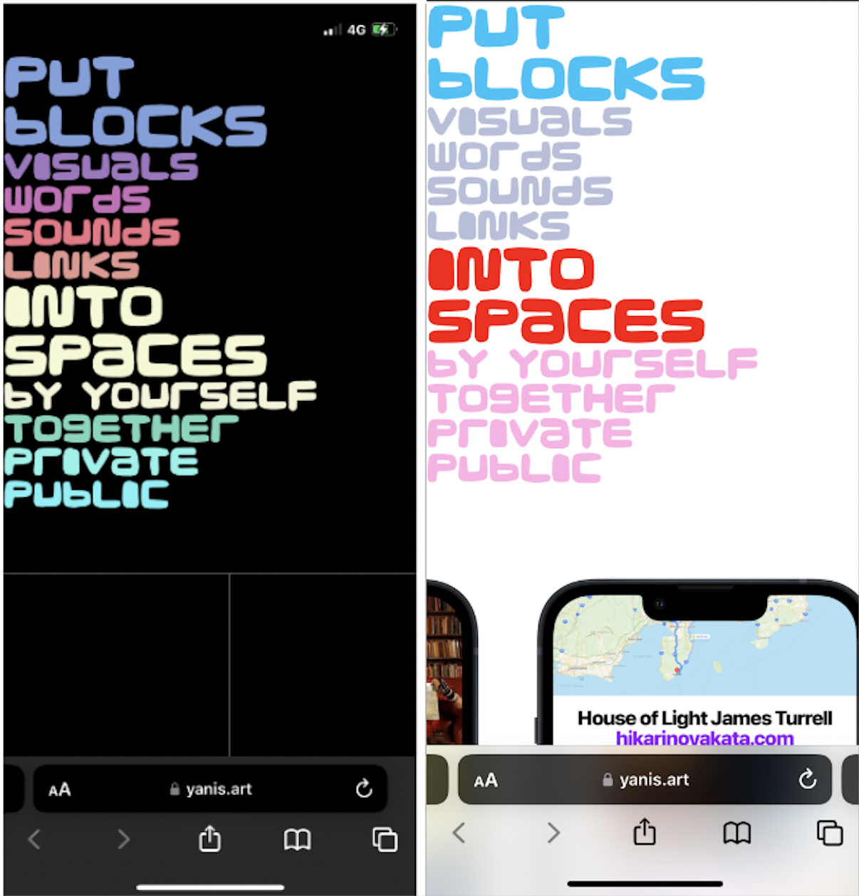
The mobile design for this website is accessible with the dark and light mode feature that can be accessed through the phone’s setting, which is quite good when wanting to make the audience quite comfortable. However, this feature only works at the top of the screen that’s shown in the figure above, as the rest of the website stays dark.
Motion and movement are quite easy when getting around the website, making it easier to flow and view different pages that can be identified when your finger hover’s over some of the text provided or even the images placed. Each image represents an app that can be installed when clicked on, and the links provided can take you to additional pages depending on the audience’s needs.
The carousel is included in the mobile version, proving a consistent design across all devices making it quite a successful webpage.