
Images below consist of real-life objects that use different grid designs to present the way these objects are formed, along with different designed frames to also present these objects:
Photo Frame
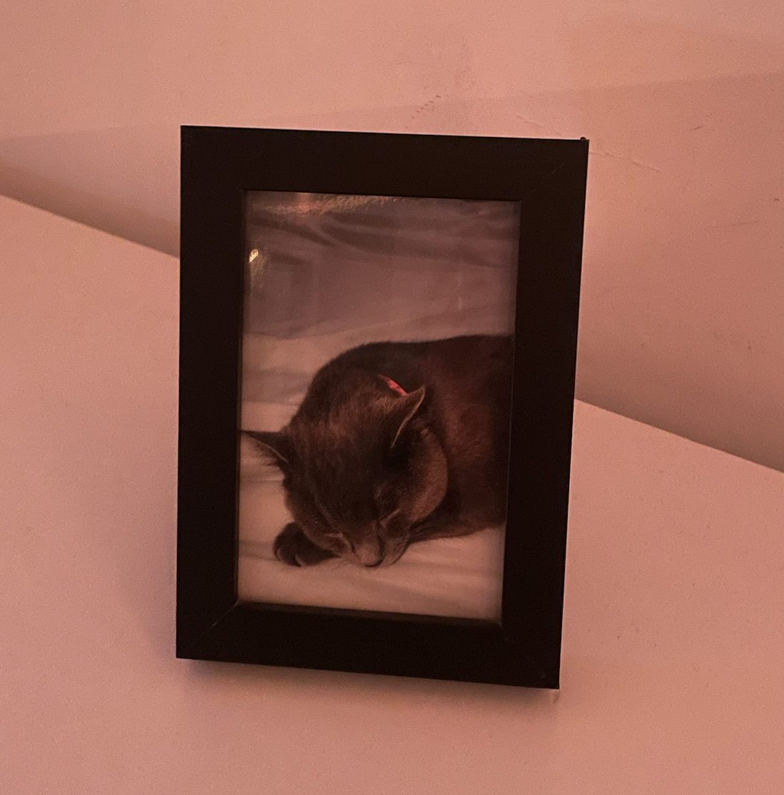

I had chosen this image because of the frame the photograph sits in. The frame is simply designed so the image can be seen as a whole and fit to scale. There’s a lot of untouched space around the frame due to how thick it actually is but naturally blends in with the aesthetic of the photo itself. The grid used in this specific image does not help organise anything but instead keeps the object in place, if it were to be more than one photo in a large frame, that would be considered as the grid keeping the objects organised. Given the product itself, because it was created to keep and store memories, it does bring an emotional connection to a person which is another reason why I chose this image.
Book | Grid systems – by: Josef Muller-Brockmann

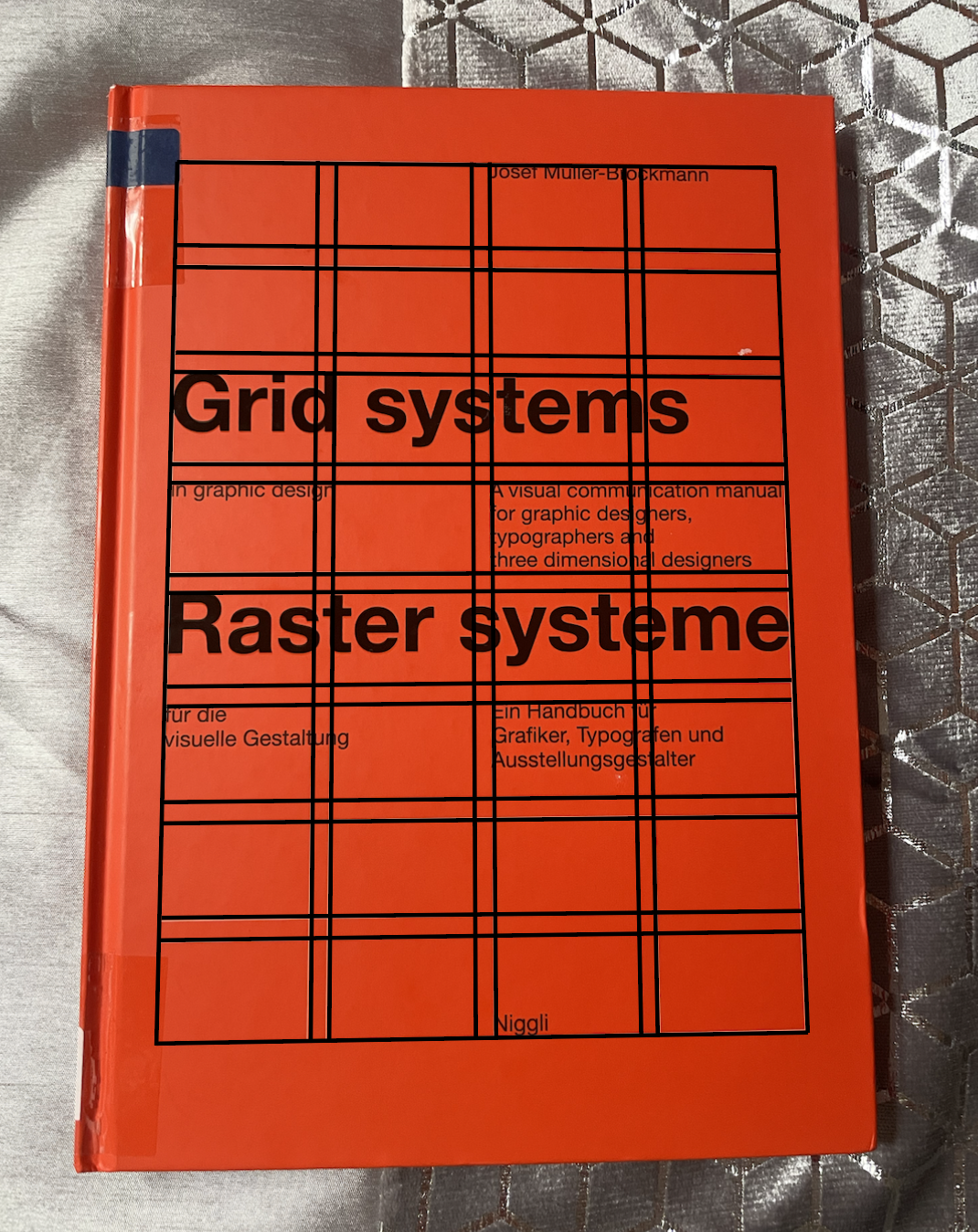
I was drawn to this product mainly because of the brightly coloured cover, but also the natural lightly drawn lines across the page. They clearly show and stand out the grid design on the cover with the title of the book across the lines. Because the book is targeted to graphics and graphic designers, the lines across the cover with the title crossed over do fit in with the “graphics” design look, which altogether fits its aesthetic to graphic designers. This grid design does not organise the cover’s design or layout spacing, it only relates more to the aesthetic than it does organising it.
Clock
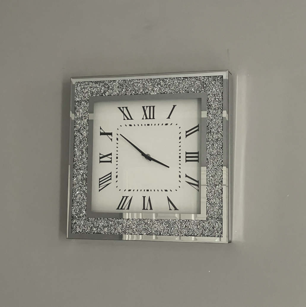

This clock image uses the same shape multiple times, the frame itself is shaped as a square and I was mainly drawn to it because of how the squares are formed within one another. The frame starts with one large square into a medium-sized square, then finishes with a smaller version of the square and every part of the square includes an aspect of the clock itself. It is styled very elegantly and simply, but that’s what makes it more attractive.
Door


The door is a lot more simple and shows its grid design a little more clearly than most of the other examples do. Mainly because the shapes in the centre of the door that stick out a little bit made the rest of the door’s grid shape more obvious. Since there’s no design and no colour to this door, I would say there is no aesthetic to it. however, if it was another designed door that was possibly taken from an older building or another designed house, you would possibly find more of an aesthetic there than you would with a bedroom door.
A page from > 100 Design principles for using grids
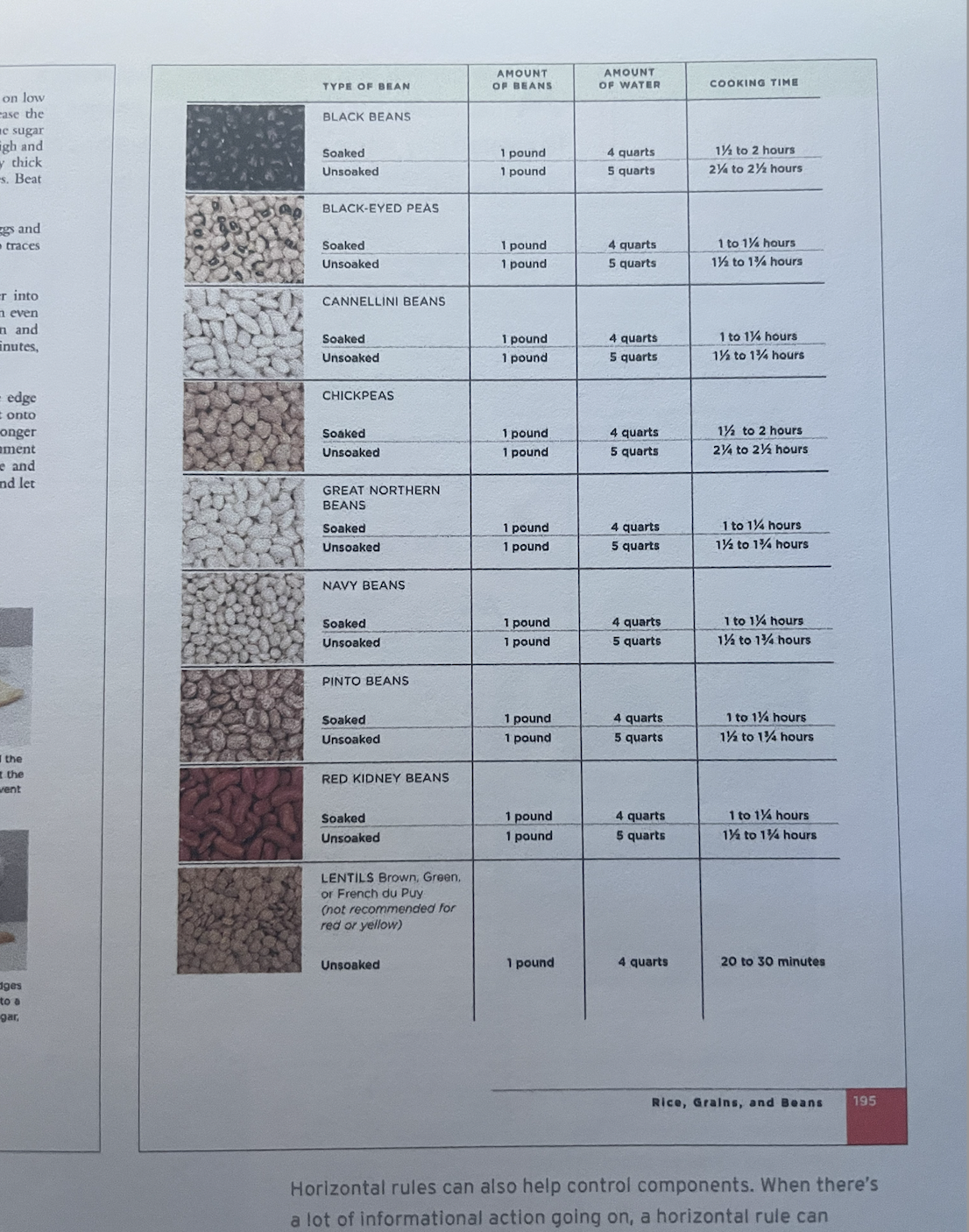

The layout essentials book includes many design grids and grid designs throughout its entire book layout, but this specific page had a grid layout that was designed to organise the information. Because the information is about cooking essentials, the design grid fits well for this purpose, it’s easy to understand and access for either beginners or anyone wanting to access information for a particular meal, all-together it fits its cooking aesthetic really well. In addition to this design grid, if it was for a beginner to read information about a grid design like this, it would bring them comfort and ease since the design of the grid is not complex.
Tropical Juice packaging
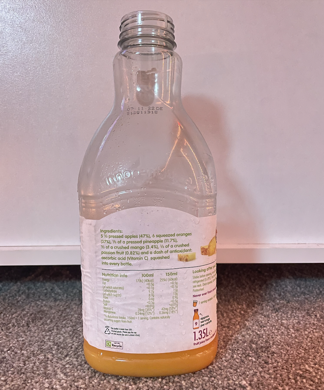
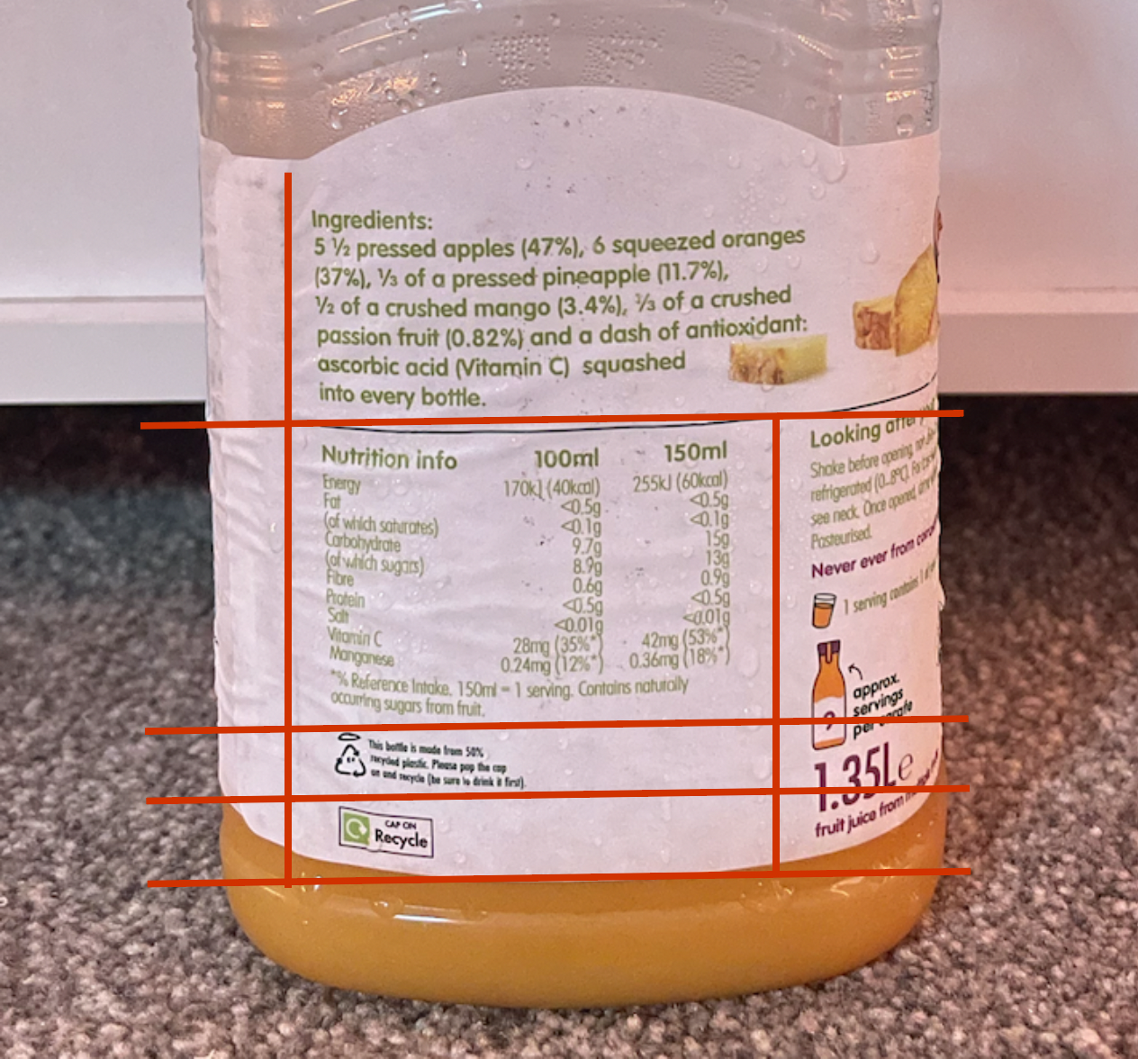
All juice cartons use grids to split down and show important information that a person may want to read and find out if it contains an ingredient they may be allergic, to or it consists of an ingredient they may dislike. The design of the grid used in this product is similar to any other, this one was chosen because it was easy to read since some can be designed to cramp together which makes it harder to read and understand. The grid design is not very clear but you can just about see where all the sections split off for every part written to make it clear for their audience to see. Since this particular design of the grid on this product is quite well spaced, I would say it does fit the aesthetic, the font is quite small which can make it difficult to read, but a decent amount of space makes it slightly easier to access.