Elementor is a further detailed and well-supported web builder designed to help create your websites to your standards. The application allows you to freely work across your website and design your website exactly the way you wish to.
How to install:
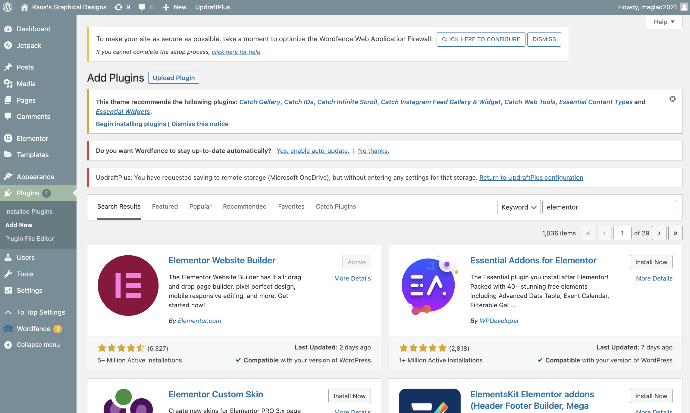
WordPress’s Plugin page allows you to find and download your Elementor Website Builder plugin.
Scroll down on the left through your menu bar to then select “Plugins”, and search “Elementor” to then install the first software that appears with the burgundy and pink icon.
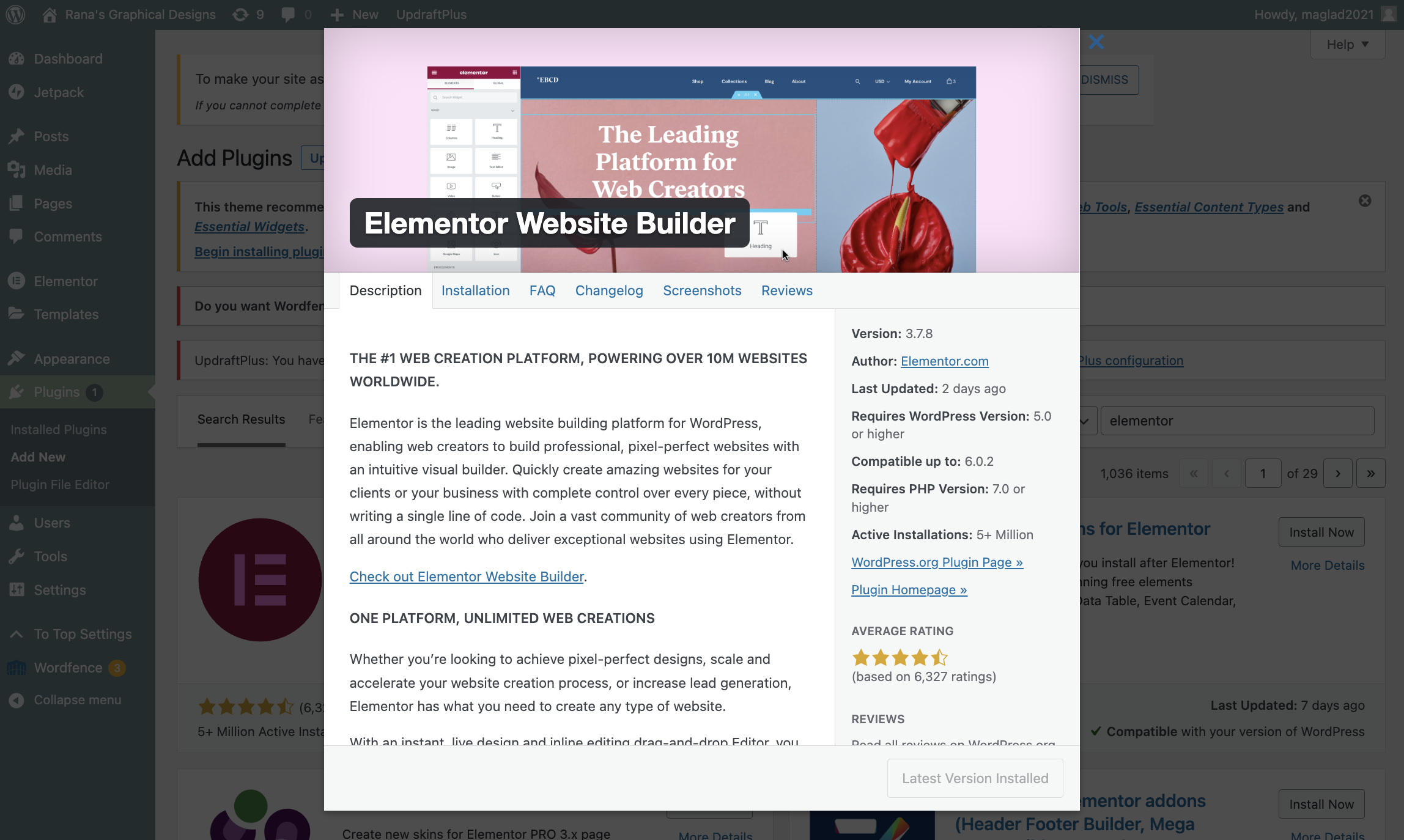
The introduction to Elementor’s website builder page shows you everything you need to know before installing.
Before installing, make sure to read the details and check the information provided in Elementors introduction to ensure that the provided skills through this plugin best fit your website design.
All the plugins that get installed create a list of plugins that can be found on this page.
Once you have installed the Elementor plugin, you will notice that when you go back to your installed plugins and software, it is included in the list. Make sure that the plugin is up to date with the latest version and that it is activated on your website, and ready for you to use.
Using Elementor for my Design Portfolio:
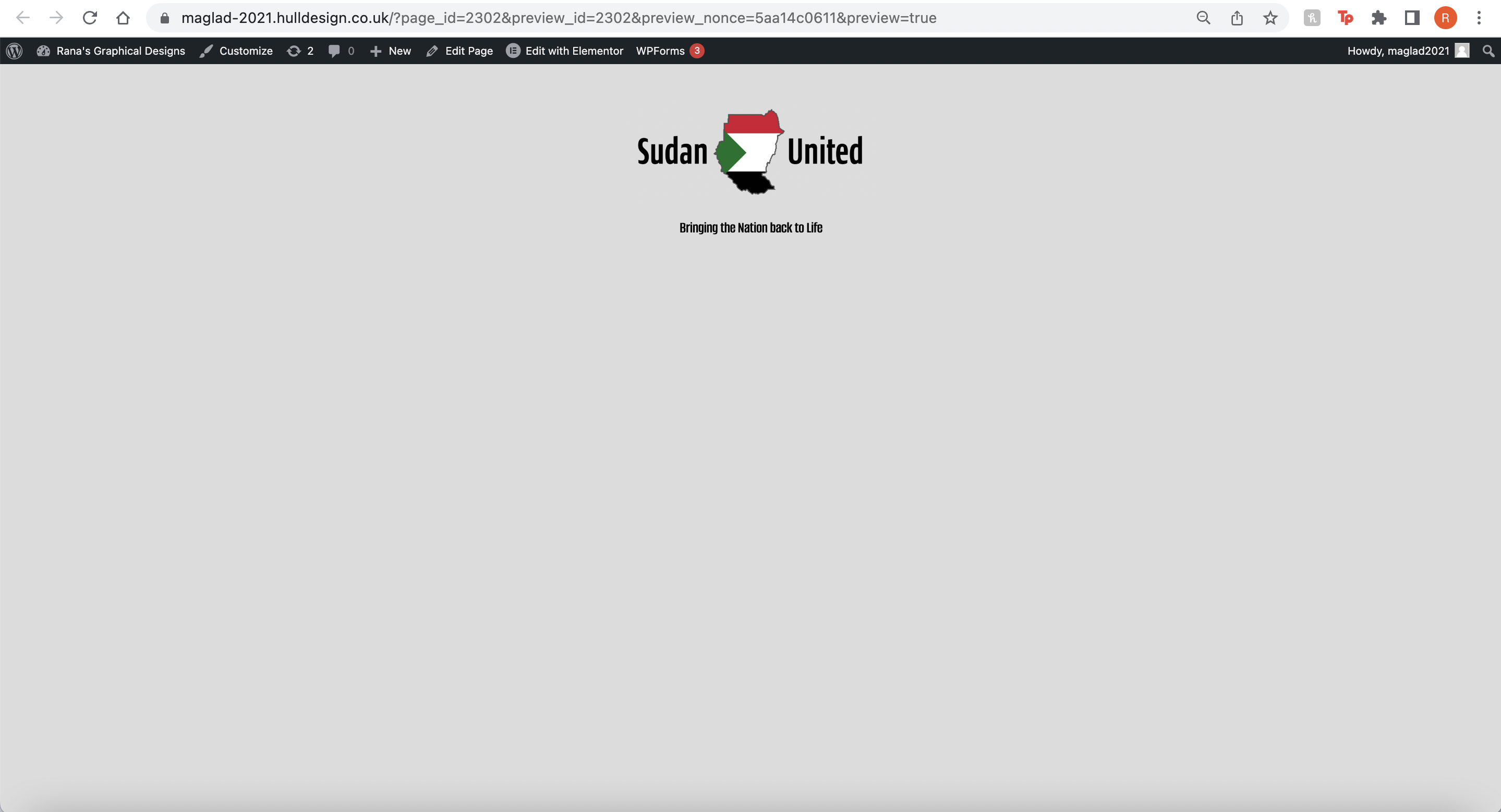
Creating the website I started off with a simple plain webpage layout with no content.
I started off with an empty page, applying the following steps to create my home page for my design portfolio campaign. The clip above shows a demonstration of the set settings I applied for my website called ‘Global Settings’, meaning resources I will constantly be using throughout my design process.
A close up of the background colour I decided to go for.A close up of the chosen colours taken from my moodboard.
The moldboard as previously mentioned is where I took my chosen colours to apply to my design portfolio website.
Before starting any process, I added a small space between the top and my next column, to avoid overcrowded space at the top with my items being too close to each other. I didn’t want too much space, but a natural size of 15 was enough to make it look organised.
Adding the Logo widget:
Next, I added the image object to the next panel beneath the added space to apply my logo. To the left side is my image settings, where I selected the image icon and began looking for my created logo to add to my webpage, then finally resized the image itself so that it fits perfectly to scale at the top.
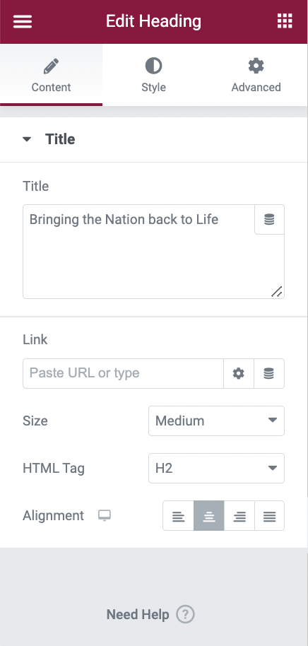
Adding the heading widget:
I then added my slogan using the ‘Heading’ widget on the left sidebar setting and adjusted the position to the centre instead of to the fat left side.
Adding the slogan that I came up with for my campaign, I added it just beneath my logo, in a medium-small size so that it was still visible, but not bigger than the logo itself.
When I decided I wanted to add it to my search widget, it was brought to my attention that the section with my logo had only one column in it which makes it a lot more difficult to actually place in that search widget beside the logo. I then created a new column that had 3 sections instead of 2. My reason for this is so the logo could still be positioned to the centre with the search widget just to the right side of the logo with no struggles.A quick preview of the progress so far to make sure all widgets are set to place with no collision or complexion.
Adding the ‘Search’ widget:
Once the logo and slogan were put in place and saved, I then moved on to applying my search widget to the page. The clip above shows a simple import of the selected search engine placed on the right side of my logo.
How the search widget was placed and designed did not match the theme of my website. Using the left sidebar settings for my selected search widget, I used the provided sections to alter and change some designs to my search button. This includes resizing the text, adding a simple shadow to the box and making the search engine noticeable.
Next, I moved to the search button, by simply changing the colour and resizing the search icon on the button to make it look more pleasing to my website. Choosing red only make’s sense since the main colours of my website revolve around the green, black, red and white.
Realising that when the mouse hover’s over the search button, it turns back to purple which I did not like too much. As previously mentioned, I decided to add the green colour to my hover-over so that it looks more noticeable when to click ‘Search’.
Once I had finished designing the search bar to a design that fitted my campaign webpage design, I then moved on to re-positioning how the search engine sat to the right side of my page. I thought it was a little too high up, so I decided to bring it down in line with my logo.
Although my search, logo and menu widgets all fit well to my desktop mode, I went further to check how responsive my design structure was developing so far. Only to find that the search bar was not effective enough for my mobile version and the menu had in fact disappeared. Improvement for this would be to make sure the mobile version is responsive and to make sure no widgets go hidden in the process.
Adding the ‘Nav Menu’ widget:
The starting point of my website was starting to come through, but in order to make a webpage have pages accessible across different pages, I needed to then place it in the ‘Nav Menu’ widget, where I would then create and add the pages to my website for my audience to access through this menu bar at the top of my page. I didn’t like the position of the menu bar to the left side, so I positioned it where you would normally find it, to the centre of the page.
I was not too happy with the style of my hover feature on my menu bar, which turned to the colour purple which does not apply to my house-style theme. Using the left sidebar menu, I changed both the text and hover line to red to match my search engine style and webpage theme. My menu had already been created through WordPress settings, where I created all my pages to design, alongside making sure all were linked to each nav menu across all pages.
Inputting a carousel widget:
Having images on an opening home page only makes a website more pleasingly comfortable, especially when wanting to find out more of a visual insight behind the purpose of the website. I adjusted the size of the images using the left sidebar settings so that my images don’t come out too big, along with making sure I did not select the same image more than once.
After adding in the carousel, I made sure I saved it and went ahead to test and see if it adapted well to my website through preview.
Inputting the ‘Paragraph’ widget:
for my next task, I added my ‘text’ widget just beneath the carousel to add in my introduction to my website. I had placed this just beneath so that it sets the layout for my website.
Adding in the text, I realised that it was not visible to the page and that it had automatically been added in with a small font, making the paragraph not visible. Using the settings on the left sidebar, I changed the colour of my text and increased the text size to make it visible.
Adding in Text and Animation together:
This individual section I added just beneath my paragraph included a 2 column section, where I then added both an image and a text widget. I then added an animation I previously created to my website, which I placed on the left side of this column. The text would then be placed on the right side.
Inputting a link to the animation:
I want my audience to be able to access different pages by navigating not only using the menu but being able to click through images with a link that can take them to another page. Using the settings to the left side, I added a “Link” with a URL to the ‘about’ page I already created, which would then allow an easy transfer from the home page to the about page, by just clicking the image.
To make sure my audience can identify this link, I included a small caption beneath that would tell my audience that a link is provided and that they can read further on another page.
Inputting socials as a footer:
The bottom of the page was very close to the paragraph and the image I had just added, since I had an idea to add a footer, I included a small place using the ‘space’ widget I previously used at the start to make room for my footer.
Using the ‘socials’ widgets, I decided to add them to my footer, this included a Facebook, Instagram and Twitter page that all associated with my campaign, in support of my campaign’s goal.
For each social link, I then included the URL links to all the pages I had created for my campaign, and added them to my footer’s social icons, making them accessible for my audience to easily locate and reach.
Final testings to the page:
Finally, I went back and tested all the links I had added to my footer and my animation, making sure that the text was in the correct space and that the images were set in the correct form.