
App
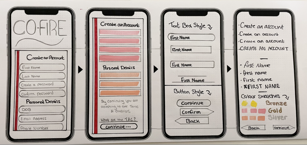
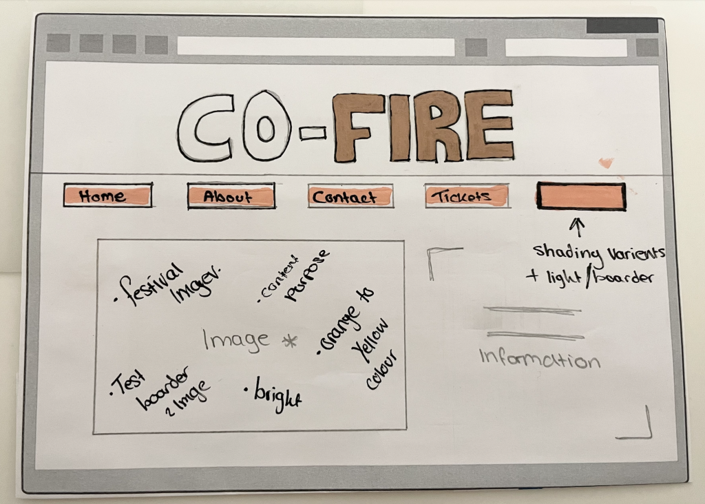
Paper Prototypes were first created to help produce guidance on how my festivals app would be produced through XD and it’s a way around a web design. Structures of the app design were the beginning focus of my testing. Making sure that enough white space was still visible allowing equal spacing between seconds of typing as well as the background still blending in with the design of the app is important.
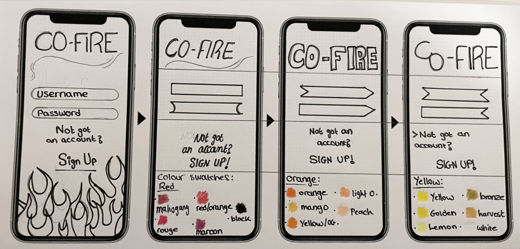
The colours used throughout my app and graphical designs are drawn were placed as swatches to give a clear view of which fades of red, orange or yellow were best fitted to the app’s design, this step was done to give a brief on colour options when making later the mid-fidelity app to allow the testings of these colours, then being able to see which swatches were best fitted for this app.
Button shapes and fonts were stretched out to brief also to allow a variety of choices through making the app, being able to see which font best fits the designs as well as the audience still being able to read the information and context provided is important and was later tested throughout my designs.
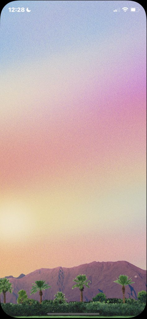

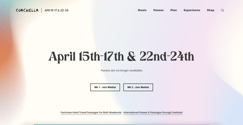
Having the ‘Fire’ graphic design drawn to the bottom of my app was heavily inspired by my inspired festival design app Coachella. When first opening their app, you are introduced to a peaceful and warm welcome of their palm trees at the bottom of the screen for about 3 seconds before “loading” appears.
Their background is covered with a variety of different shades of pastel colours blended to help give a better sky over look to the nature design fitted at the bottom. This was also heavily inspired for my festival where I then decided to add many different colours together and then have that blended out to allow a similar look to the Coachella design.
Website
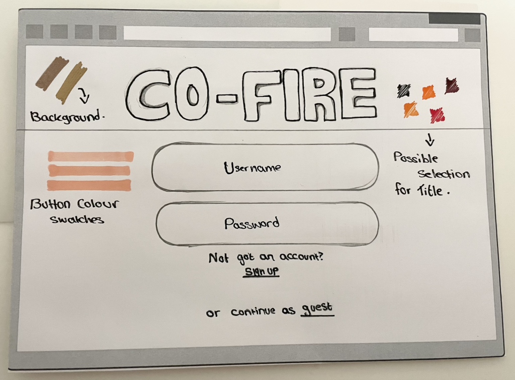
Similar reasons for my app were done and related to my website, both designs were to be done the same or similar to keep the same house style design across both devices allowing the audience to remember and recognise my festival. The structure of the app of course changed for my website to make it accessible for both platforms and easier for my user’s to access.
Allowing a reasonable size of the fonts used across the website had been overlooked several times when making the festival’s website, being able to see visually and clearly from a distance, the information was important, without readable content, the purpose of the website would fail to perform. Colours and the style of fonts were later tested to show and produce a better [performance in presentation for the website and app.
Different colours were also tested on my website to allow different choices to be considered when making my website. Having the choice for more than one swatch produced to the website would allow me to see and get feedback on which design or colour best fitted the purpose or theme for my festival, any changes that were later made for the website were also done for the app.
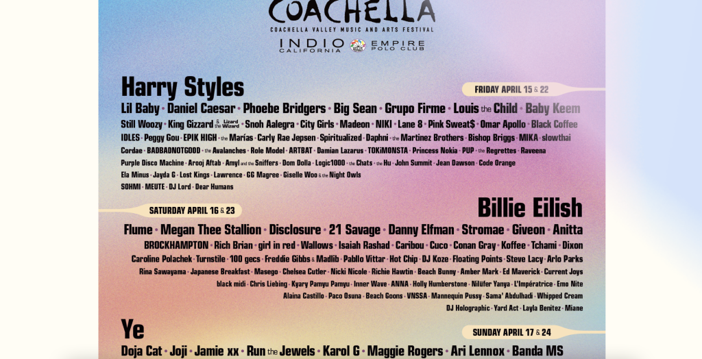
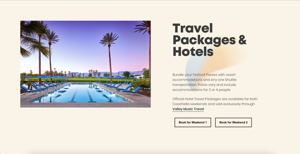
Inspiration came from the Coachella website for my website:
Biblography: