
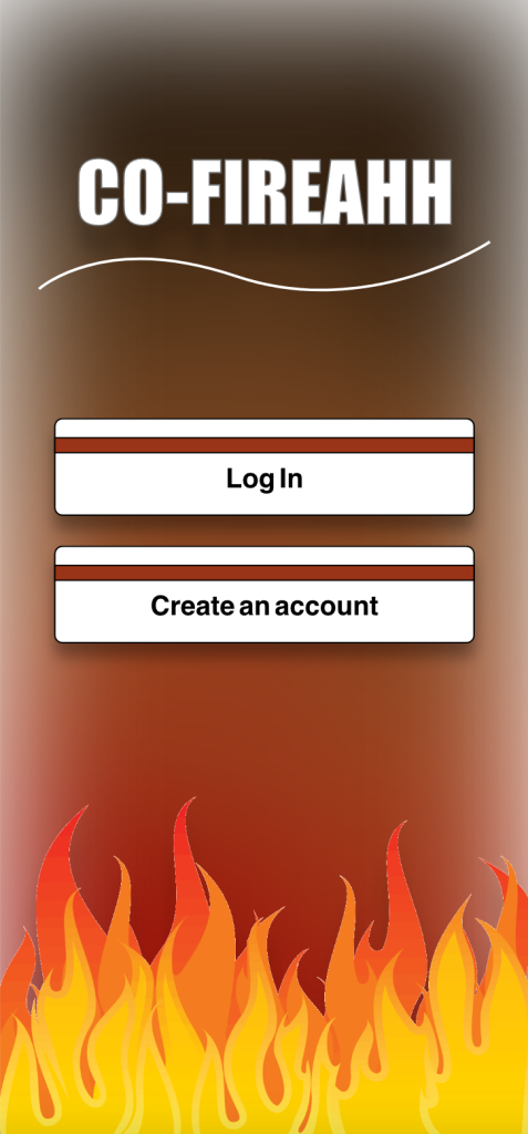
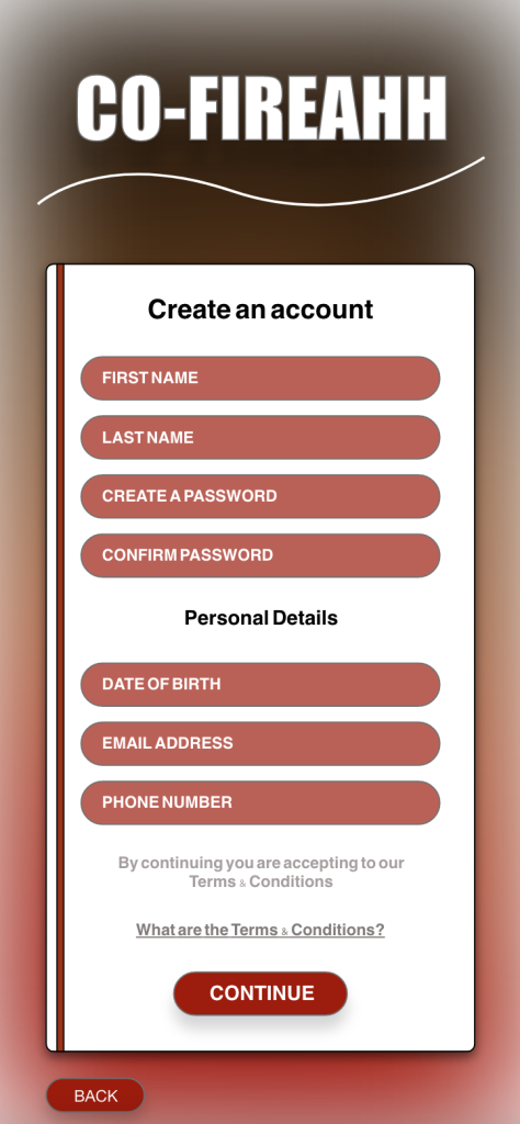
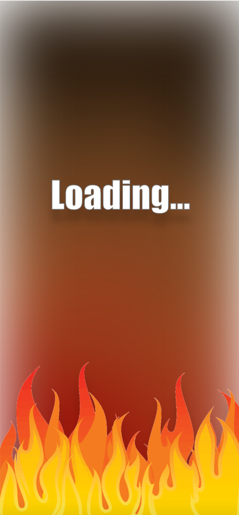
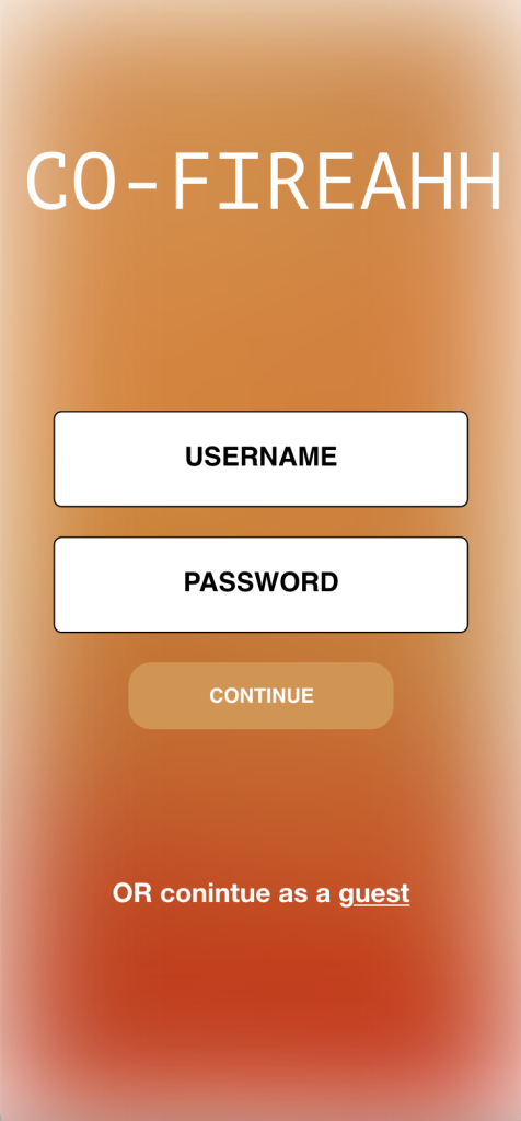
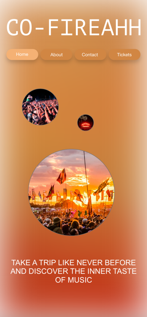
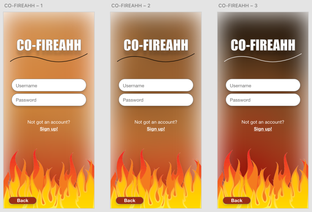
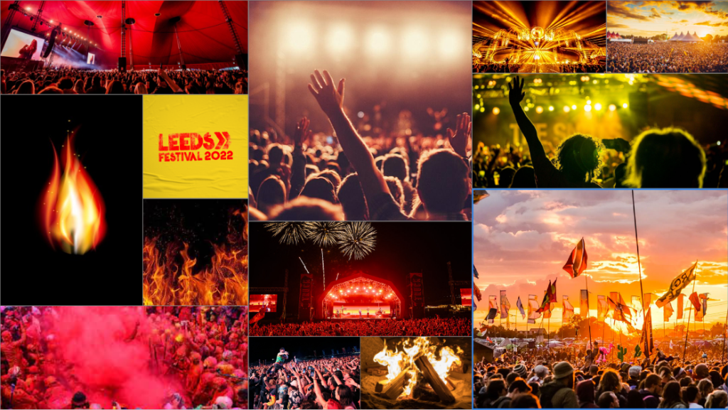
CO-FIREAHH’s website kept an on-going house style of a flaming yet brightly coloured fire themed background across its pages, which where then reflected to the app design to keep the familiar design strcuture continous. Having that familiar design across the app and website to the audience gives a better comforting feeling, viewing a design they’ve recgonised before previosuly and knowing their on the right page allows them to feel settled and in the right place, even on the go.
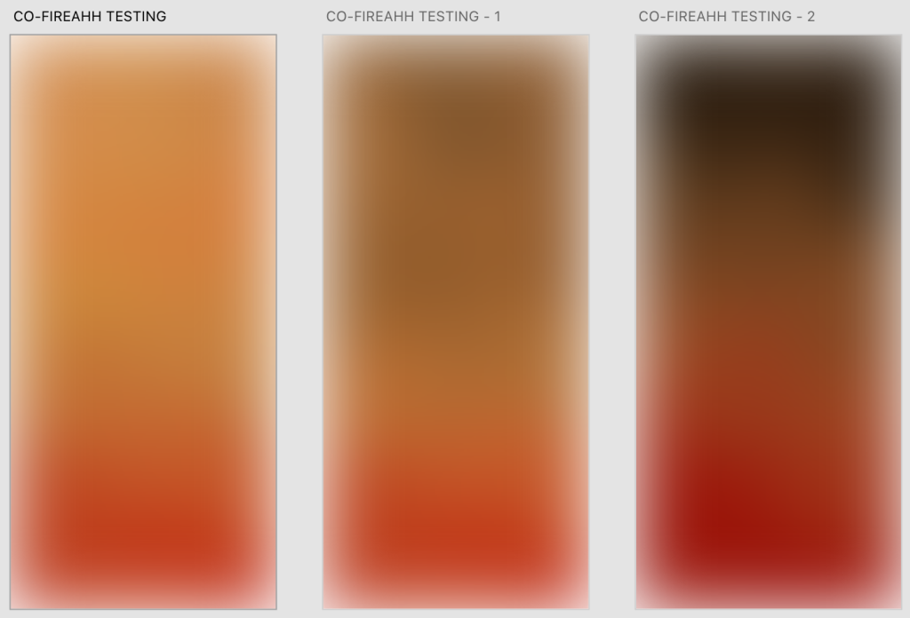
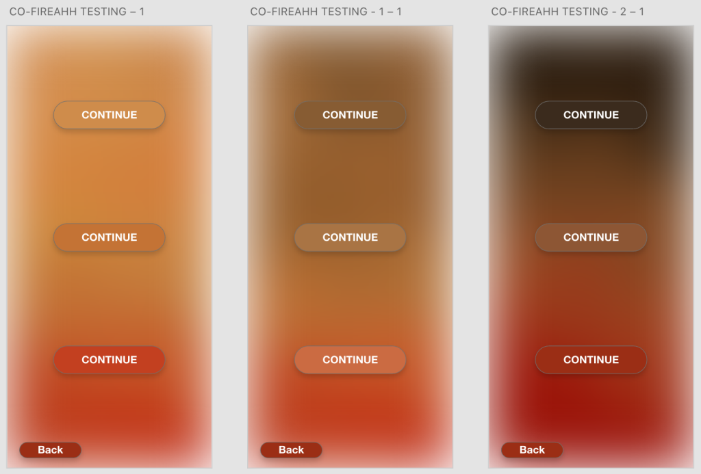
Chosen swatches of the colours on the page are shades reflecting towards flames and fire swatches. The colours fit well with the title of the festival since it sends with the phrase ‘FIRE’, furthuer more keeping the colours based of the theme would only make sense as well as fit its purpose. Bright and dull, blurry and vibrant various of the colours shown have been used throughout the page.
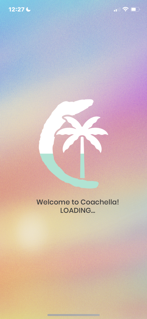
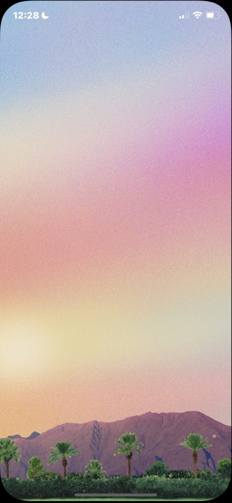
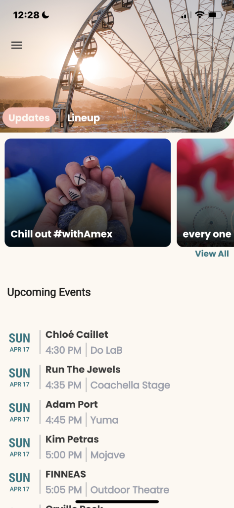
Coachella’s app keeps a very brightly coloured energetic feeling across it’s app. Having that bright feeling can give the audience a very warm and peaceful welcome approach to its newly introcuded app, leaping to a very pleasing welcome and a high user experience. Varients of different shades of colours have been used to give the real-life aesthetic to the app as well as allowing their use of typography not to clash or become unreadable to the audience.
keeping that type-style clear and visible allows the users to have a more confident and easy experience when reading their provided information through either the website or app. A chosen colour must also be considered to keep a presentable look to the page and for the users vision, avoiding struggles with viewing the page. Light images used across the page which also are viewed with light swatches of colours used on the image, it could possobly indicate that a aesthetic and calming filter may have been used for the images to keep that ‘warmth’ feeling from the used content.
Graphical logos such as the palm tree on the loading page can also give a pleasing user experience, noticing how easy the loading bar is inside the palm tree making it easier to visually see what percentage the loading is to that particular page and how long the user may be waiting for giving their connection.
VIEW: https://xd.adobe.com/view/cbd0932a-45d5-403b-a8c7-f21ad08ee436-9e83/
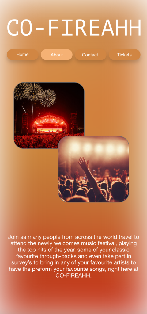
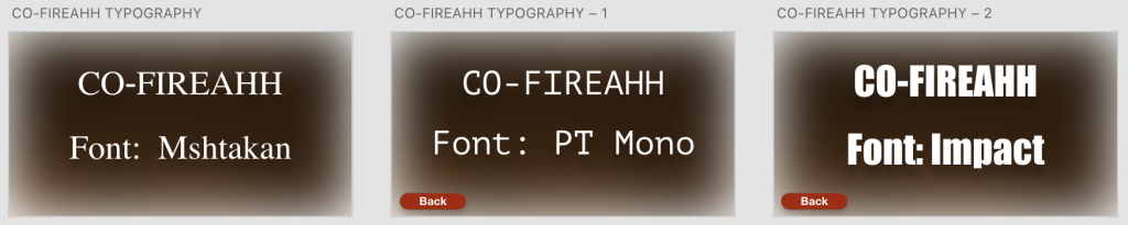
A mid-fidelity app was designed to get a starting visual point of how my app design may strcuture or change forward to its final design. Testing the title’s font size and shape as well as shaping to images across the page, context information sizing and placement was important in order to give of a good first impression to a new festival. Allowing the font to look presentable as well as read-able, making sure the images had suitable colours that did not clash with the background colour but still fit the purpose of the app and allowing an easy acess across the menu at the top, all buttons and links tested to give the best performance for the audience.
VIEW: https://xd.adobe.com/view/bf196f8f-877c-4c76-b2f0-0d44ba990b1f-ea4a/
COLOURS
VIEW: https://xd.adobe.com/view/daa3985d-6181-4686-82cd-55ef736de035-8ff0/
Bibliography
https://www.istockphoto.com/photos/fire
https://www.clipartlogo.com/istock/burn-flame-fire-background-1595148.html
https://www.themanual.com/outdoors/how-to-build-a-fire/
https://www.visitliverpool.com/whats-on
https://time.com/5799354/what-is-holi/
https://www.festicket.com/festivals/leeds-festival/
https://www.signaturebrew.co.uk/blogs/news/a-love-letter-to-music-festivals
https://www.festicket.com/festivals/untold-festival/
https://www.visitscotland.com/destinations-maps/glasgow/see-do/events/
https://filtermexico.com/2019/04/12/este-seria-tu-festival-segun-lo-que-escuchas-en-spotify/
https://www.mtv.com.tw/news/newsdetail/8642
https://riotmag.co/truck-festival-announces-its-massive-2021-lineup