
Design App one:
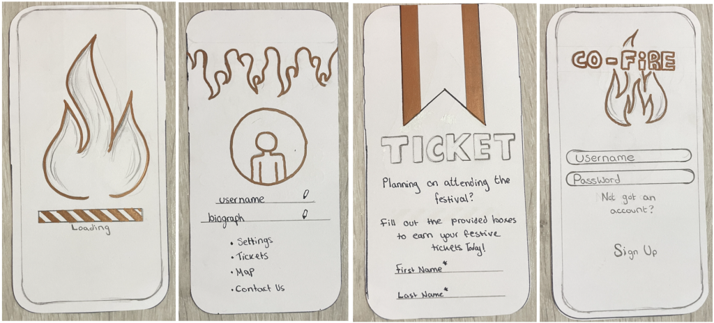
Fire flamed design theme was the best option in my opinion for my web and app design theme. Inspired by the name ‘CO-Fireahh’, I had designed to base my theme on a fire flame image across my app and website. The fire flame is introduced to nearly every page giving the theme stays across the pages as a house style is structured. Colour choices are to change in the future but the bronze tone is to give a welcoming starter point to the user at this moment. Bronze has been selected as the base colour because of its easy viewpoint, matches to a fire flame and does still fit the ‘Festive’ theme. This design has met nearly all requirements set except for one improvement which is to set out the design for page layouts which can later be altered.
Design App two:
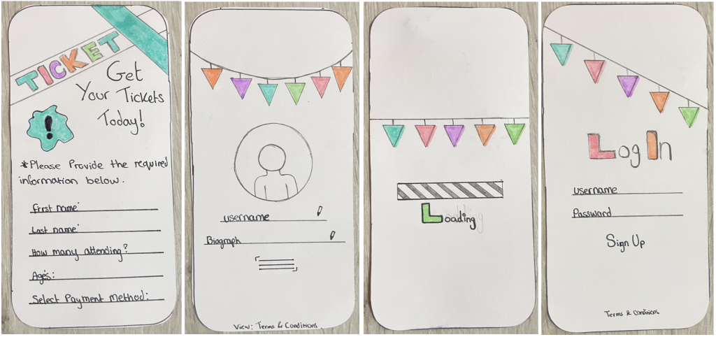
Design two had not met all requirements, although the layout and structure of the pages across are suitable and have no issue to its standards, the chosen colours are not well fitted with the title of the festive. Colour choices and graphical designs give a user more of a young kids’ festival instead of a more musical festival for ages 16+. When designing for a website or app, matching the user’s age and the festival given information, the layout can come across as either misleading or discomforting to the user.
App 1
Application appearance has met the following requirements. It’s met standards to the graphical design and choose colours, alongside the structure fit the website’s original design above which follows a consistency to a given theme. The title was set to the middle overlapping the graphical fire flame to give the title of the festive app a more ‘bold’ appearance, as well as making it easier to notice and identify which app belongs to this festival.
App 2
Application appearance did not meet the following requirements. A simple design that shows no title to the festival makes it difficult to identify which app may belong to this specific festival. The chosen design does not give a very out-going pleasing first impression to a user when first viewing this app, although it contains the letter ‘C’ indicating ‘CO-Fireahh’ it is still difficult to identify that this app belongs to this festival.
Design Website one:
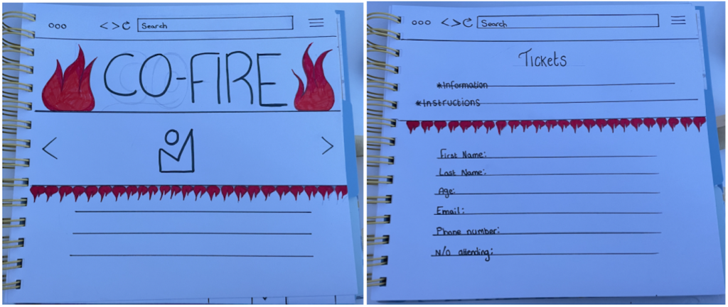
Having designing the website so that it fits with the same scheme as the app design, I decided to go forward with the flame design since it was the best fit with my graphic choices for the app, as well as reflecting with the festival name very well.
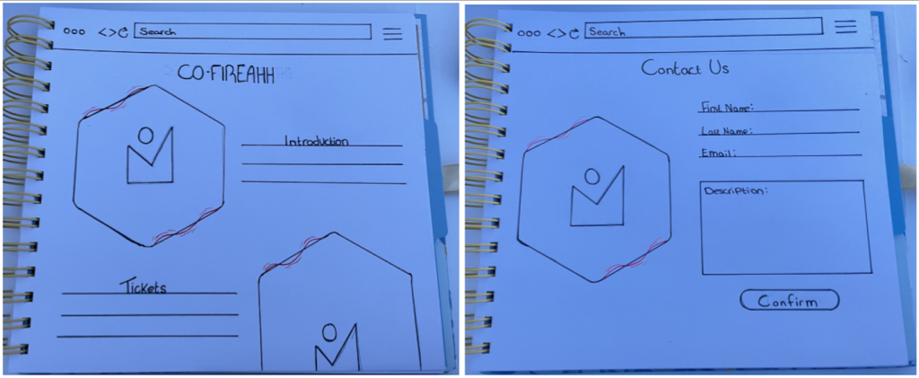
However, through designing the website pages, it had come to mind that the tickets and home page above were not settled with their format structure of the website, use of colours and placement of some graphical content did not fit a well-presented page.
Design Website two:

Reflecting back at some choices, the designs chosen for the tickets and home page now fit my standards and as shown, are less harsh to the vision for my users. The home page has a banner located just above the bold title to link in with the tickets symbol that’s presented through my website and app, showing my user’s where to purchase tickets at any time across the pages. A carousel fitted in the centre to allow users to visually see the festival’s images, followed by tickets information with a small introduction to the festival to welcome users and new users.
The tickets page starts off with its symbol to the left side near the title, introduced to the user with an introduction about the page with instructions on how to purchase their own tickets.