
Heavily inspired by the original festival ‘Coachella’, known to be a music festival. A music festival that invites many popular artists to perform and produce their latest music to the stadium where many of their audiences come dressed all out to the occasion.
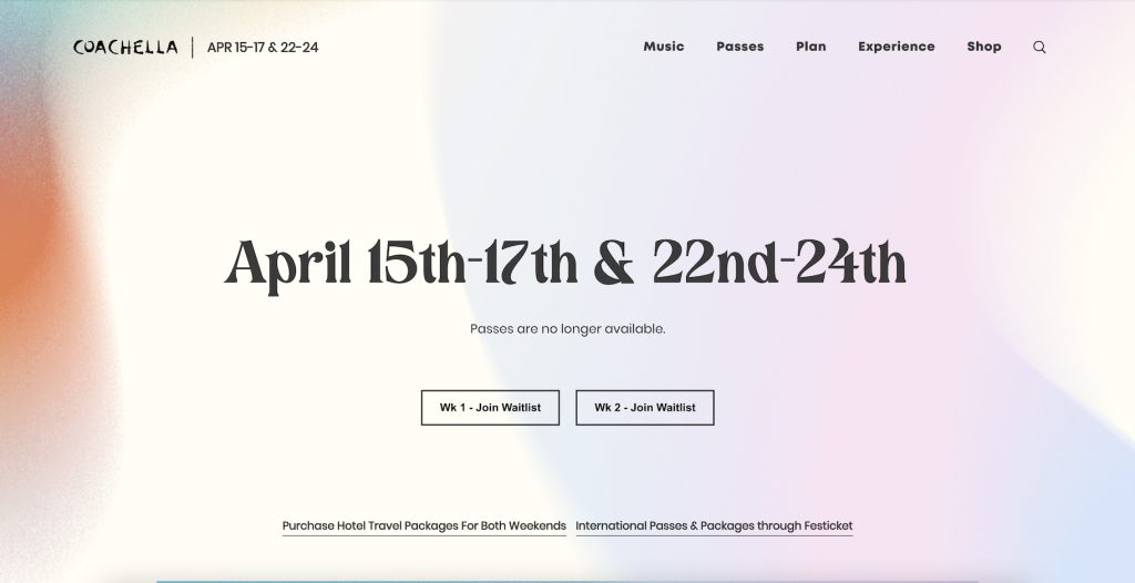
Coachella’s design for their website is introduced plainly by their bold centred date structured in the middle, the date set to show the days of when the event is taking place. Having the bold title to make the date memorable for the audience is one aspect that can be then included in my website when wanting to make a specific piece of information memorable and learnable. However, their small title that sits at the top giving the small title of the festival ‘Coachella’ is unnoticeable and unclear to the audience, giving the audience a few seconds to notice and see the title of the website itself. Taking this into consideration, I’d personally make chose to have the title of the festival in the centre of the page, then put the bold date of the festival as a subtitle, but in a large size to keep that memorable yet learnable effect to my audience.
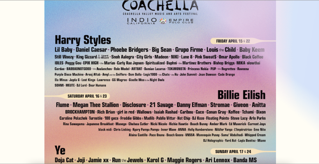
First impressions from the information post to what may be taking part in this festival have every detail set, although the font chosen may not be the best fit for a section that concludes with lots of text which can also be something to consider when creating my own website, as well as this, the information written is relevant to the festival, giving the names of which artists are performing to their festival and the size note date that’s written to the side of the subtitle of the section given. Every date includes who’s performing when, including the following of the attending.

The most comforting and attractive part about this entire website must be the image choices, giving the bright and smooth images fitted in with the subtitle, fits the context of the information provided for the audience which is something to consider for my own festival.