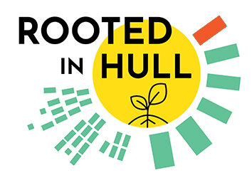
Using a variety of colours throughout their web page, the colours were also used throughout the logo to keep a continuous house style theme. Rooted in Hull’s logo uses simple shapes and structures formed together around the logo, the yellow circle positioned to represent the sun links in with the farming purpose and adds a bright touch to the logo. Rectangles that form outside the circle to represent the sun peaking edge, highlighted in a light shade of green to add to the farming purpose again, additionally showing intentions of growth since two supposedly rectangles have smaller ones, forming one large rectangle. One miss coloured rectangle in red may indicate their differences from other farming companies, that Rooted in Hull is a unique and differently designed organisation than other urban farming businesses. Having the drawn-out plant just at the bottom of the circle gives a clear view of the ‘plant’ represented to the audience, blending in with the sun at the back.

Separating the colours used throughout the web page and the logo, the image below gives a broken-down viewpoint to the colours expressed throughout the theme.

Analysing through the logo, every colour in the circle is shown continuously through Rooted in Hull’s website. The chosen colours express Rooted in Hull’s design, as well as linking back to their purpose throughout farming. The logo also fits under a well-shown example of a conceptual design logo, given the choice of shapes and framing, as well as the colours, the position of the layer together to make one large image of the sun which fits with Rooted in Hull’s purpose.

Further analysis of the colour choices picked and chosen for the Rooted in Hull logo, and website house style. All colours were used throughout the structures and design formats.
Shown on the Rooted in Hull website is the logo right to the start when first opening the website, followed with relevant images scrolling downwards through the website which all fit best with the theme, almost fit the colour scheme however, they’re real-life images.


Following on to the bottom of the website is relevant information to the website’s standards, giving details about Rooted in Hull and their background, including a short summary about their organisation, giving their audience an understanding and more detail about Rooted in Hull. Information follows on with a relevant image that fits with the given information.

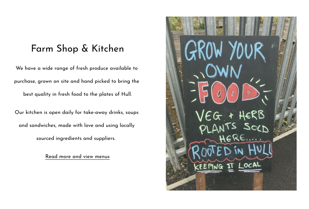
Uses of typography are used throughout the image given on the side of the current post. Many colours and letter designs, fonts are used to build and catch attention to audiences who may catch the eye of the stand placed.
Directly beneath the following post is another relevant content that’s posted through Rooted in Hull’s website, a quote given by the owner of the business, Adrian Fisher, who speaks about why Rooted in Hull had started, its meaning and why its relevant. Speaking in-depth about the growth in wanting a bigger community, showing people a better interest towards wanting to grow and cook their own food.
Bibliography
