
Rebus Logo – KC

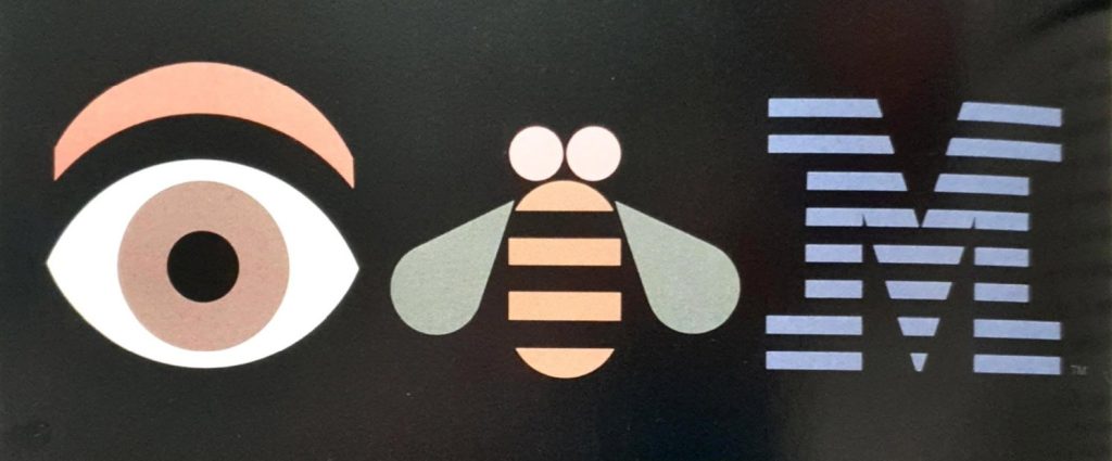
This KC symbolic piece was inspired by the ‘Eye Bee M’ method created, the C made from scratch using the brush tool and a number of different coloured strokes across the small wave bump to create the sea look. The reasoning for this choice is because when pronouncing the word ‘C’, the phrase “sea” is also heard, which is how this part was inspired. The ‘K’ was to stay natural because no inspirations led to change it, instead, I left it as a single letter, enlarged it to be the Capital of the company itself instead of including the ‘C’ with it but adding an image of the ‘sea’ instead.
Inspire image:
Font’s Used:
- Menlo