
Designs developed from the master plan to help increase Rooted in Hulls’ community in growing its passion for celebrating and educating people on how to grow crops as well as learning how to cook their own food. The master plan was developed to brainstorm a number of ideas to help attract an audience from around hull to help encourage large businesses to donate to Rooted in Hull in order to keep the business improving and growing efficiently and successfully.
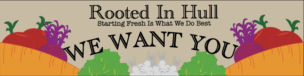
Poster
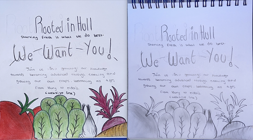
One design idea that was taken from the master plan was the Poster, being efficient through the easy contact in passing around these posters in public areas as well as hanging them up in busy spaces clearer to the public eye. Included with a range of red, orange, grey, purple and green colours that best fit the vegetable shadings as well as keeping that bright shade, catching the audience’s eye from a distance.
The poster was then finalised through Adobe illustrator using the font “Academy Engraved LET Plain:1.0”. This font was chosen because of its design typeface that’s presented through each individual letter, having the double line within the letters gives the ‘roots’ lines that best fits with the Rooted in Hull design scheme, included a stroke of 1pt to keep the bold effect to attract the audiences eye as planned. The information included the font “American Typewriter” which also had the design of the flicks within every letter, keeping an even space and so there was no complex within the reading.
Banner
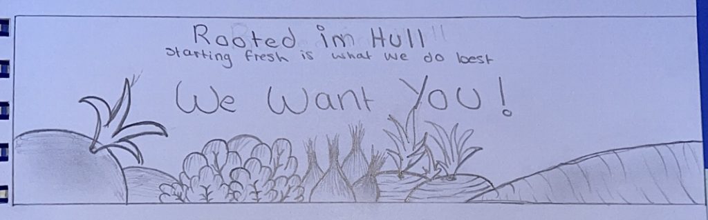
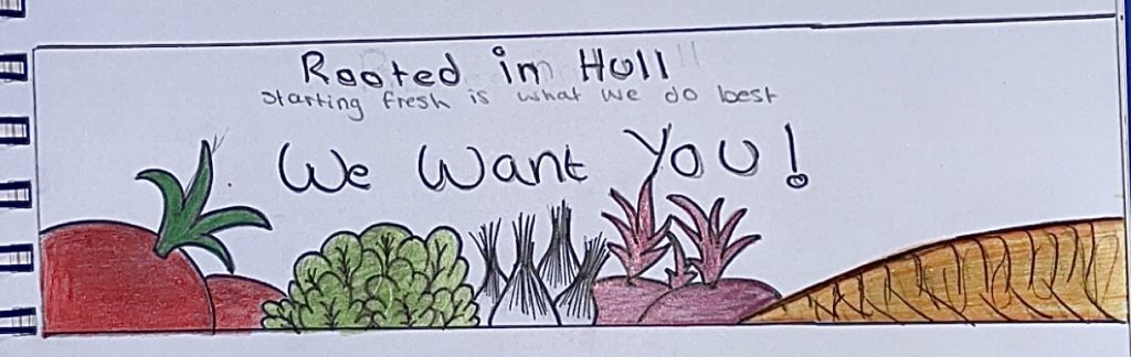
Next to developed from the master plan is the banner, designed to match the posters’ theme to keep the consistency of the same theme throughout, making it easier for the audience to identify the Rooted in Hull’s promotions in public. Repeated choice of colours stayed the same to keep the ‘farming’ design look continuous. Colours such as red, purple, green and white were all chosen to match their chosen vegetables, as well as keeping that brightly shade to be noticed from a distance. Typefaces such as “Academy Engraved LET Plain:1.0” and “American Typewriter” were selected because of their design style, best fitting the theme due to their individual gave fonts of every small flick within their performance. Both the title and the ‘WE WANT YOU’ design were kept bold in order to place the eyes of the audience to that point first when viewing.
Web Design
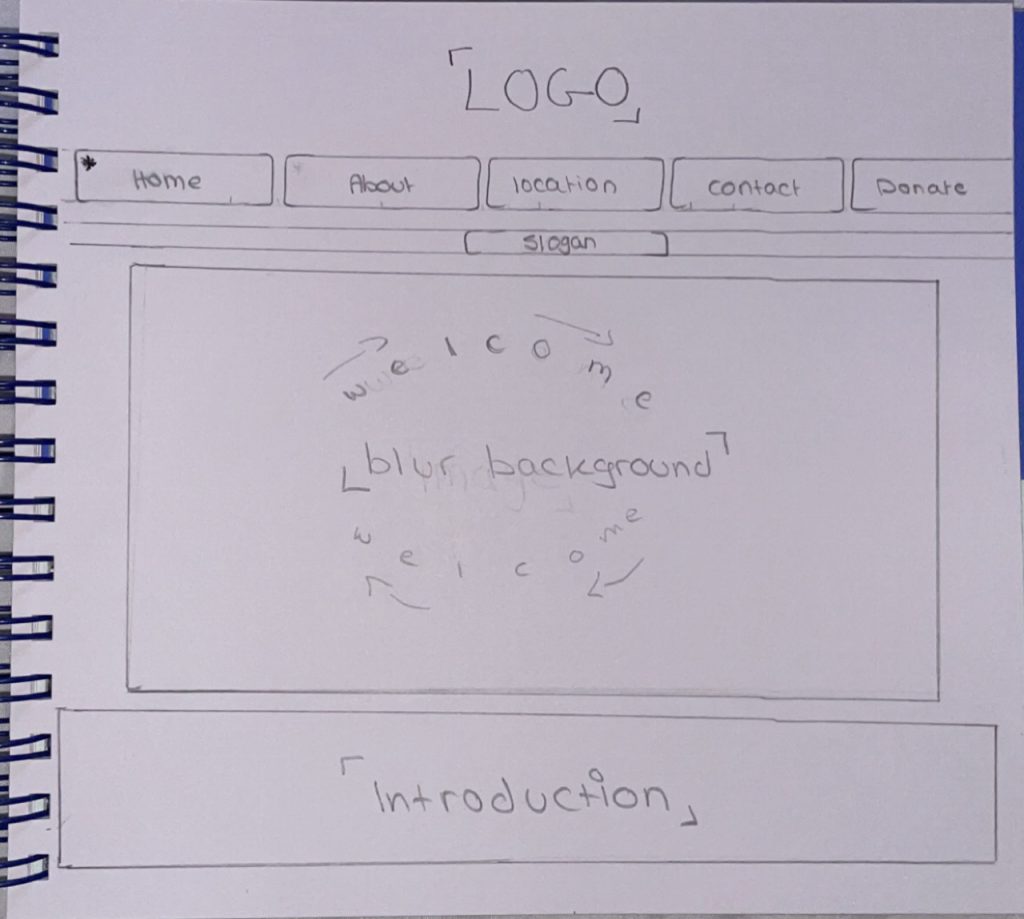
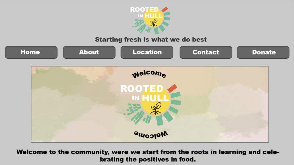
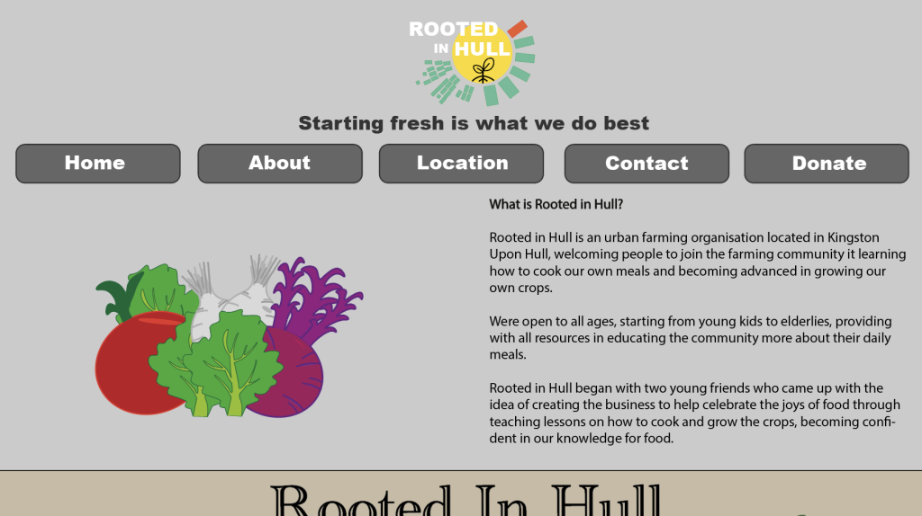
Home Page
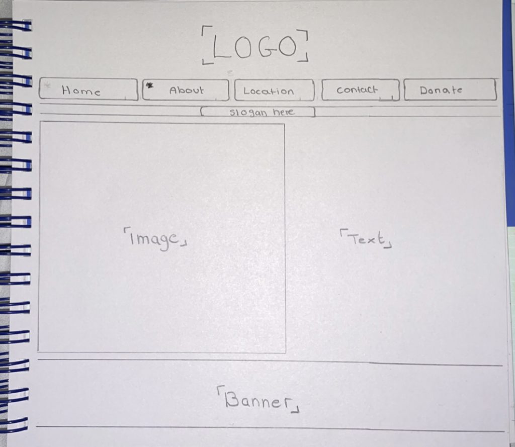
About Page
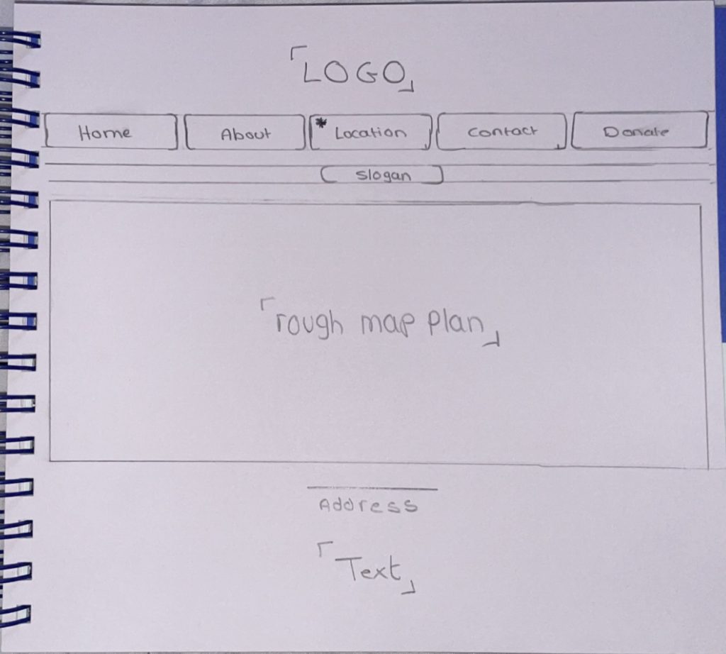
Location Page

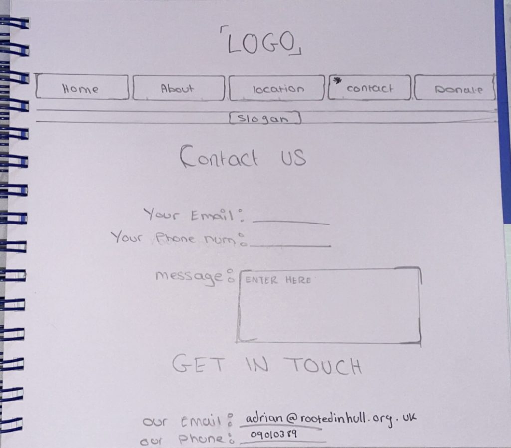
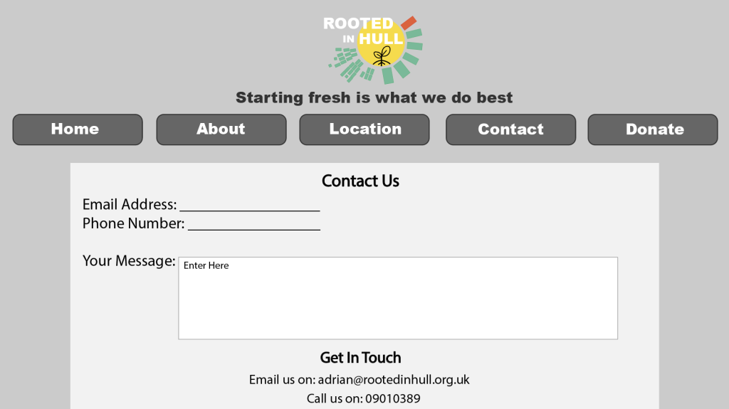
Contact’s Page
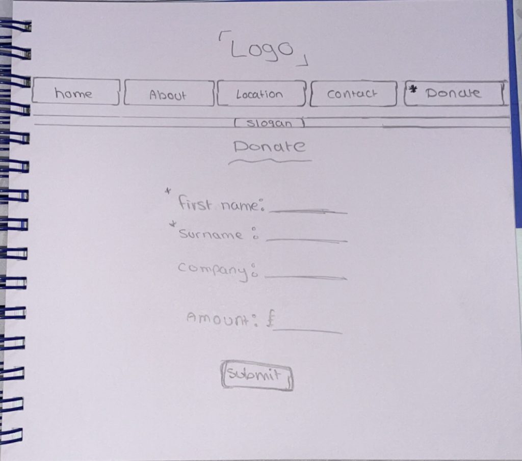
Donation Page
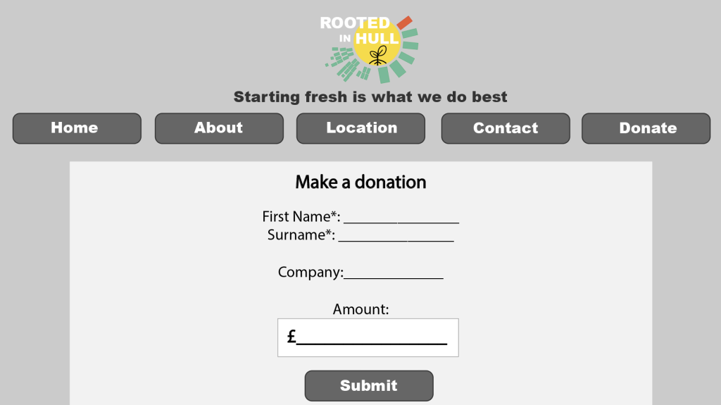
Producing the final design developed from the master plan was the web design, including a detailed and well-developed website for Rooted in Hull, can make it easier for several reasons when having the community or newly joining people wanting to contact the organisation or wanting to donate, planning a visit or general information. The web design concluded with one simple design through the website with a slightly off grey background, making the vision easy to see through the website, being able to read the font as well as analysing images through the website.
Colour choices of the buttons of every page stayed the same to make it easier for the audience to identify every icon easier, knowing what the icon looks like can become efficient to the audience when wanting to either change pages or submit anything. Typeface designs used through the website where “Myriad Pro”, a simple and easy to read font, allows the design of the fonts to stay professional, “Arial Black” is another font that was used through the buttons and the slogan of the website to keep the “edgy” design appearance, but still fitting in with the logo’s style of typography used.
The welcome page was specifically made with two of the same logos to present the websites official ‘Rooted in Hull”, keeping a similar design, but adding in the typography design of the welcome circle design around the logo, showing a welcoming yet comforting design for the audience. Repeated designs of the websites stayed continuously throughout to keep the professional house style design look.