
Taking a well-known logo with its slogan and changed to one that does not hold any good values towards it.
KFC’s currently slogan holds to ‘It’s finger-licking good”, the slogan has been held as part of their logo since 1952 and has not yet to be changed. The organisation later on through the years then had a slight down-fall with the lack of chicken they were able to produce for their customers. It was said later through the months of examining the quantity that they had run out of chicken to serve.
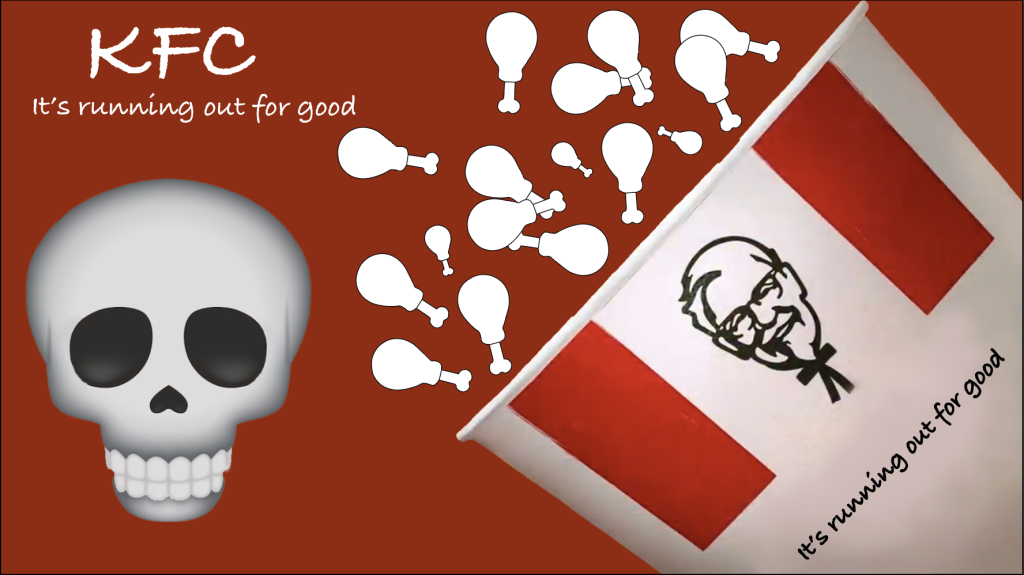
Given this task and what had happened through the chicken crisis, I was inspired by the situation to move forward by changing KFC’s current slogan to “It’s running out for good”.

Simply removing the “Finger-licking” quote from the slogan and placing my own on the logo. Had then removed the background to make it look more efficient and used the ‘Bradley Hand’ font to match the rest of the slogan’s typeface as much as possible to the original. No colours were changed through this process since the editing skills around the slogan are more focused on the skills of matching the new logo to the original, with a slight twist.
After making alterations to the logo, I then moved forward to their popular advertisement. Taking one of their streamed adverts and adding in the newly created logo, along with changing the advert.
Keeping the chicken outline shapes an empty white outlined image to represent the emptiness and plain vision of no chicken coming out of the box, being spoured to the background.
I had added the new slogan to the box and right above the skull emoji which also represented the ‘coming to an end’ feeling for KFC, reflecting their chicken crisis.