
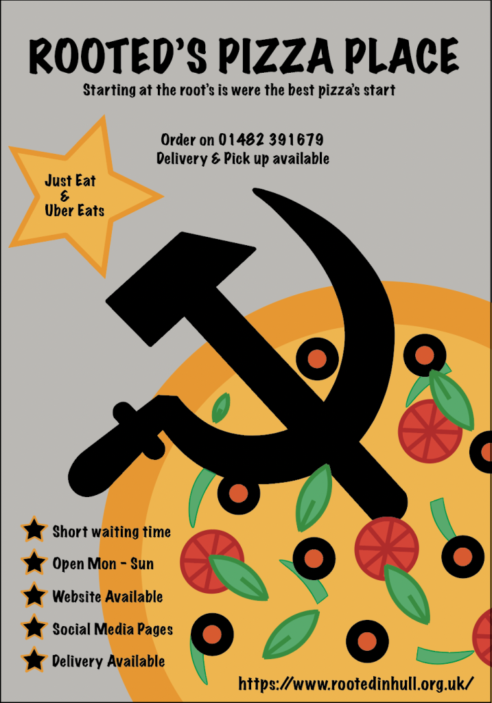
Rooted in Hull’s organisation has a newly introduced pizza business to be opened up. In ongoing planning, the different typefaces, compositions and colours were used throughout the planning and making of each category to help make the pizza business successful, purposes throughout the planning were taken from the current master plan that was organised to help raise money for Rooted in Hull.
Client Brief Logo
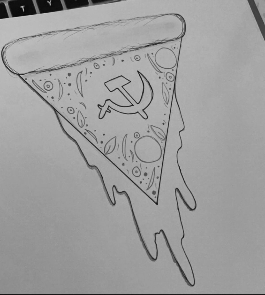
One essential key to making the logo was to draw out the idea to paper, using the previous knowledge having read the client brief is that the hammer & sickle symbol must be included through making the logo. Not knowing how to combine a hammer & sickle with a pizza, the final decision made was to add the symbol in the middle of the pizza, showing the main focus of the image as well as adding what was required through the logo.
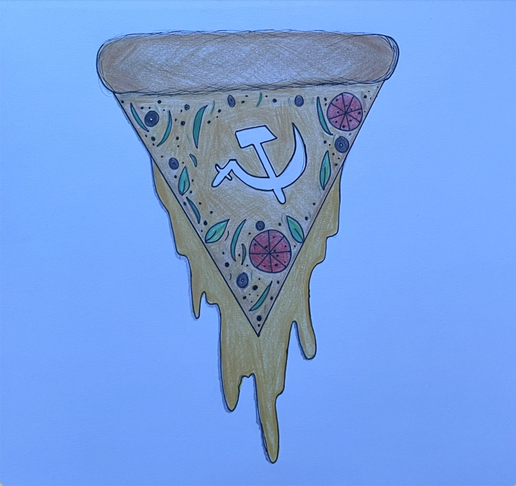
Adding colour to the logo then showed a clear view of what toppings and additional work may be added to the logo. A clear view of the melted cheese falling from the pizza at a straight-up angle was created to give a more ‘edgy’ design to the logo, giving one requirement for the brief is to aim for that edgy look. Going back to the hammer & sickle, I then left the symbol white so that it was clearly shown in the centre of the pizza.
Since the original plan sketched out did not finalise any logo title description throughout, I then decided that I would place the title of the business at the bottom of the created pizza logo so that it was visible to the audience to view clearly. The font choice was ‘Marker Felt’ to give a more bold effect as well as linking back to the ‘edgy’ feeling that the client brief had listed. Small details like the cheese dropping from the sides were drawn out for a more over-exaggerated look towards the pizzas.
Having then changed the hammer & sickle symbol to a black filled image, making it more visible than white so it stood out more through the bright colour choices of the pizza from behind. Making sure the colours did not clash together so it was easier to view from a distance.
Personal Logo
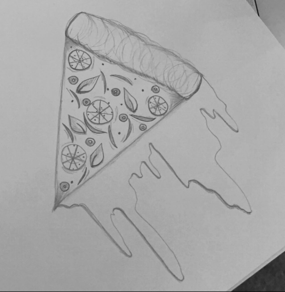
Creating the personal pizza logo ideas throughout where inspired by the client brief logo originally created, using the cheese melting idea from the pizza beneath initially from the start as well as making the toppings the same. Since the overall subject evolved around the Pizza Project, I made all the current pizza’s look identical in order to make the businesses designs to a professional outlook.
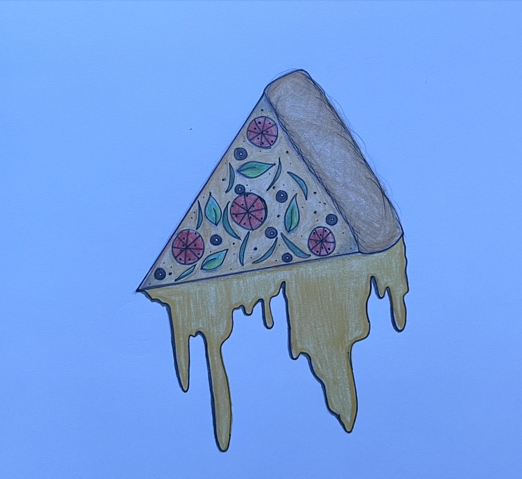
Colour choices were similar to the client brief logo, having the cheese be a brighter shade of orange than the pizza itself so that it stood out a little more than the pizza. Colour choices were picked for the pizza theme, such as the black for black olives, then green for green peppers and herbs and the red for the pepperoni. When drawing out the pizza through the personal logo, I found that the cheese on the pizza shading was a little too light for considering the tomato sauce that would also be included in the pizza.
Further creating the pizza logo, I had kept the pizza the same as the previous client brief design to match the ongoing pizza project theme. The colour choices were picked to match every topping chosen for the pizza, colours picked specifically so they match as well as choosing them so they don’t collide with the pizza colour from behind, however, giving the dark red pepperoni had been a shade of red to close to the pizza sauce. Changing the colour of the pizza from the given colouring above to a colour that contained both the cheese and tomato sauce both blended together.
Typeface using Marker Felt font used for the title of the Pizza to match with the client brief logo was also used for the personal logo, the design of the font used on the title had been chosen for its style, giving the small bold flicks at then end of every letter gave the more edgy feeling of the title which best fit for the pizza business.
A5 Promotional Flyer

Processes are shown through the A5 flyer drawing were done to match the client brief for the required symbol of the hammer & sickle image. The pizza’s toppings were created similar to the personal and client brief pizza logo. Having the hammer & sickle symbol aligned with the centre curve of the pizza’s crust placed the symbol to land within the centre of the page, overlapping some of the pizza’s toppings.
Placing the hammer & sickle image above the pizza presents this object in becoming the main image of the flyer, the pizza behind then becomes with second focus image of the flyer.
Shapes, colours and outlines are covered throughout the flyer to give a better understanding of what to expect from the flyer, however, colours were then further examined through the process of making the flyer through adobe. Topping colours stayed the same as the logos diagrams to allow a more organised theme for the business rather than many different images that don’t collide with one another.
Side shapes along the flyer were placed to guide the audience in which availabilities were covered for their satisfaction to the business such as ordering availability, phone number, website details, time waiting etc. Outlining surrounded objects through the flyer gives a better show of what the main focus points are.
Analysed through adobe, pizza toppings where created from scratch to match the other made pizzas of the logo with the flyer. Colour choices with outlined shadings of the herbs and peppers on the pizza show a better and more presentable performance towards the audience. Using the same green but in different shades shows more composition through every topping.
Side shapes used as stars with a orange outline where done to match the pizza theme, as well as licking with the hammer & sickle symbol through a black filling, representing the combined colours already used through the flyer and keeping a consistent house style design then combining off colours that aren’t already used.
Detailed information in a font best fit for the flyer yet readable, using the marker felt font, giving a bold and visible look to the audience. The same font had been used through the entire flyer to keep a consistent design through all the products, as used in the logo. The marker felt font keeps an even width apart from the letters together and has an easy stroke through every letter that’s best fit or a pizza business.
Pizza Packaging
Providing a package for the pizza has to be designed based of the pizzas business brand, whether it links with the logo design or flyer pizza design. For both different styles of pizzas created, the A5 flyer pizza had the best look for a pizza packaging since the pizza was drawn towards the corner, filling up the page and becoming the main focus of the audiences eye when being served. Having the correct colour choices also linked with the flyer after the structure of the pizza was picked from my previous design, using the toppings created and placing them to pizza box packaging so the theme continued through.
Adding suffienct words on the side of the pizza had also been included to allow the customers who may purchase from the business a sense of what they’re into when reading along the word choices on on the side. Words selections, 3:
- Memorable
- Sensational
- Flaming
All word selections were based on the pizza description itself, to give the customer a better satisfaction when ordering a hot (“flaming”), non-forgettable (“memorable”) and a variety of amazing toppings combined for one startling pizza (“sensational”), every word used towards its self meaning.
Colour choices also fitted best with the pizza packaging from the A5 flyer as mentioned, having to add one different topping to make the pizza packaging have one unique touch from the flyer and logo’s previously introduced. The Colour of the pizza from behind was done lighter than the toppings and crust colour so that no shadings through the after result would combine and be miss looked at or understood incorrectly by the audience, having a better and more professional design structure.
Having placed the pizza to the right bottom corner of the pizza packaging relates back to the client requirement of the ‘edgy’ design feeling that was put in place for the designs created. The bottom right corner has been chosen so that the title of the business and other information was readable from the top of the packaging as well as from any other angle, avoiding any awkward positionings.
The hammer & sickle symbol placed in the centre of the pizza box which then overlapped through the pizza image had been done to represent that symbol in giving the meaning behind ‘community’, representing the business as a ‘one community as well as linking back to Rooted in Hull, one large community which evolved around friendly and mindful people.
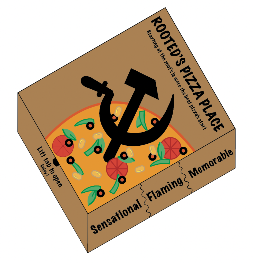
Chosing the slight dark shade of brown on the background of the box and given a more realistic image of what the outlook of the pizza box may be created, combing other colours such as the pizza, the toppings on the pizza and the centre symbol to avoid any colour collision, allowing all shades to be shown in its own way and so the audience also understands what each object represents.
Strokes used on every topping through out the pizza itself to give the 2D effect on how the pizza is presented to the customers, colour choices where chosen to the object so every topping is understood, different shades of every colour is used to allow a more effective design structure to the pizza. This includes the pizza drawn itself which has a different base colour than the crust to show the separation between the both. Pinapple is the only topping that was added to the pizza packaging and nowhere else through the logo or flyer which gave the packaging a more slightly unique touch to the rest, however still contributed to the given theme throughout the process and no major changes were done to keep the continuous house style design.
Typeface of the font Marker Felt was again used on the pizza box because of its edgy design. Giving the structure of every design and the slight edges of every letter gives the design that links with the client brief. Making the font a solid black colour shows a black and darker tone through the title and design to show visually from a distance the information provided through the pizza box, including the adjectives given on the side of the pizza.