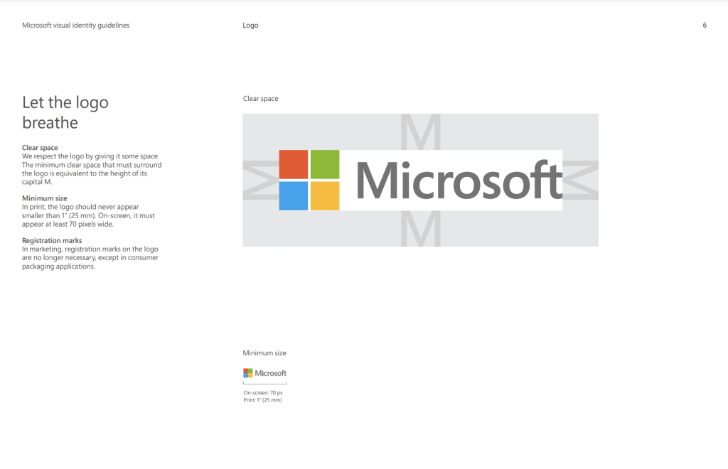
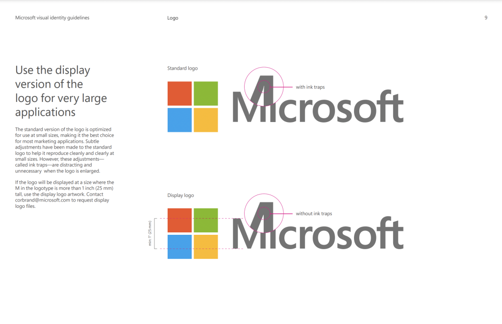
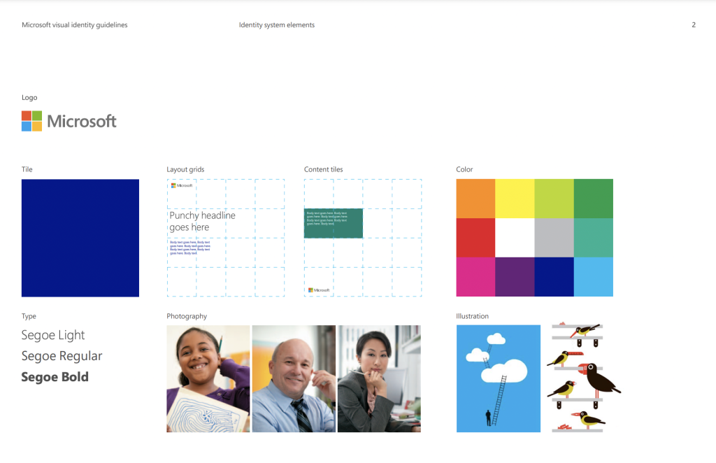
Microsofts logo contrasts together with shapes and a simple title, giving a non complex look but a professional one. Used shapes in the logo design are more focused around the squares colliding together to form a much larger square, including all the primary colours and one secondary colour which all place together and do not collide with one another. Giving Microsofts purpose and how their organisation relies on professional work space apps, the logo fits perfectly with the given organisation, colours to show a bright performance, yet to show perfection. Setting a well designed logo attracts the correct target audience.
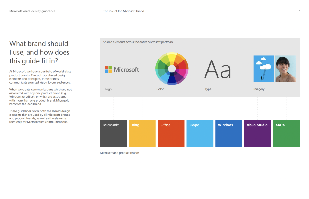
Relating your graphical design structure to best fit your brand comes down to the main priority. Having the correct logo that best fits your organisation’s purpose will give a better outlook on your audience. Relevant images through Microsoft’s page become a large impact when linking through the type of colours and meaning behind the used images, an example is a use of blue through both images used in the above screenshot show relevance throughout Microsoft’s purpose, as well as keeping the professional look throughout. This is a consistent scheme that Microsoft keeps a very high eye on to make sure it brings the correct satisfaction towards the target audience.
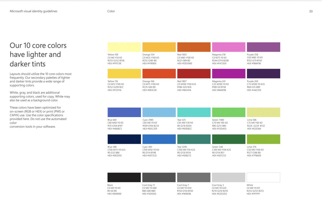
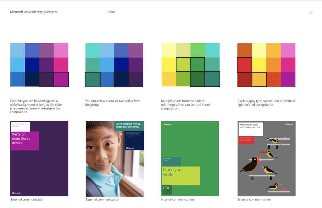
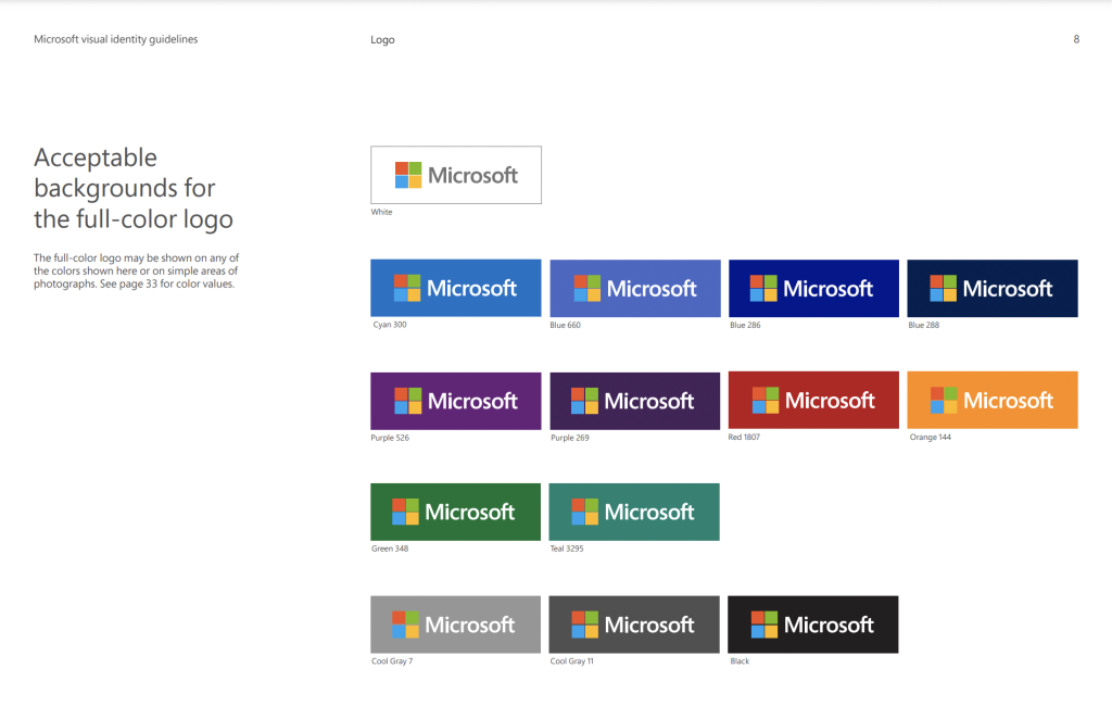
Microsoft has a 10 core colour palette of colours that consists of both primary and secondary colours, including grey, black and white. They conclude of having one colour on a page using different shades of that same colour. For example, the green demonstrated page consists of many shades of green, evolving around both light and darker shades of green, then again shown through the purple. One example also is structured around the main focus of a colour through an image, so that the chosen colour badges around the image fit the image, giving a multi-colour profile look on the given area.
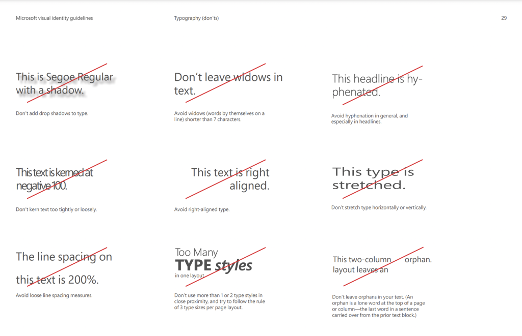
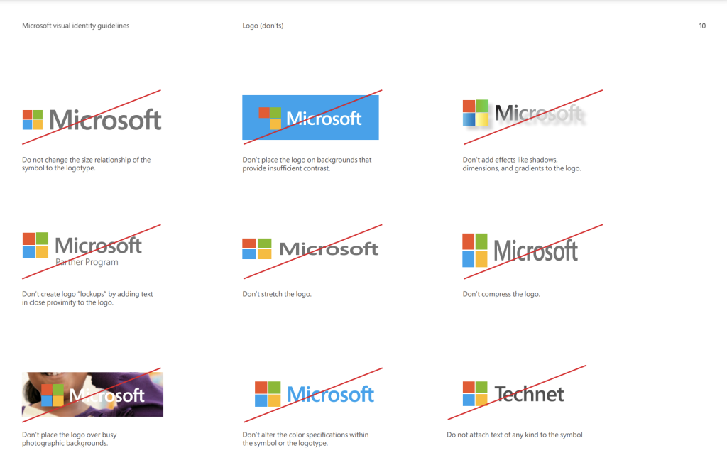
Types of different typefaces used through Microsoft’s examples consist of examples that are advised to avoid when creating either their logo, or any sort of type face design that may be used through their page. Avoid designs that use shadows, windows typeface, headline designed typefaces, any typefaces that are too close together or positioned to the right-hand side. Using more then one design of font when focusing through typography is also advised to be avoided when creating or aiming for a certain type of type face. Microsoft demonstrates these examples to help other designers what to aim for.
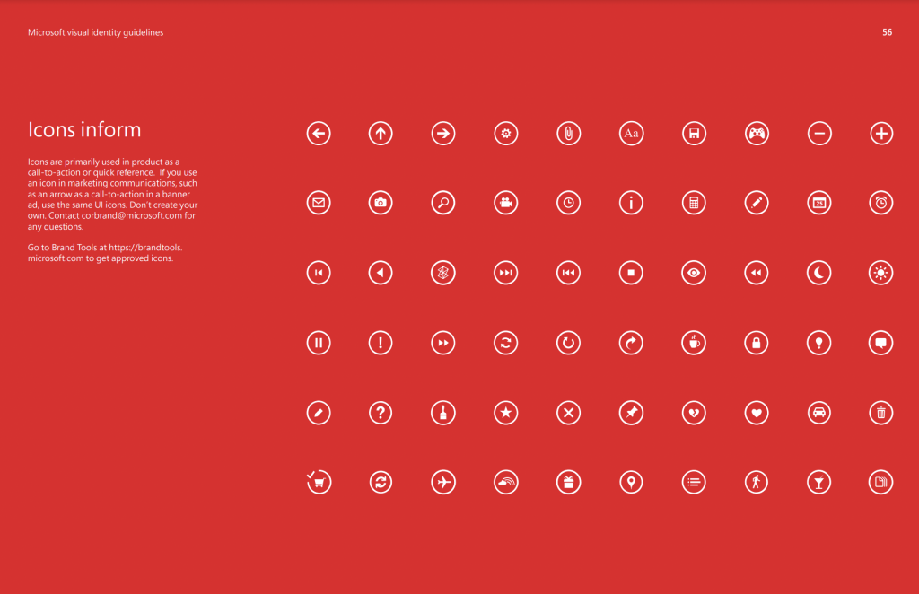
One design using a white outline circle shape around every icon used in Microsoft is formatted to look the same as the others. Keeping one design throughout one area can help the audience identify what the given image may be about, or targeted to. Since the given examples above are icons for the Microsoft page, having a simple and consistent design through the page allows the audience to know what they’re looking for when searching for a particular page. Microsoft uses these a quick call-to-action base allowing people to know where to search to.
Bibliography
https://ratnacahayarina.files.wordpress.com/2014/03/microsoft.pdf