
What is Composition?
Composition does not include a very complex meaning, but simply shows many different parts that are fitted together to make a new and better, bigger piece. These parts are fitted using a blank white or black space, collided with a variety of different colors and graphical images, fitted with more shapes and added objects to make one large piece.
For it to become a Successful Composition, making sure it fits with the purpose of the objective as well as every shape, graphical image, object or colour has a purpose and why it fits this certain theme so it becomes relevant in its own way.
This process comes with many objects such as:
- Finding the focus point as a guide
- Measurements and scaling to the correct angle and purpose
- Catching the audiences eye to the purpose point of the piece
- Making the main focus point the most outstanding point of the piece
- Repeating element in your piece, making it the most important section
A good example used
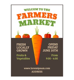
This poster was chosen as a good example because of the choice of colors, positioning, and measurements throughout the design.
Focusing on the main eye-catching point of this poster concludes around the main object itself which is the carrot that’s located in the center of the page. It draws the audience’s attention as to what the theme of the poster may be about, giving off the correct color to scale of the carrot that isn’t too bright or too dark, so it is visually seen from a further distance as well as a closer distance.
Around this Farm, Retail Poster includes much information about this Farm marketplace which helps give the audience a better understanding of what they may provide. This poster includes a clean and yet well-fitted font so that again it is readable and visually seen from any angle. However, not all the text can be seen from a further distance as the link and address title at the bottom is a lot smaller than the rest of the given information located around the poster.
The title at the top of the poster is designed with only two colors, the two colors of which both fit perfectly with the ‘Farming’ theme given. The Colour orange is used to reflect on the focus and objective of the poster as well as the set theme, the orange is not the exact same color as the object itself but fits between both the tomato and red pepper, blending with the carrot too so that there all linked together. Furthermore, the color green Is also fitted with the title to show a better design and example from the leaves on all the provided vegetables shown in this poster at the top, also connecting with the farming theme and how most crops and fields consist of the colour green throughout.
Not so well designed example
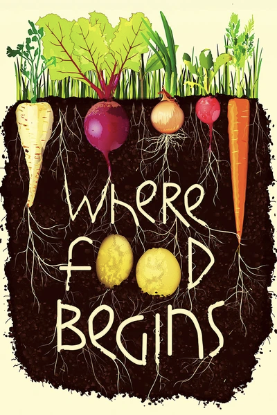
This poster for a Farm retail shop has been chosen as a bad and not so well-designed example because of the amount of detail and purpose that is presented throughout the piece.
The main focused area throughout this whole piece is the different colored objects that are located around the top of the poster which clearly represents the theme and purpose of this Farm Retail Shop. Near to the bottom of the poster is where the title is located for the audience to visually see.
When focusing on improvements to this poster, because of how much is going on at once around it, the font used for it is a little hard to see clearly and understand because of how close it looks to the design of the roots which can be difficult to see from the rest of the design.
Making sure that everything is visually easy and clear to see from a close-up or further distance is important to many of their target audience, the poster’s location could be anywhere which makes it harder for further people from a distance to see and understand what the poster may say.
In addition to this, the top of the picture is drawn to have many similar lines and colors of green which are to represent trees and crops where the roots are formed from the vegetables growing in the image. This is a slight downfall since the poster already includes many different lines and objects throughout the poster which can draw attention to the audiences’ eyes elsewhere than the real focus of the poster which is the title. This is because the audience should be able to visually see what this Farm Retail Shop is about and what it concludes altogether.
Re-Design:
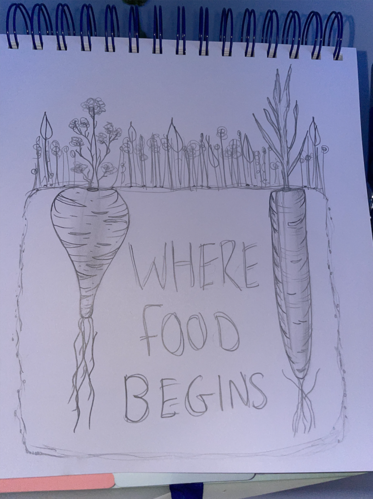
The poster doesn’t have major changes, but the changes that were made were done to help make the poster more understandable and clearer to the target audience. Adobe Photoshop and Adobe Illustrator were both used to make the new design, ‘Academy Engraved LET Plain: 1.0’ font was used to type the new title. My reason for this font is because of the type of typography it brings out to the set theme, the letters having a bold outline that almost matches the roots at the bottom of the crops on either side of the title.