
The meaning behind Colour
Light of colour, also known as a form of energy. Sir Isaac Newton back in 1666 discovered the source of sunlight is a foundation of mixed colours by identifying through a ray of sunlight striking through a prism. It’s noticed to split into 7 constitute colours, known to be:
- Red
- Orange
- Yellow
- Green
- Blue
- Indigo
- Violet
Specific and different wavelengths often produce new shadings and angles of the given colours, which answers why to how we see different shades of the same colour.
Introducing the colour category
Primary Colours > Red, Yellow & blue. The only three colours that can not be formed by mixing other colours.
Secondary Colours > Green, Orange & Purple. When colliding together any of the primary colours, these secondary colours are formed.
Tertiary Colours > Other colours that are introduced just from colliding any of the secondary or primary colours together.
A well designed example of used colour
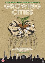
An instant attraction to this poster for urban farming is the easy choice of ‘Farm’ colours. Farm colours are the colours you would normally have in mind when viewing one, such as brown, white, dark brown, black and many shades of green.
The reason I have chosen this poster as the well-designed example is because of the creative technique use of colours it has throughout the page. To begin with, the background of the poster includes an easy shade of brown, the almost light colour of a teabag. This colour fits perfectly with the theme of the Urban Farm topic since the colour is found usually on farms. Another reason this colour is a good example of colour is the use of green through the graphical image, as well as the matching text colour to link with the poster. A shade of green has been placed to represent the leaf to the audience, in contrast with the top title of the poster to catch the audience eye quicker. The used shade of green is particularly vibrant when compared to any other used colour throughout the poster, which is why it stands out better when used as a font colour too.
The black at the bottom used slowly reflects the darker shade of brown on the roots linked together. Black is a very solid colour that can also draw an audience’s attention down to the bottom of the page. The owner of this poster may have used the black colour to help draw attention towards the city background, indicating the position of this Urban Farm and its location. The roots above the black setting of the background may be located right above just to help the audience see clearly and not to forget the purpose of the poster itself, meaning the roots link to the urban farming subject.
A not so well designed example of used colour
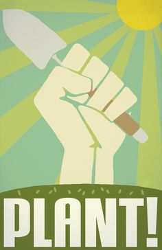
Most audiences look for bright and eye-catching colours to a poster to help draw more of an interest when viewing from a distance. Seeing a simply made poster can often drive an audience away since they may get the wrong first impression and may think that it isn’t to their understanding or may not be attracted enough to read.
One large reason this has been chosen as a bad example of an Urban Farm poster is the choice of colours that have been collided together to make this final piece. Starting with the focus of the image which is the central object of the poster being the hand. The choice of colour is too clear to the background colours of the poster, making it difficult to notice the outline of the hand is clear enough.
Another reason this poster could be better is the title at the bottom of the poster. The choice of colour and format of the ‘PLANT!’ title could have had better time spent on it to help attract the audience more in, the colour matches the same colour of the hand and gives a simpler and more calming message than what its producing, the objects in the image give a more powerful message, but the colour choices for them don’t match.
Making a difference to this poster has very simple steps, but to just change the colour of the hand in the centre as well as spending more time on the title, adding a better font, and making it more attractive to the audience. The hand could have a lighter shade of that same colour, the same colour used for the title beneath to draw attention for the same reasons.
Re-Design:
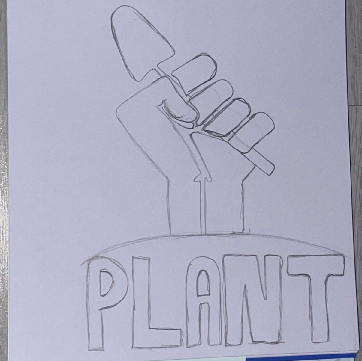

This design was created through Illustrator and Photoshop, changing the background and title of the font title for the poster to bring a better. The colour of the fist was changed mainly because it is located in the centre of the poster, meaning it’s where the audiences eye would be attracted to first. The second attraction is to be focused on the title of the poster, being the name at the bottom of the poster which is ‘PLANT!’, which concluded using the font named ‘Academy Engraved LET Plain:1.0’. The reason this font was used is because of the shape and type of typography it gives off, using lines to create the letters forme’s the design of roots which fits the theme Urban Farming, topped off with a light grey stroke around the edge to give a more shadow effect to the text. The background of the poster was changed to brighten up the poster, as the original colours used were dull and would not have been as pleasing as hoped to the audience. Clouds were drawn from scratch using the brush tool to give a better setting than just one solid background image.
Bibliography
https://www.imdb.com/title/tt2408586/