
What is Typography?
The arts of changing and designing letters, texts in a way that presents them legible, visually understood to the satisfaction of their audience. Steps as part of this include the font style, appearance and structure. Presenting emotions through the art of these letters to bring them to life.
Relating to the 11th century, when the innovation of movable type was existing, typography was often only identified in books, magazines and public work. One important example is the Gutenberg Bible, which began the revolution of typography, calling his style and being known as “Textura”.
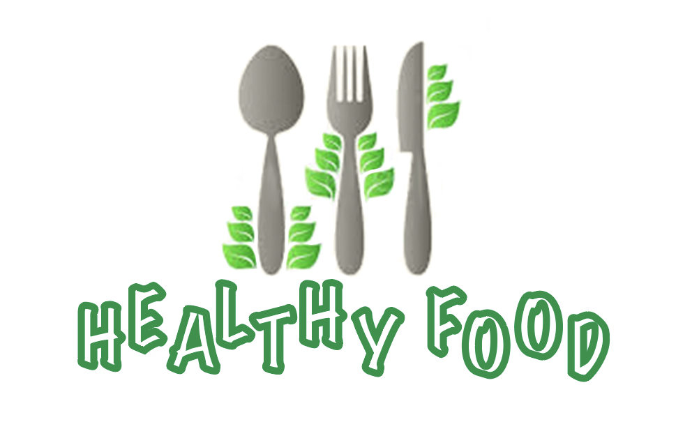
A not so well designed healthy eating logo

The reason this logo was chosen is due to the colour scheme, design, and format. A healthy eating logo is formally looked at to help give you a small objective towards your audience on what the website or page may include or what it’s based about. Including a style of font and typography to your logo will not only attract a wider audience but will give a better impact to your website and help give a better and meaningful image too.
The font used in this image is ‘Danger Neue Free Regular’ which does however link in with the design of the logo. Given the shape of the font on the logo, it is bold with a reasonable size for the audience to read and understand, however has not used any sort of typography. The title positioned at the bottom of the symbols matches the same colours in green which doesn’t make it easy on the vision for the audience.
When looking at the symbols used for this logo, the symbols used do represent cutlery that people use to eat. Along with size, these symbols are the leaves growing from the size of the piece of cutlery which links to the popular saying for healthy eating ‘Eat Your Greens’ to indicate the ‘healthy lifestyle, which then links to the starting purpose to this meaning, a healthy eating logo.
However, the use of only one colour does keep a very boring impression. Using more than one colour can not only attract a better audience but can give a better understanding to your audience about the ‘healthy’ lifestyle, not all vegetables come in the colour green, so using multiple colours does help to understand other fruits and vegetables such as yellow and red peppers which are healthy to eat in your daily meals.
RE-Created:
A well designed healthy eating logo
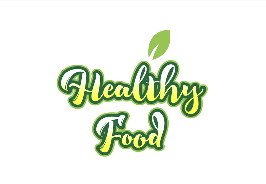
This logo was used as a good representative because of the use of colour and typography style attached to this design. the logo uses a range of different shadings and colours to make the final piece, matching the theme well together with a simple and small image to finish. Overviewing the logo, the audience can tell and asses that this logo is in fact linked with the purpose of ‘healthy eating’ giving them an insight and an objective on what the website may be about.
The font used in this logo is ‘Bowling Script Basic’, used to give a wavy but in-lined title, with a green stroke around the edge of every letter. The strokes used help give a bold outlook to the typography format used as well as giving a better view for the audience, making it less difficult to read from a distance, avoiding trouble with vision.
Another reason this logo is well designed is the use of colours within every letter, the logo uses three colours, two of the same but used in a different style and shading. In the inner letters, the colours used to present the logo are blended with off-white and yellow, which are colours of some healthy vegetables and fruits. The outline stroke has a dark green stroke to match the top image including a small singular leaf.
The image use does in fact link with the purpose of the logo, which Is a healthy eating style, also reflecting the popular saying ‘Eating your greens’ which conveys the use of the leaf since the popular vegetables do include leaves that are good to be used in a healthy meal. All together the logo uses its typography and colours to help give the main purpose to the audience which is to eat well and follow a healthy lifestyle, which this logo has successfully achieved.
Bibliography
https://careerfoundry.com/en/blog/ui-design/beginners-guide-to-typography/