Rob Janoff
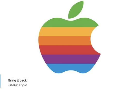
Apple shape created with a bite on the side, so it isn’t mistaken for any other fruit. The history behind the apple, Represents the law of gravity “the apple fell on his head” > newton sitting under an apple tree.
The rainbow colour scheme was a nod towards the apple ll, it was the world’s first colour display feature as a logo.

Use of the blue is to represent the water sector to the purpose of the company, a ‘water-based planet’. A capital ‘C’ in the form of a Ying-Yang symbol to show a bit of Tokyo’s culture within the logo, as well as representing the ‘Planet’.
Company involving provision for social games, blog sited and internet mail order sites for women
Rob Janoff’s journey: