
What is Conceptual Design ?
Known to also be a piece of framework, gathering information and resources to express and show a design visually through a piece of artwork.
“Concept Art” falls for the illustration of how these resources and information are fitted together to show how the outcome may be introduced. The main phrase specified as “Concept” is also identified to show the meaning being a certain piece.
An example including Conceptual Design:
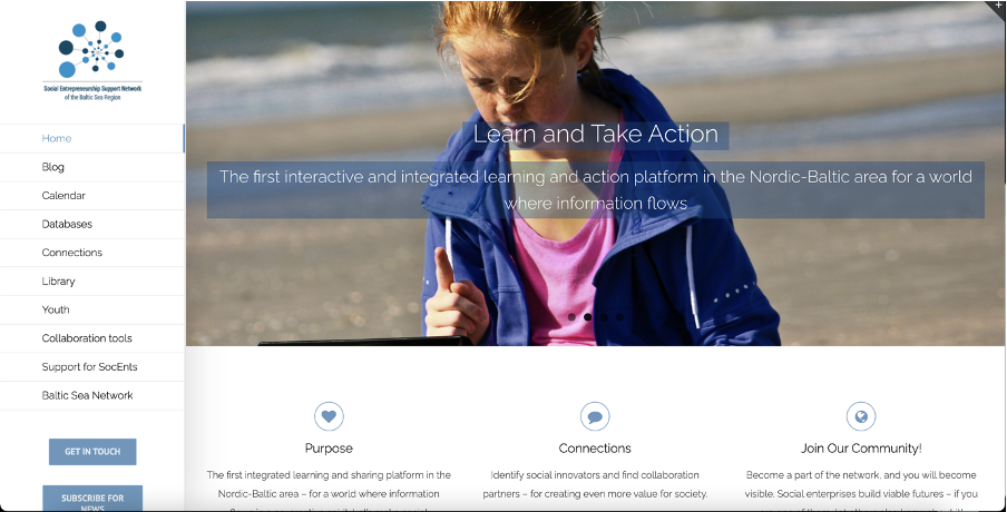
Social Entrepreneurship support network’s purpose is to allow a wide range of different communities to connect from around the Baltic Sea, helping an audience bring relevant content to this existing social network group.
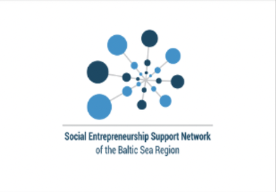
When analysing the logo as part of the website, you can see it is a conceptual Designed logo. How this is noticeable is the use of the circles which may suggest the different communities coming together to form one large circle, indicating one large community. This then brings me to my following other reason, is the lines that connect through the circles which show a form of connection, linking the communities together.
Because the network is based on areas around the Baltic Sea, this may suggest the reason behind the different shades of blue circles used. The Baltic Sea is located just between Stockholm and Poland, not far from the United Kingdom. Due to the Baltic Sea being located within Europe, this can again also suggest the number of different countries and cities located around Europe to help form a wider range of different communities supporting the network further.
When taking a clear view of the Logo, we can take a sense as to what the website may already be about before reading on through the formation, colour, and design. The circle does however stop at the largest circle through the spiral, which may also indicate that there is more to come, either that may mean communities to future upgrades to the company.
An example including a non-conceptual design:
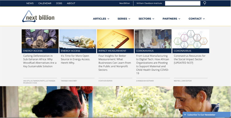

Provided to the top left corner of the page is their logo. A clear example of a non-conceptual design shows the final product compared to its purpose as well as the way it links to the meaning behind its use, however, the logo used is a very simple shaped triangle, which could indicate a one-way circulation through how the business may form and how their work is presented, but it is simple.
Personally, for this purpose, a design logo for this page would have been better if a symbol was to be drawn out to represent the ‘Billion’ phrases within the title of the logo. Adding to this, an arrow that blends into the symbol represented the ‘Billion’ phrase so that the whole logo fits together as one.
The colour of money is to be used, targeting green as it gives a sense of positivity and a feeling of ‘correction’ to draw in their target audience, not to mention since the business is partially about low income and charity work, a symbol for money would help give a clear overview of what the purpose of the website may be about before even reading through.
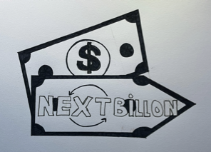
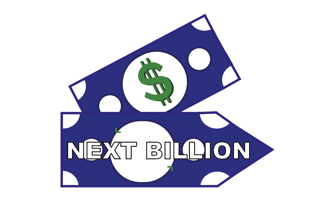
Multiple shapes were put and collided together to make the final piece. Shapes including rectangles, triangles, and circles were fitted in places to make the bill shape. A clean white circle is placed in the centre of the bill note to show an outline of an actual bill. The colour blue links to the purpose of the website’s original logo that includes a blue triangle, and the green dollar sign is the value of money, to represent the money symbol.
Creating the ‘Bill’ note design helped relate to the title of the website ‘NEXT BILLION’, creating a piece that fits the relevance and purpose of the website which is a charity to help the poor. By doing this, a representative of a bill note can show the audience the immediate money sign to give an insight into what the purpose of the page may be about.
Bibliography
https://www.freepnglogos.com/pics/dollar-sign
https://99designs.co.uk/blog/tips/conceptual-design/
URL: https://www.socialenterprisebsr.net/
URL: https://nextbillion.net